Radical Dots Simulator: Visualizing Agent Belief Change
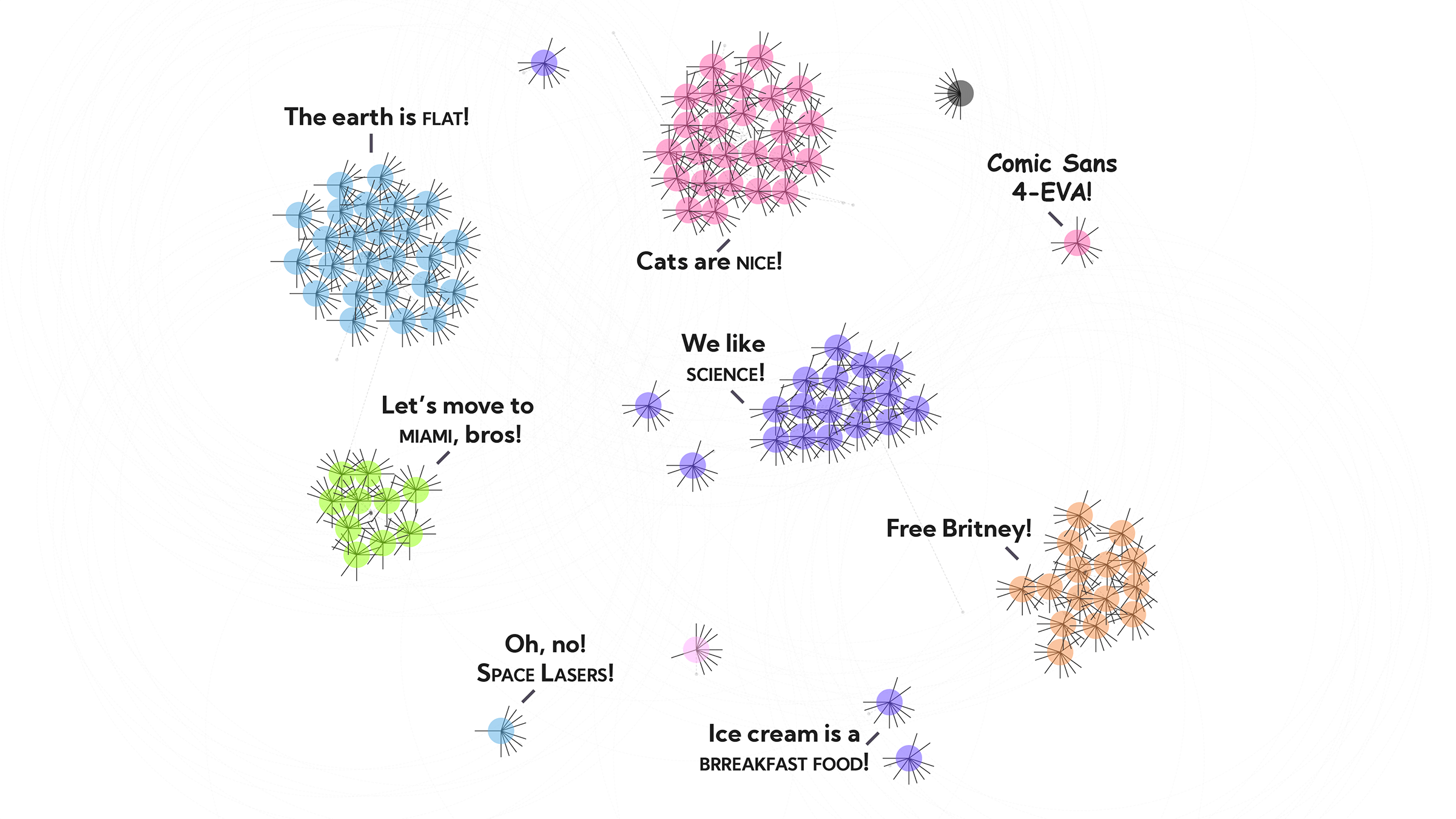
The world is full of people who are immune to data and reason. We’ve got Q-anons, anti-vaxxers, flat-earthers, and many millions of delusional people who think cats make fine pets (which is exactly what the whiskered illuminati want you to think).
But what can we do? If you come at people — guns blazing — with your opposing beliefs, the best case you can hope for is not being persuasive, worst case you’ll actually drive them further away (src, src, src, src).
What’s the psychology behind belief formation? Where do our deeply-rooted, occasionally-pernicious beliefs come from? How are they influenced by the people around us? What role does evidence play in what we believe?
A few theories offer compelling explanations for how individuals develop beliefs, but how does this play out with lots of people interacting in real time?
To test this out, let’s try a small simulator, using a rough model of 100 agents, who walk around, talk to each other, and attempt to influence each other, loosely based on Social Judgement Theory and Selective Exposure.
Fast forward a couple weeks later, we’ll find we’ve spent a stupid amount of time watching little swarms of small dots dance around and argue with each other, but we’ve found a few cool things.
Cool Things:
- With just a few simple rules, agent-based models can show complex (and weirdly hypnotic) emergent behavior. (The dots are dancing for a reason!)
- To the extent that a) the theories represent reality and b) the model represents the theories (two big qualifiers), it seems like Social Judgement Theory + Selective Exposure explain some interesting real life behaviors (e.g., groupthink, echo chambers, the persistence of strong beliefs).
- Visualizing agent-based models, and all their different variables, was a struggle (i.e., how to show 100 people × their 10 beliefs, all changing over time?), but eventually I stumbled onto a technique that worked surprisingly well.
Before we dive in, let’s talk about some theory (and cats (who are the worst)).
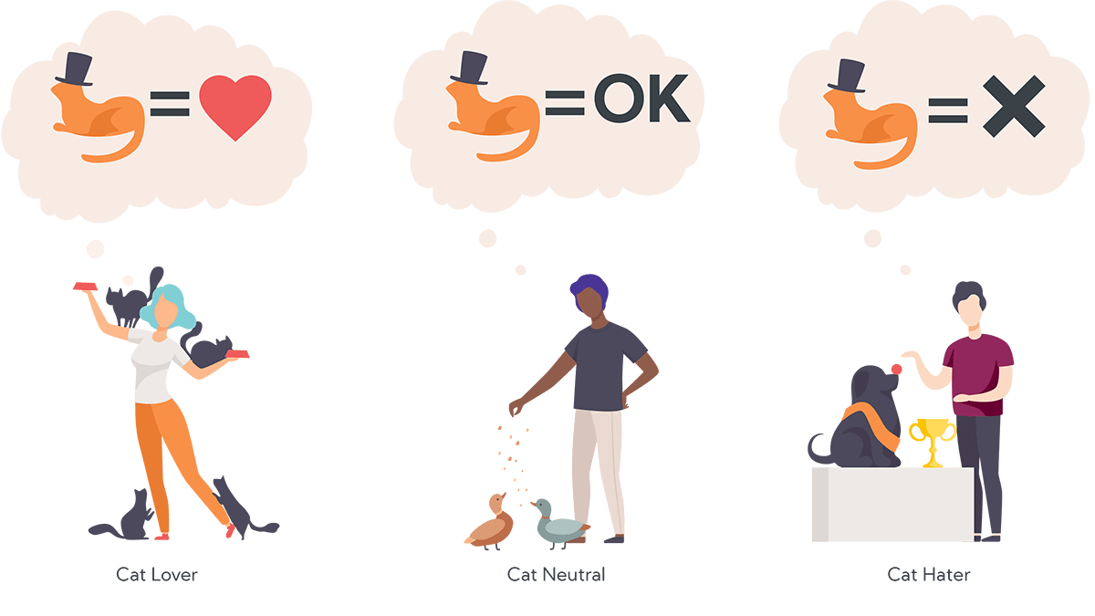
The Theories
Social Judgement Theory of Attitude Change
This project was inspired by a theory of attitude formation called Social Judgement Theory, which was first proposed in the 1960s by three social psychologists: Carolyn Sherif, Muzafer Sherif, and Carl Hovland.
They proposed that people accept (or reject) new ideas based on their pre-existing “latitudes” of rejection or acceptance. The short version:
- If we hear an idea that we agree with, we’ll strengthen our existing belief (toward the new idea).
- If we hear an idea that we’re neutral toward, we’ll change our weakly-held belief (toward the new idea).
- If we hear an idea that we disagree with, we’ll strengthen our existing belief (away from the new idea).
(Note: Both the first and last scenarios result in the person doubling-down on their existing beliefs.)
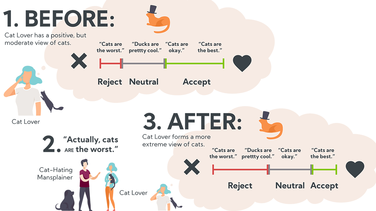
What does it mean to “strengthen” our attitudes? The more “involved” we become with a topic, the stronger our attitudes become. These “strongly held” attitudes are defined by narrow latitudes of acceptance and wider latitudes of rejection. That is, once we’re involved in an issue, we only accept a narrow range of new ideas that confirm our existing beliefs, and we reject a wider range of ideas that (we perceive to) contradict our beliefs.
In the example above, the man in the purple shirt tells the cat lady, “Cats are the worst.” Instead of convincing her, his statement has the opposite effect and she becomes more extreme in her original belief; she becomes more ego-involved, widens her latitude of rejection, and shrinks her latitude of acceptance. After this, the only acceptable ideas about cats are those acknowledging absolute feline exceptionalism.
One important takeaway for the data community: sometimes it doesn’t matter how good your data is, or how well it’s presented — changing minds, even with data, is anchored by pre-existing beliefs (src).
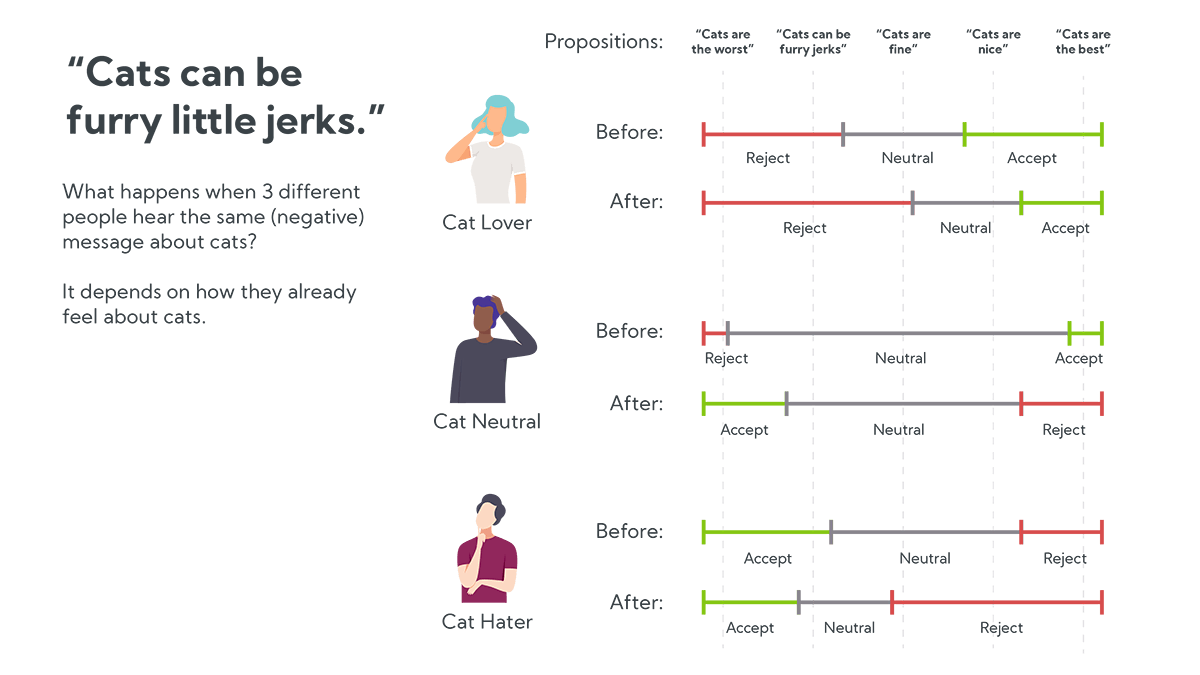
For example, if you tell someone, “Cats can be furry little jerks because they vindictively knock things off the counter,” they won’t necessarily stop to consider the merits (or how much glassware they keep on their countertops). Instead, their attitude will change based on their pre-existing opinion of cats.
- Cat haters (aka realists) might say “True! Cats are the worst.” Their anti-cat convictions will become stronger and eventually even neutral ideas like “cats are fine” become unacceptably pro-cat.
- Cat-neutral people might say “I suppose.” They may actually stop to consider the argument and, upon consideration, will grow to dislike cats a bit more. In the example above, the cat-netral person flips their scale.
- Cat lovers might say “No way!” and strengthen their resolve that cats are the best. They shrink their latitude of acceptance and grow their latitude of rejection, until even neutral ideas like “cats are fine” become unacceptably anti-cat.
Belief formation is obviously more complicated than this, but Social Judgement Theory provides a compelling theoretical foundation for why it’s counterproductive to confront strong believers with opposing beliefs.
This has a few interesting implications:
- Arguing directly against a strongly-held belief is counterproductive.
- It is easiest to change our minds when we’re neutral toward a topic. Once beliefs become strongly held, they’re nearly impossible to change.
- Cats are, in fact, the worst (Sherif, Sherif, and Hovland have not spoken to this, directly, but we can assume they’d also reach this inevitable conclusion).
Selective Exposure Bias

Another dynamic to consider: our attitudes are driven by what we’re exposed to, but we tend to only expose ourselves to information that confirms our existing beliefs. We choose confirmatory information in lab settings (src, src). We surround ourselves with people who look like us and share our values (src). And Facebook / Twitter / Youtube (or any other personalized feed) exacerbate this exposure bias by feeding us content optimized for our engagement (e.g., things that either confirm our pre-existing beliefs or lead to internet arguments that entrench our beliefs even further).
The Simulation
Sherif, Sherif, and Hovland explored attitude latitudes in the context of an individual’s response to new ideas, but what happens when we scale up to a bunch of people, with a bunch of different beliefs? How might it play out when we consider exposure dynamics? Would we see some of the polarization and extremes we see in real life?
Setup:
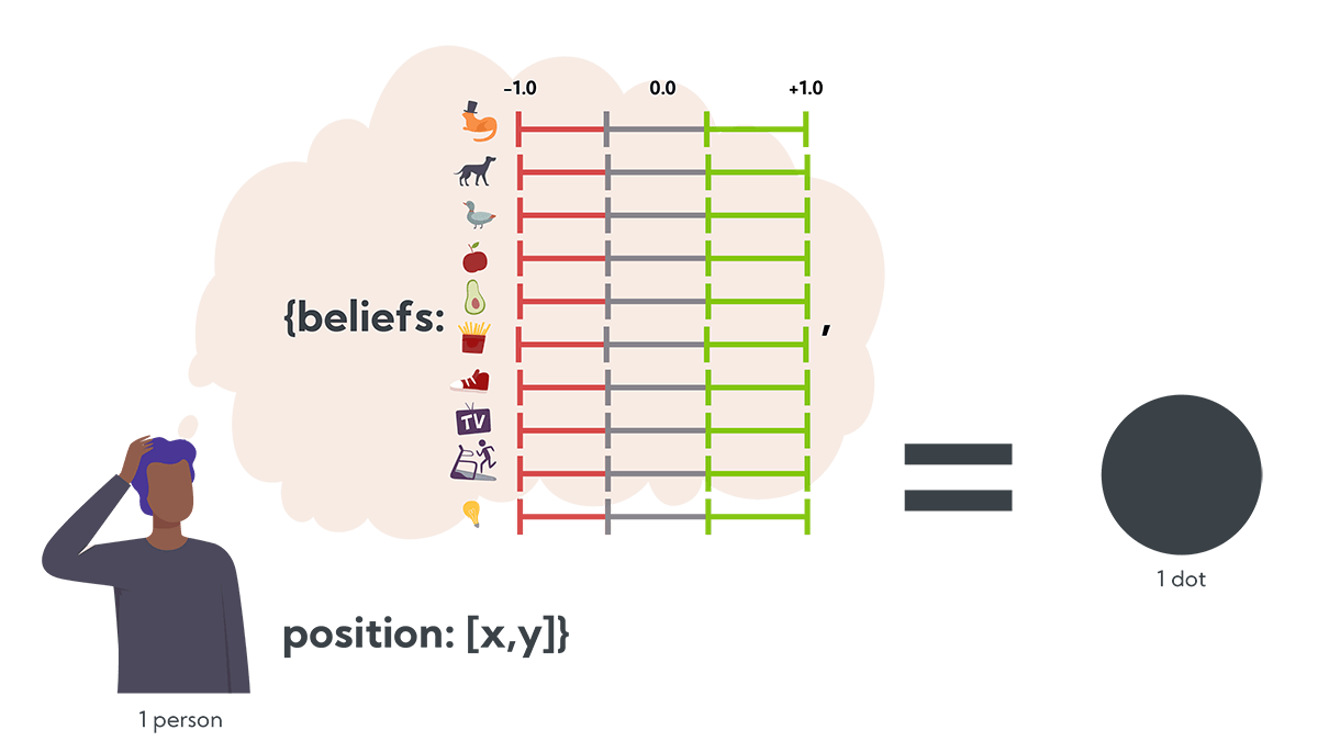
Let’s start with a person (from here on, a dot). Let’s say each person (dot) has 10 beliefs, ranging from -1.0 to +1.0 (e.g., -1.0 might agree with, “Cats are the worst,” +1.0 might agree with, “Cats are the best”). Let’s also give the people (dots) physical locations (x,y), so they can move around and speak with other people nearby.
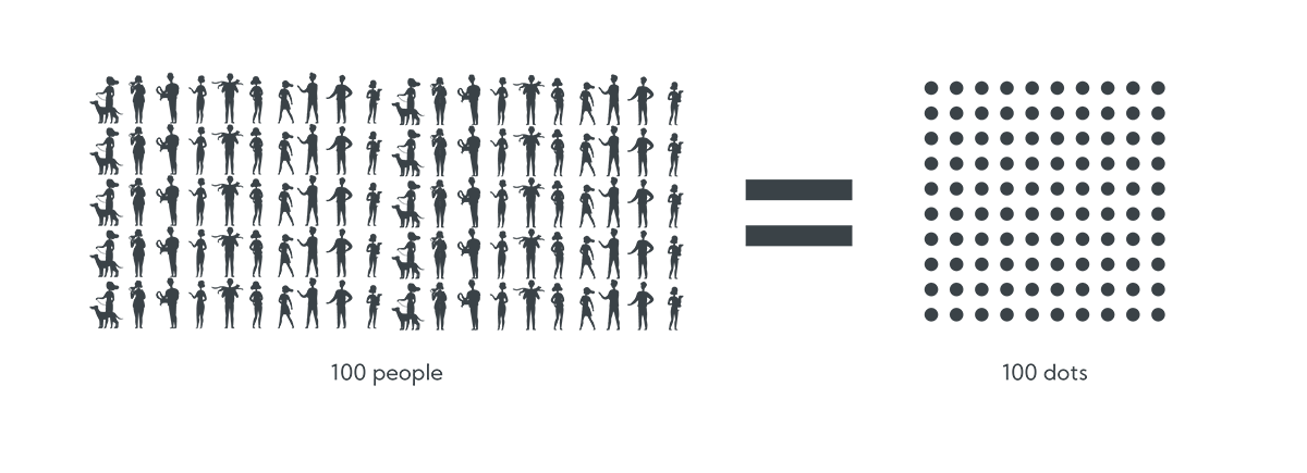
Then let’s say we have 100 people. We’ll initialize them with 10 random beliefs and random positions, and then apply the following set of rules over several turns.
Rules:
- Each turn, one or more random dots “speak” to their neighbors about a random belief.
- Dots that “agree,” step closer to the speaker and adjust their attitudes toward the speaker’s belief. Dots that are neutral also step closer and adjust their belief toward the speaker’s belief.
- Dots that “disagree,” step away from the speaker and adjust their belief away from the speaker’s belief.
That is, beliefs are updated based on each dot’s latitude of acceptance (rejection) and as dots move to (from) speakers, they’re exposing themselves to more (fewer) other beliefs that they agree with.
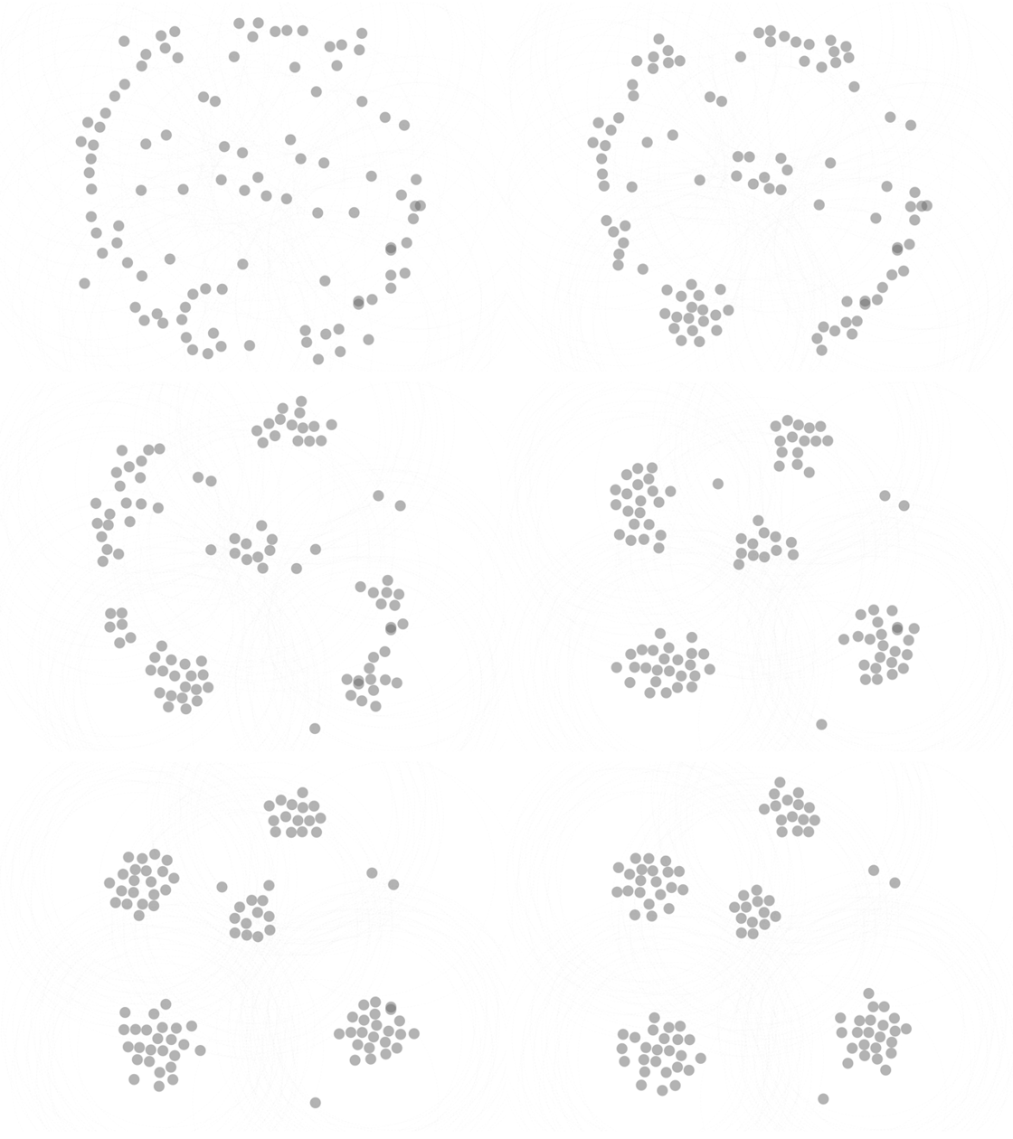
In this animation, you can see small groups of people (dots) banding together, presumably based on their common beliefs. We’ll discuss more of these behaviors below, but first let’s figure out what’s actually happening.
The problem: From the visual, it’s tough to tell why the dots are sticking together. Do the grouped dots actually share beliefs? Is it some random effect based on the movement rules? Or maybe it’s a bug in my embarrassingly-long Observable notebook?
Assuming the simulation has something meaningful to say, what’s the right way to visualize the underlying variables and see what’s actually driving the behavior?
Visualizing 100 dots × 10 beliefs × location, over time
Location, location, location.
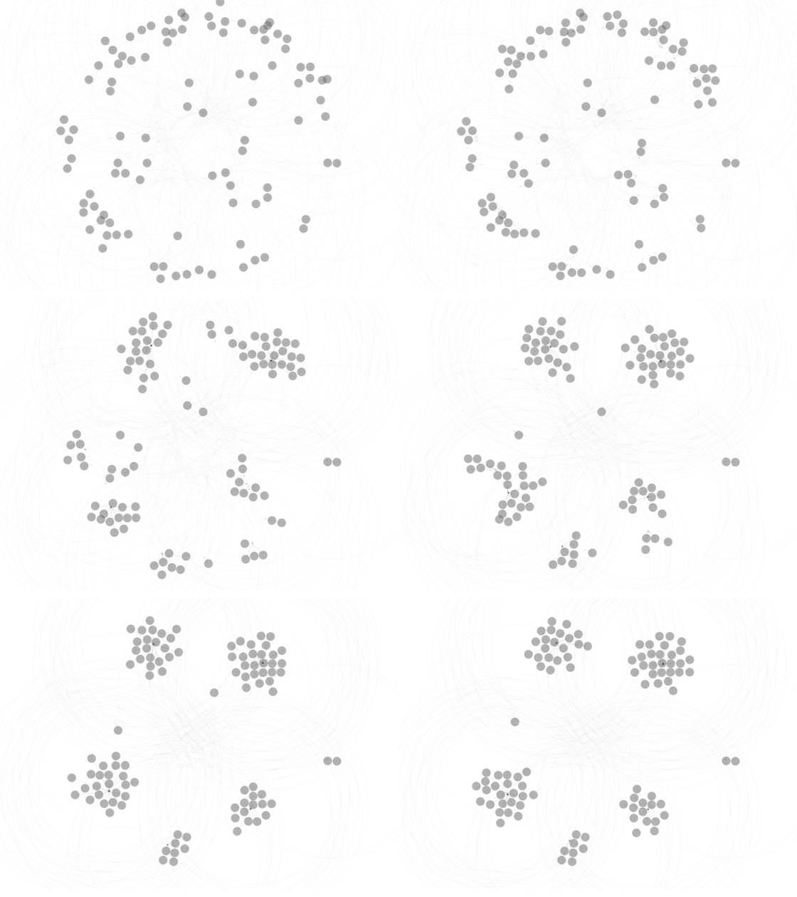
First, the easy part, the dots are arranged in x,y based on their simulated physical location. You can imagine these dots milling around in some big, open space. Occasionally the dots sprout a dashed line, showing where they intend to go and then they walk toward that point. In the example above, you can see that as they form groups, the dots in each group try to walk toward the center of their group.
Importantly, the dots only speak to other dots nearby. The large, very-light gray rings around the dots show how far they can speak (and which other dots can hear them).
The physical metaphor makes for easy visualization (and it vaguely looks like the Senate floor during a big vote), but it’s also analogous to other behavior. The dots walk toward and away from speakers based on whether or not they like what they’re hearing, in the same way we follow / unfollow (friend / unfriend) people on the internet, or move to states / cities / neighborhoods that we think will have other people who reflect our values. All of this “movement” impacts which other people and which information make it into our exposure bubbles.
What do most dots believe?
What do the dots believe as a community? How about an opinion poll?
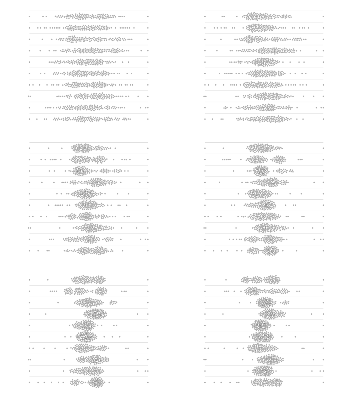
This is a stacked beeswarm visualization, showing where each dot stands on a particular belief. There are 10 rows, one for each belief. Each of the 100 dots is repeated on each row, positioned in x by the value of the dot’s corresponding belief.
In this example you can see the dots start with wide variations in belief values, then converge toward consensus in the middle. In the top two rows, you can see two-to-three distinct groups attempting to break away from each other.
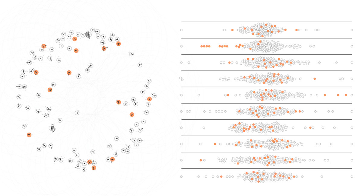
Rendering the dots individually in a beeswarm also makes it possible to select them individually. This allows highlighting dots across both views, making it easier to follow belief changes for individual (or small groups of) dots.
Two Views → One View
There are two problems with the map + beeswarm visualizations:
- Moving our eyes back and forth is a pain, especially if we’re trying to watch a single dot evolve over time. It’s hard to follow macro-changes.
- It still doesn’t answer our original question: are these dots hanging out with each other because they have shared beliefs?
Is there a way to get some sense of dots’ beliefs inline, on the original map? It doesn’t need to be precise, a “gist” read is good enough. A combined visualization would ideally accomplish the following design goals:
- Dots with similar beliefs look similar at a glance. Dots that are different look different. (These aren’t necessarily the same thing!)
- Show all 10 beliefs on each tiny dot, with some sense of magnitude for each belief value. It’s not as important to distinguish specific beliefs.
- When similar dots gather closely together, they “blend” and look like a cohesive group. Similarly, heterogeneous groups’ outliers stand out clearly.
- Micro and macro changes are discernible as the dots evolve over time.
Viz Attempt #1: Single Belief, Diverging Color Scale
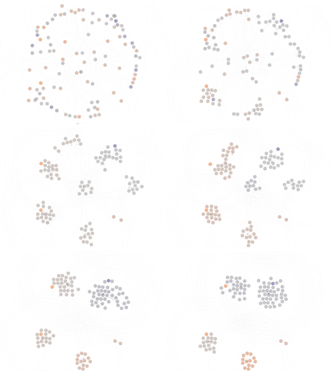
This animation shows each dot colored along a diverging color scale, based on the value of a single, selected belief (orange = -1, purple = +1.0).
In this example, we’re looking at how each dot feels about belief #1. The dots in the bottom-left are orange, because they oppose the belief. The top-right group is purple, because they’re in favor.
Eventually the top-left and top-right groups merge together, causing the top-left group to change from orange to purple, indicating they changed their belief to match the (purple) top-right group.
This view accomplishes some of our design goals, namely it makes differentiating dots easier along a single belief dimension. But, since the dots have many beliefs, it’s hard to get an overall sense of change.
Viz Attempt #2: Stars / Spokes
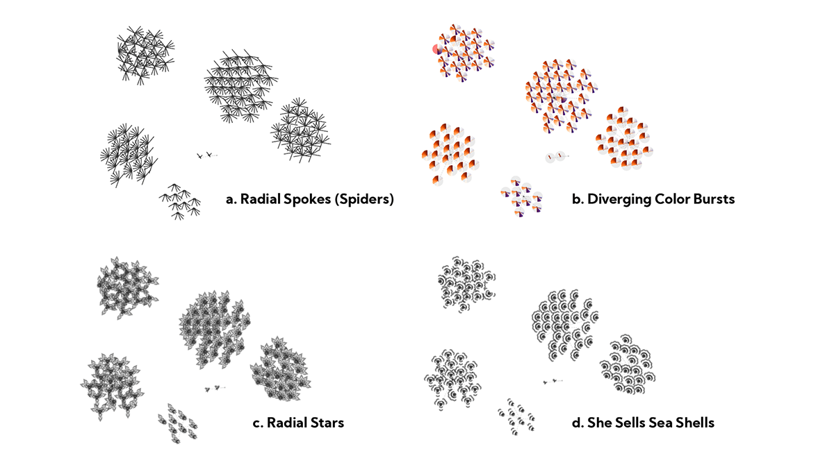
In Oriented Texture Slivers, Weigle and friends suggest that people can differentiate up to 15 different angles of overlapping lines. I thought a similar approach might work here, given that we only need to represent 10 beliefs. For this exploration, each dot has 10 angled spokes, representing each of the dots’ 10 beliefs. The spokes grow longer as the beliefs become stronger (and invert when belief values are negative).
I thought the spokes looked like creepy little spider legs, so I also tried this with radial segments (which turned into pseudo-pie charts), chevrons (which turned into stars), and small arcs (which turned into sea shells).
While this made it possible to differentiate some of the dots’ beliefs, none of these achieved the desired glanceability. I’d hoped that seeing many parallel spokes would form a semi-continuous “texture” across nearby, similar dots, but often it just looked like random cross-hatching.
Worse still, it makes dots with exactly opposite beliefs look almost identical (i.e., a dot with even beliefs = +1, odd beliefs = -1 looks very similar to a dot with even beliefs = -1, odd beliefs = +1)
Viz Attempt #3: Back to Colors
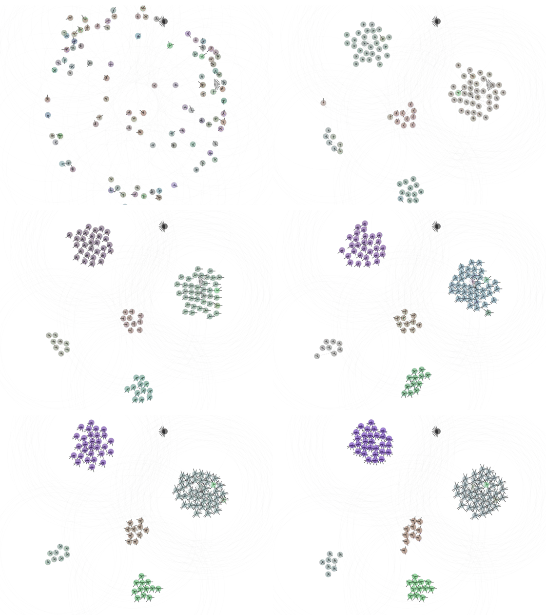
Here we’re coloring dots by mapping their 10 belief values into RGB space (by chunking the 10 belief values into three groups, taking the average of each group, scaling each average to 255, then assigning it to R,G or B).
I dismissed this approach initially, assuming the beliefs would cancel each other out, resulting in a bunch of indistinguishable beige and gray dots. But when I actually tried it, I was pleasantly surprised.
This approach finally answers our initial question, showing that groups of dots actually do share similar beliefs. It also shows when heretical interlopers don’t belong (before the group assimilates or kicks them out). It’s not great at indicating the magnitude of beliefs, but overlaying the spider legs provides the best of both worlds.
An unexpected side effect: The two extremist dots resolve to pure black and pure white, for a nice visual morality pun!
Emergent Behaviors
Now that we can see what the dots are doing (and thinking!), let’s get back to exploring the attitude formation theories.
Dots tend toward conformity with their neighbors.
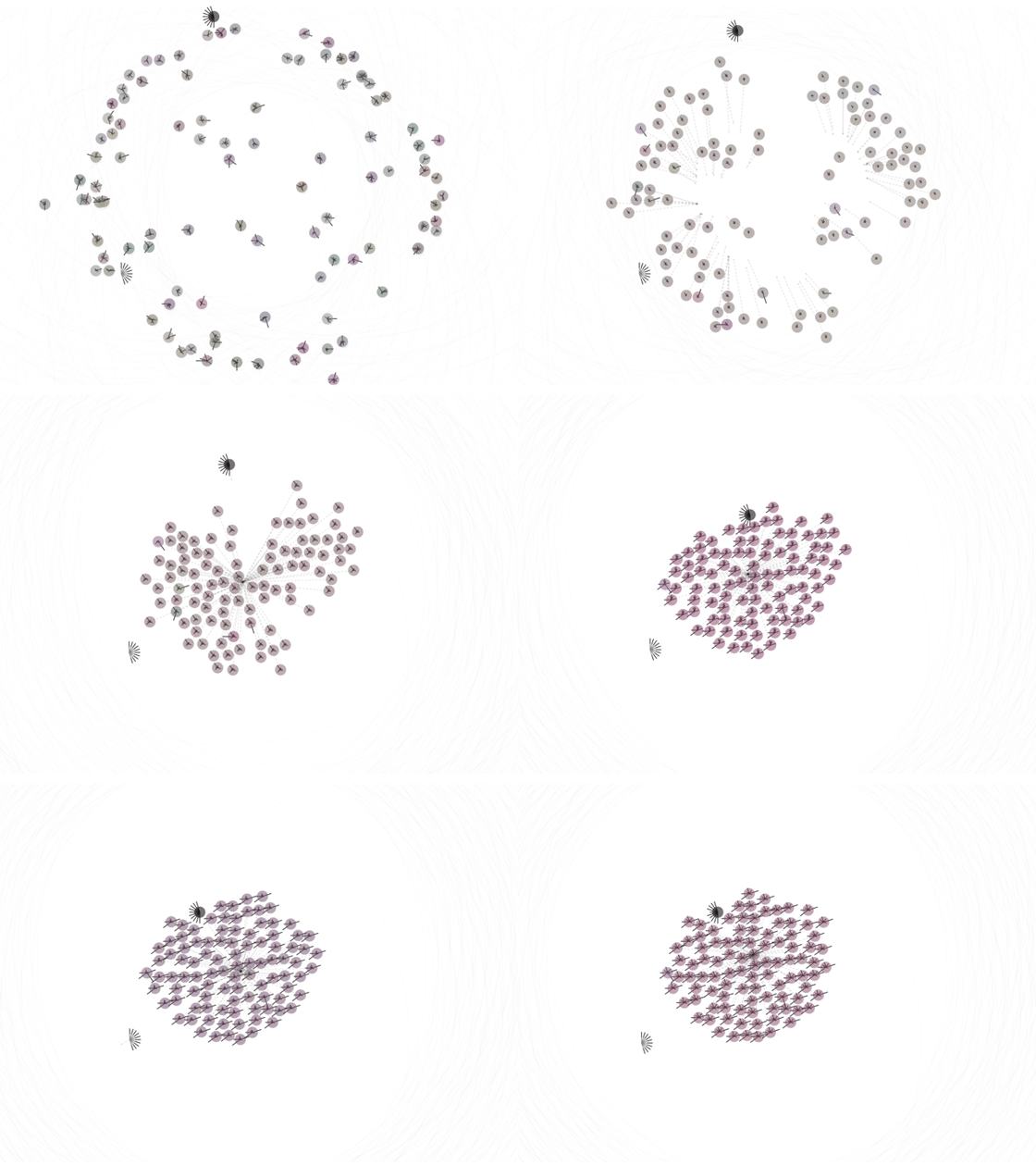
Moderate dots within speaking distance show group-think and converge to a common consensus. (This isn’t unconditional though, as we’ll see below).
Here, each dot has a megaphone and can talk to every other dot on the map. You can see they quickly come together, both physically and in terms of matching beliefs. You can also see that the spokes stay relatively short, indicating more moderate beliefs.
If you view this scenario in the simulator, you can see that their overall belief distributions hover perpetually in the middle.
Isolated dots form diverging echo chambers.
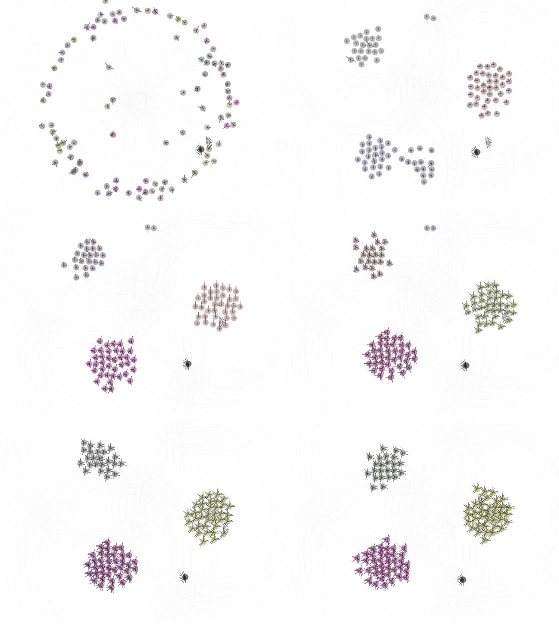
Similar to real-life echo chambers, once the dots divide into bubbles, they quickly sync up their beliefs. Each group’s beliefs diverge from other groups and they tend to be more extreme.
This is actually an extension of the group-think effect. The dots conform with their immediate neighbors, but because each group starts with different members, they end up in different places.
Echo chambers occur naturally, but in this scenario we’re forcing it by initializing the dots to be more physically distant and giving them a slightly larger speech radius to make sure they form into two-to-three neat groups and develop their beliefs before inter-group communication can happen.
Once beliefs become extreme, they stay that way.
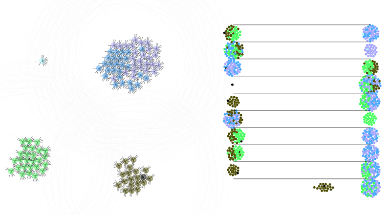
This is the map and corresponding belief distributions for a later-stage simulation.
In scenarios where echo chambers form, beliefs tend toward polarized extremes. You can see on the right that 8-of-10 beliefs are split (e.g., a bunch on the left, a bunch on the right).
Just like in real life, extreme beliefs are hard to change. The model is perhaps more extreme than we’d see in real life because once it reaches this state, it’s basically stuck for the rest of the simulation; the dots may continue to change their locations, but their beliefs are static. In the current model, the only way to pull a dot out of an extreme is for a critical mass of other dots with more moderate beliefs to approach it and win it over, but typically all the dots become extreme together.
You can see this emerge faster in the simulator by turning up the play speed.
In real life, beliefs develop in response to more than just the people around us. We, at least, have personal experience and objective reality to anchor (some of) us to reasonable beliefs, so it’s less likely an entire population descends into total madness.
Dots join / disband based on common beliefs.
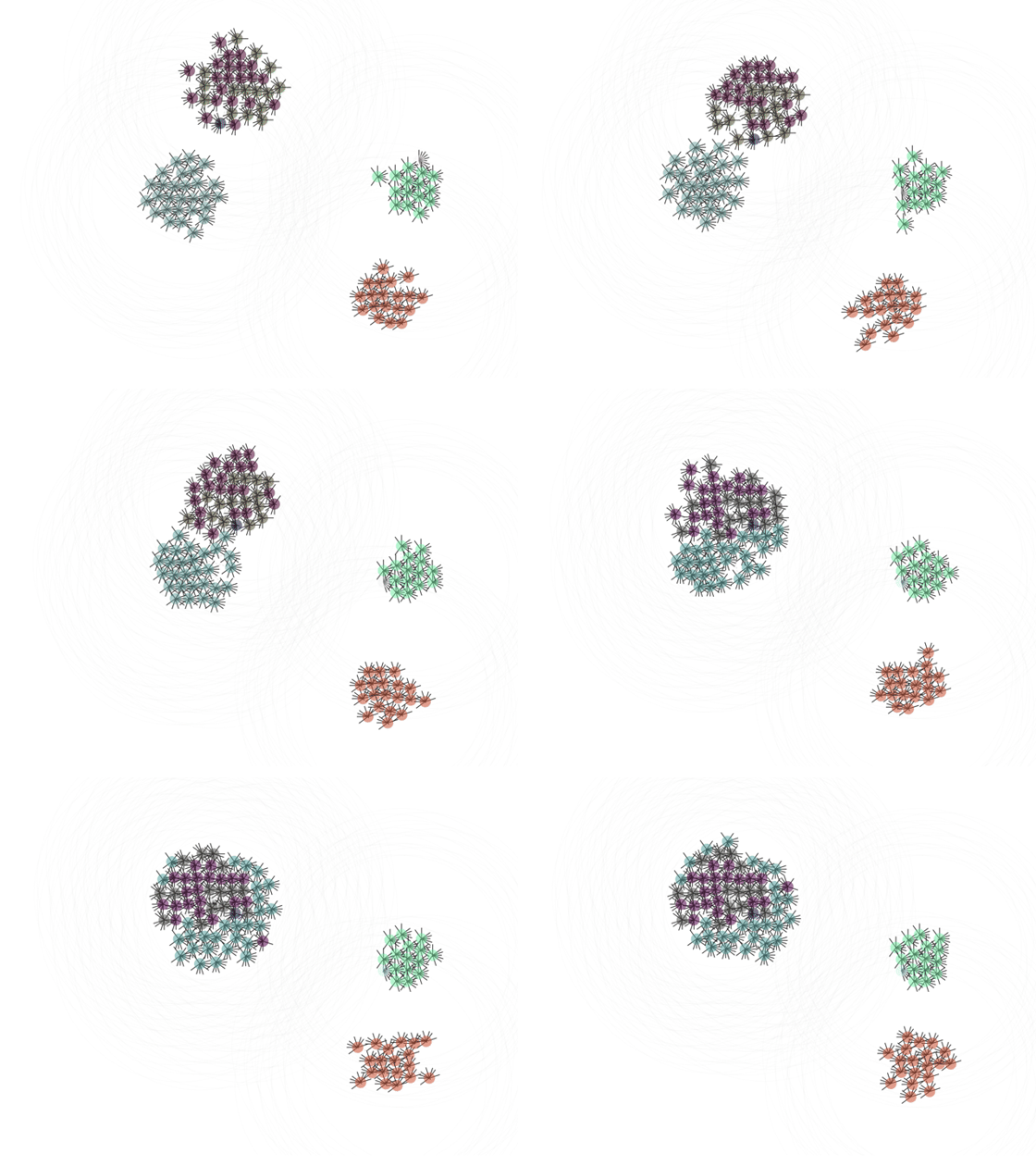
If you watch these long enough, you’ll eventually see unexpected behavior like this. At the top of the map, we see two groups of heterogeneous dots merge into a single group.
Their beliefs are already fully formed (and locked into extremes), so they won’t converge on common beliefs (you can see they retain their original colors) but they seem to stick together — at least temporarily — because they agree on more things than they disagree (e.g., for every four speeches that repel the group, six draw them back together). This isn’t usually a stable formation though; typically the groups will split up again and find their own separate homes.
You can (usually) see this play out in the simulator with these settings.
Extremist dots end up lonely.
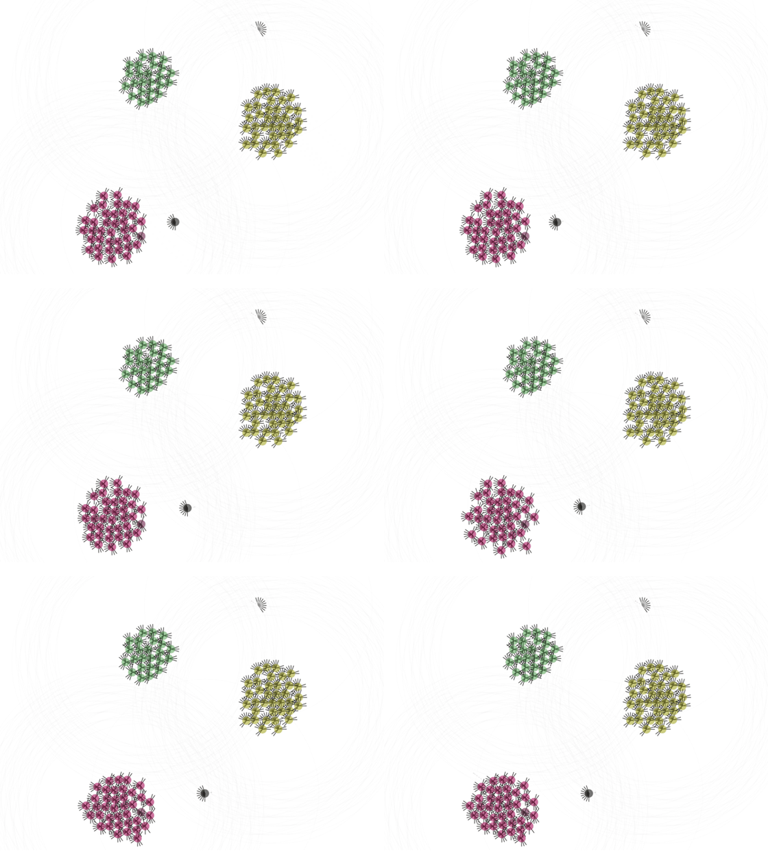
You might have noticed that in each of our groups there’s always a black and white dot, with opposing extreme beliefs. As we’ve learned above, once extreme beliefs set in, they don’t really change. Most other dots develop their beliefs together, so they tend to reach consensus, but the extremist dots stick purely to their beliefs, and as a result end up being pushed out by the others.
Preachy dots drive each other apart.
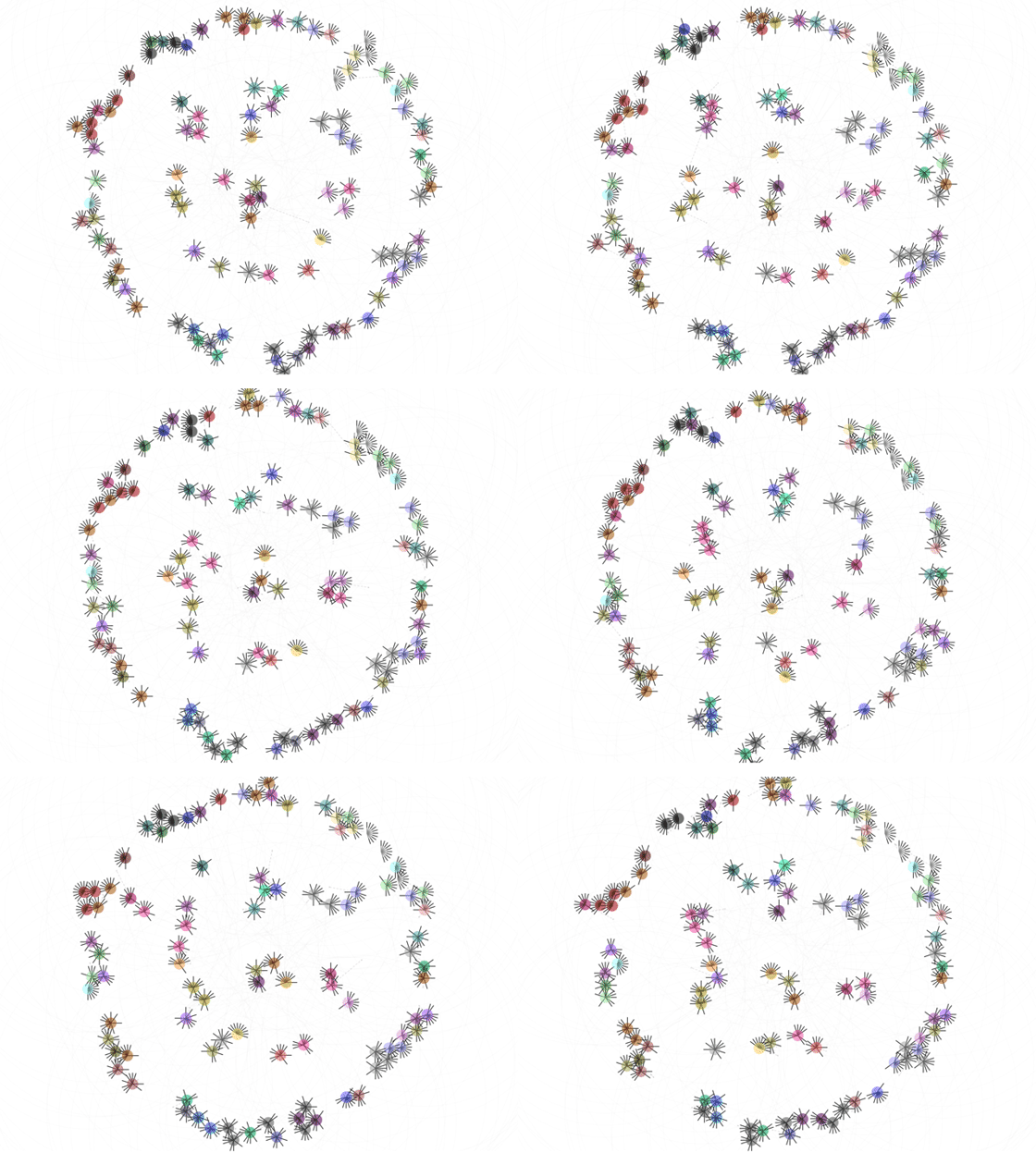
The dots in this scenario operate under a different rule than the others we’ve seen. Dots in previous sections choose which belief to “speak” about randomly, so they discuss an even distribution of beliefs. Dots in this scenario, however, are more narrowly focused and only speak about their most strongly held beliefs.
You can try this scenario in the simulator with these settings.
When dots only speak to their most extreme beliefs, they push each other to extremes more quickly, leading to more fragmented sets of strong beliefs, causing each dot to have less in common with its neighbors, ultimately driving them apart. You can see here that the dots all have different beliefs (i.e. there are 10+ colors here v.s. 2–3 colors in other scenarios). You can also see that most dots are hovering around the perimeter — that’s because they’re (literally) trying to escape each other.
An innocuous interpretation: imagine all the dots are recent vegetarians, CrossFit converts, or Tesla owners. They’re excited, but mostly harmless. (“We get it Dave, 400 miles on a single charge really is impressive. Thank you for sharing. Again.”). We all have our soapboxes — annoying our friends is part of the fun!
Slightly more troubling: this looks a lot like the environment created by engagement-optimized newsfeeds (e.g., if Facebook’s algorithm mistakes heated arguments for “engagement,” people see more arguments in their feeds and are more exposed to others’ extreme beliefs). To the extent that the real world looks like dot world, engagement-optimized feeds would not only accelerate extreme belief formation, but they’d also allow our opposing beliefs to drive us apart faster than our common beliefs keep us together.
What behavior do you see?
Try the simulator for yourself here: Radical Dots Simulator Notebook
The notebook has both the dots “map” and the beeswarm belief distribution, with controls for tweaking the parameters.
Recap
- Good charts aren’t always enough! Social Judgement Theory suggests that others’ attempts to influence us only strengthen our pre-existing attitudes. This explains why even strong evidence often fails at persuading others of opposing beliefs.
- Our tendency towards Selective Exposure means we tend to avoid information that doesn’t confirm our pre-existing beliefs.
- The simulator attempts to model Social Judgement Theory and Selective Exposure with three relatively simple rules. Despite this naive approach, it shows surprisingly realistic emergent behaviors like groupthink, echo chambers, and the stubborn persistence of extreme beliefs.
- Neither the theory nor the model offer silver bullets for neutralizing extreme beliefs, but they both suggest it’s pretty useless to be too pushy about our own beliefs.
- From a purely viz perspective, we looked at a few different ways to visualize dots’ beliefs and found that color can be super effective for visualizing belief convergence/divergence for groups of dots. (Perhaps this is useful for visualizing other agent attributes in agent-based simulations?!).
