Good Dashboards Inform. Great Dashboards Align.

When we think of dataviz in the workplace, we’re usually thinking of Tableau and Looker dashboards, designed to make everyone smart and support big, strategic decisions. But there’s another overlooked benefit of visualizing an organization’s data: the power to align.
Every organization struggles to keep members aligned around a common purpose. Brilliant strategy and customer insights are useless if everyone is rowing in different directions. Goal setting and OKRs go a long way toward accomplishing this, but this is where the humble dashboard can really shine.
One of the more common uses for dashboards is visualizing a team’s recent performance.
At their best, these team performance dashboards aren’t just about measurement, they’re a monument to what matters to the organization. The presence of a metric on a dashboard signals “this metric is important to the organization,” which in turn signals “this metric should probably be important to you, too.”
In this way, dashboards can do more than visualize performance, they can actually drive it by reinforcing the organization’s values, nudging the culture and focusing teams’ efforts on the most important outcomes.
In this post we’ll cover 3 examples of impactful dashboards in the workplace that were designed to help teams align their everyday behaviors.
1. Chartbeat

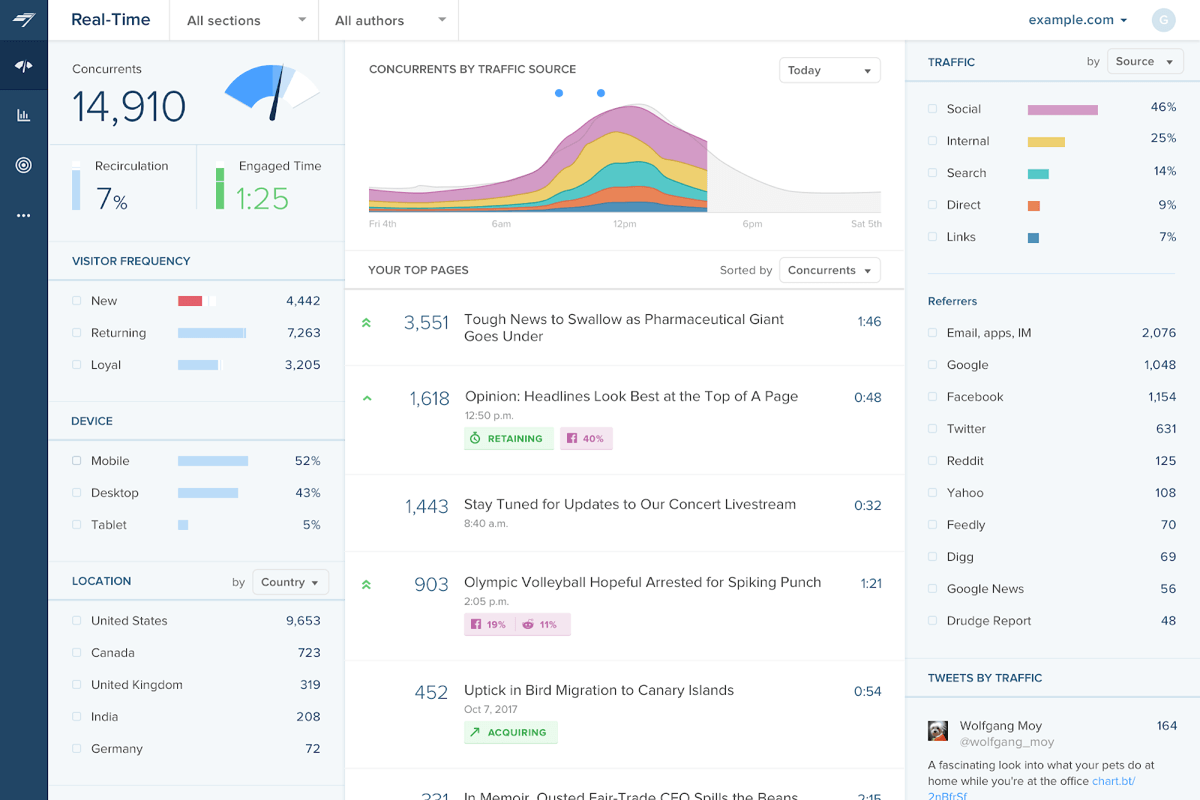
Though I still cringe when I see the goofy gauge dial, Chartbeat is one of my favorite examples of how dashboards can align an organization.
When Chartbeat started in 2009, news publishers weren’t exactly enthusiastic about reader analytics. Some editors were openly hostile. For example, The New York Times’ executive editor claimed: “We believe readers come to us for our judgment, not the judgment of the crowd. We’re not American Idol.”
This initial resistance made Chartbeat’s eventual dominance that much more impressive. By 2015, the top 80% of news publishers in the United States all used Chartbeat to track audience engagement (including the previously reluctant New York Times).
One of the overlooked aspects of Chartbeat’s success was that the dashboard was so much fun to look at. One of the privileges of working for Chartbeat was visiting these top-tier news publishers for user research trips. On almost every visit you’d see Chartbeat’s bigboard, mounted front-and-center for all to see.
“Sometimes one sees writers just standing before [the big dashboard], like early hominids in front of a monolith.”
While you might debate the merits of journalists glued to their audience metrics, one thing that isn’t disputed is that many were, indeed, glued.
Nick Denton, founder of Gawker (RIP), described reactions to Chartbeat’s bigboard to the The New York Times as: “Sometimes one sees writers just standing before it, like early hominids in front of a monolith.”
What made the dashboard so engaging? Chartbeat broke ground in two ways:
- The Data: Instead of relying on editorial instincts about audience interests, Chartbeat gave newsrooms hard evidence on what was popular and what wasn’t, helping writers & editors adapt stories to their audiences.
- The Viz: Chartbeat’s visualizations showed user behavior in real time. Even as an observer it was mesmerizing to watch stories shuffle up and down the leaderboard. According to CJR’s Caitlin Petre, in her epic ethnography of Chartbeat, Gawker & NYTimes, users described this effect as “sanity-ruining,” “addictive,” and “the crack cocaine of web data.”
Chartbeat’s mission, of course, wasn’t to create newsrooms full of glassy-eyed journalists staring at dashboards. Aligning audiences around more meaningful journalistic metrics was both part of the mission and existential to their business. So for every hypnotic realtime dial, there were also indicators for more consequential metrics like user engagement and retention.
By commanding attention and redirecting it toward audience behavior, Chartbeat elevated the importance of the audience itself, transforming many of the world’s largest newsrooms in the process.
Focusing on the right metrics.
For Chartbeat users, the real time visualizations were powerful, but sometimes the effect could be overwhelming.
Even though Gawker’s employees were some of the most engaged, Petre found that “many writers and editors largely ignore those Chartbeat metrics designed to reward high-quality content in favor of the [real time] concurrents dial, which is the closest thing Chartbeat has to more typical metrics like page views and uniques.”
In Gawker’s case, at the time of Petre’s interviews, there were strong incentives for writers to favor more traditional traffic metrics, but it’s important to remember that any workplace intervention is sensitive to the pre-existing culture and it may take some calibration to get it right.
Effective dashboard design considers not just which metrics to prioritize or how to visualize them, but also the cultural context of the organization and how the data will be used. Or, as Petre notes: “This data is simply too powerful to implement on the fly. Newsrooms should create opportunities - whether internally or by partnering with outside researchers - for reflective, deliberate thinking… about how best to use analytics.”
Takeaway:
To jumpstart a data-driven culture, one tactic is making the data more enjoyable to consume. At first, users might only engage because it’s fun to look at, but over time the things that capture our attention actually become more important to us. Beware, though: Like any gateway drug, visualization mesmerization should be used with care to avoid unwanted side effects!
2. PwC Perform

PwC UK’s PerformPlus program has a similar engaging, aligning effect.
“It’s not just about the metrics for us. You can really feel the buzz and energy on the floor.”
The program is a 12-ish week engagement where PwC coaches (real humans, non-accountants) give teams the tools and tactics to rally around their metrics. The program draws teams’ attention to the metrics that matter and teaches leaders how to interact with their teams through the language of data. This drives significant results for a wide variety of organizations, consistently improving target productivity KPIs by double-digit percentages.
“It’s not just about the metrics for us. You can really feel the buzz and energy on the floor. All of that has led to a significant improvement and change in culture. And the results have been amazing,” says Chris Rauch, EVP, Customer Success at Sage, a PerformPlus client.
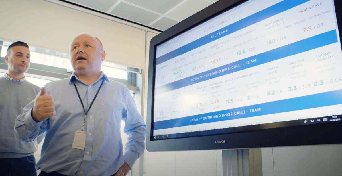
Perform’s central artifact is the team’s “Information Centre” (British for “dashboard”). Because the Information Centre has a prominent physical presence, it has a similar effect to Chartbeat’s Big Boards; it creates a focal point, drawing teams’ attention to their numbers, creating alignment by elevating the perceived importance of those metrics.
One of our goals when designing the Information Centre was making people the stars of the show. We wanted team members to see themselves in the data and feel proud. So the main stories on each team’s dashboard are 1) the people on the team, 2) their individual performance metrics and 3) how their metrics cascade upward into the team team’s metrics. This helps team members frame their performance in terms of the bigger picture. As an added bonus, since everyone’s favorite word is their own name, for team members to see their name in big letters feels good, even if it’s a dashboard at work.
Team Data → Team Conversation
Perform’s secret weapon wasn’t the data or the dashboards, it was their emphasis on tying the data to team rituals. I think this offers important lessons for data-designers in the workplace.
Visualizations should always be considered in the context of the conversations they’re likely to create. I think this is true in general, but it’s especially important when communicating people’s performance data at work.
On the positive side, rituals like daily “huddles” (standups) create alignment by putting team metrics at the center of the conversation. They also serve as a starting point for proactively, collaboratively solving problems as a team (because everyone’s looking at the same data everyday, it’s hard to avoid any issues that may come up).
When done well, this creates an environment of not just intra-team accountability, but also psychological safety and mutual support.
But there are risks to visualizing team performance data at work. If it’s implemented poorly, displaying team or individual performance metrics out in the open can have surprising effects (src). Like anything in the workplace, it takes care to maintain a culture of safety, risk-taking and problem solving (src).
Consciously pairing data with regular, structured team rituals ensures the benefits of a data-driven culture, with less potential for toxicity.
Takeaway:
For data to make a difference, we usually expect it leads to some action. At work, that first action is often a conversation. These conversations reinforce the importance of the metrics and nudge teams toward collective problem solving. Seeing the data helps trigger and ground the conversation, but the dynamic that actually improves performance is teams working together to solve their problems.
3. The Garden of Health

This last example looks more like data art than data visualization, but it’s equally powerful.
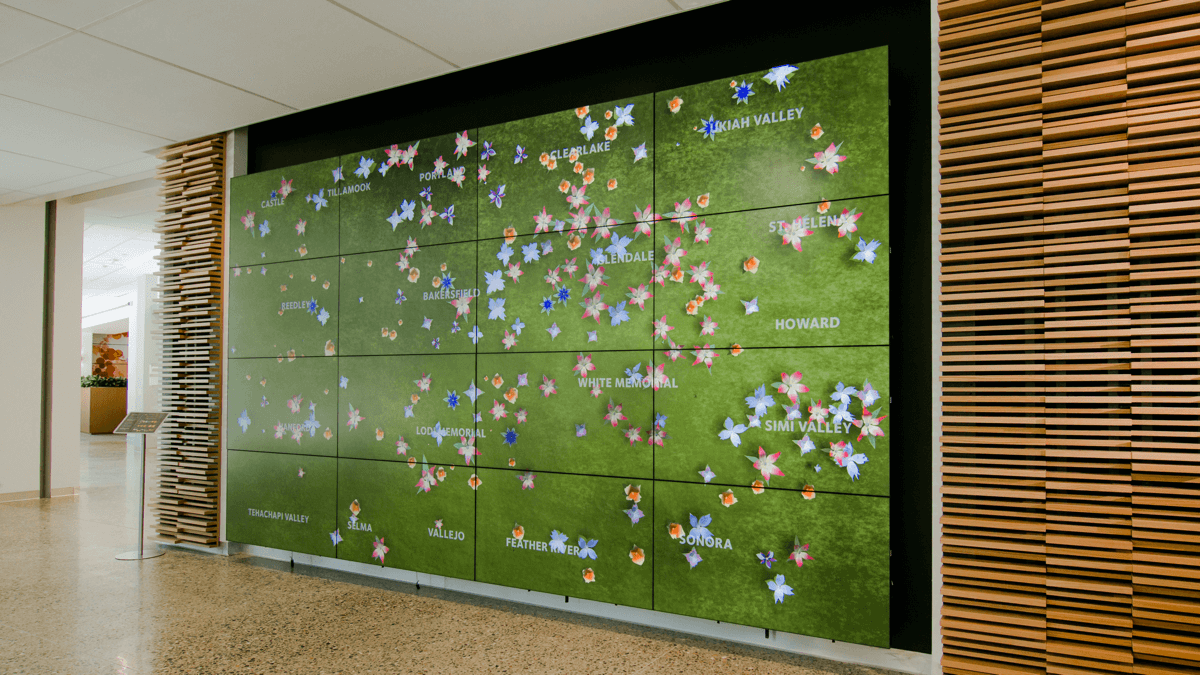
The image above shows the “Garden of Health,” an installation by Schema Design Studiofor their client Adventist Health. It’s currently placed prominently in the lobby of Adventist HQ, at their main campus in Roseville, CA. Each flower represents a patient at one of Adventist’s locations. Each butterfly represents a nurse, physician or other provider tending to a patient.
According to Schema: “The goal of the project was to illustrate the diversity of the Adventist Health patients, connections and coordination between the organization’s teams, and productivity throughout the system.”
The final result was a virtual garden, acting as a visual metaphor for the patients and providers across the Adventist Health ecosystem.
“Impactful” doesn’t require “Actionable”
This installation has the same aligning effect as the other dashboards we’ve reviewed, but it’s unique because it’s powerful without being actionable. There is information being conveyed, but the main effect is motivational.
By choosing patients as the main characters in this data story, and by giving their flower avatars the most detail and emphasis, this visualization signals the same priorities to onlookers; patients are the most important thing in the visualization because they’re the most important thing to the organization.
When I spoke with Sergei Larionov, Schema’s creative director behind the project, he said that even the garden metaphor was meant to convey Adventist values, in particular their focus on “holistic” care. According to Sergei:
“The garden metaphor supports the ‘holistic care’ story beautifully … There are basically two perspectives of the human body. The Western view sees it as a machine, to be fixed when it’s broken. The eastern perspective views the body as a garden - it’s a thing to cultivate. This resonated. They got it right away.”
Alignment + Affirmation
At first you might assume the project was meant for patients’ benefit. Many studies suggest that artwork in healthcare settings can have a positive effect on patient outcomes and experiences (src, src, src, src, src, flowers too! src).
But the installation actually wasn’t for the patients at all. The HQ building where it’s installed is an administrative office. According to Sergei:
“One of the needs we uncovered through conversations with [the client] - the people in the system’s administration, who don’t directly deal with patients, they’re so removed from the patient experience.”
This adds another interesting layer to the work. The visualization became “a means for people in the administration to connect with the population of patients and providers.” By visualizing “the totality of the network” they were helping the staff feel closer to the patients, nurses and physicians whom they don’t get to see everyday.
So the visualization aligns passersby around the primacy of patients and it also gives Adventist employees something to feel proud of, by reflecting their hard work in a way that’s more immediate and visceral than their real-life feedback loops. Further still, by showing all patients across the ecosystem, it reinforces the way each person’s contributions add up to the greater good that the organization strives for.
Takeaway:
Data displays don’t necessarily need to convey information to be a potent force in the workplace. Visualizations can align viewers around what’s important to the organization and create an emotional connection to what matters to us as humans - helping other people.
Or, as Sergei says, “You can think of data as any other raw material, like clay or ink… Not to communicate information, but to communicate feelings and attitudes.”
Conclusions:
Dashboards at work can be so much more than a firehose of data. The higher calling for the humble dashboard isn’t greater dissemination of information, it’s greater alignment.
All it takes is a slight change in perspective: Dashboards, when done well, aren’t just a visual data feed, they’re a reflection of the teams they represent and all of their hard work toward common goals. This is easier said than done, but as Chartbeat, PerformPlus and the Garden of Health show us, armed with a little bit of psychology and a humanistic perspective, the humble dashboard can give teams unifying superpowers.
