Introduction
“What you measure, you improve.” We’ve heard this a million times. It sounds nice. It seems plausible. There’s a bunch of evidence supporting it.
But how does this actually work?
What is it about seeing numbers that pushes people to action? What separates an admirable, “actionable” dashboard from all the B.I. “data vomit?”
To understand effective, motivational data design, you need to understand the psychology of feedback. So let’s look at a few examples of (quantitative) feedback in information design.
- Tufte v.s. Robinhood. Two very different charts demonstrate the opposing forces of feedback.
- Indiegogo and Fundraising Progress. Is positive or negative feedback better? Depends on the audience.
- Dynamic Speedometers. How just two numbers create contrast (and safe drivers).
- Atom’s Meditation Forrest. Why counting things feels good.
- Withings’ Weight Graph. Balancing contrast and commitment for difficult health behavior interventions.
- Benchmarking Worklytics. Why do business people love benchmarks?
Tufte, Robinhood, and the fundamental forces of feedback
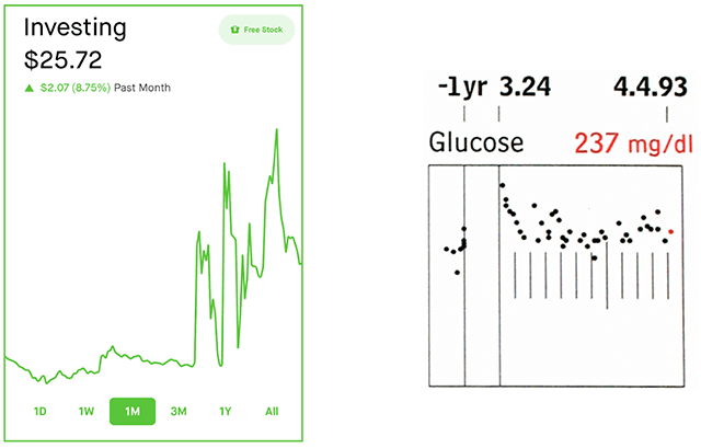
Let’s start with two examples of quantitative feedback: 1) Robinhood’s investment portfolio chart, and 2) Tufte’s patient status chart.
On the left: A line graph from the Robinhood app. As a testament to my investing savvy, you can see that I’ve grown my portfolio 8.75 percent (to a whopping $25). As charts go, this one’s a dumpster fire and is Fox-News-level manipulative. But it’s quite encouraging!
On the right: A segment of Tufte and Powsner’s “Graphical Summary of Patient Status,” showing that a patient’s blood glucose is elevated above the expected range. Though Tufte now discourages this design (he recommends sparklines), it’s a powerful example of critical feedback.
These charts have more in common than you might expect. They both forgo y-axes. They’re both data-ink efficient. They both give quantitative feedback.
Where they differ: Robinhood’s chart uses feedback to create commitment and motivate users to carry on. Tufte and Powsner’s chart uses feedback to offer contrast, enabling users to adapt and change course.
Robinhood → Commitment
Robinhood’s chart demonstrates how feedback influences our commitment to a goal (e.g., day-trading Gamestonks and Dogecoin until you’re super rich).
Efficacy / Expectancy
For new Robinhood users, their graphs shout, “OMG, you’re great at this!”
For example, by blurring the lines between users’ deposits and their investment returns and starting the plot from y=0, users are never more than a few taps from a bright-green graph of their portfolio, showing a sharp, satisfying uptick. Rosy feedback like this builds users’ self-confidence (efficacy) and encourages higher expectations for future returns (expectancy), thereby increasing their commitment to continued trading.
Feedback’s effect on efficacy applies outside of Robinhood. Positive feedback increases goal pursuit for students (src) and logistics employees (src); negative feedback, when it erodes confidence, can knock people completely off the wagon (src); it might even explain why some progress bars feel more satisfying than others (src).
Reinforcement
While Robinhood’s overall impression is rosy, the day-to-day experience feels more like a rollercoaster. The first thing users see is their portfolio’s performance today. The chart itself is tall, with a zoomed-in Y-axis to maximize the distance between the plot’s min and max. When markets are open, it updates in real-time (to mesmerizing effect). And, regardless of how much your portfolio is up or down, the whole app is either bright green or bright red based on the direction of change.
A positive spin on this: it makes day-trading more visceral, fun, and emotional! It encourages trading the same way a “runner’s high” encourages marathon training - it just feels good! Slightly darker: it’s using the random walk of the stock market as variable reinforcement, hijacking user’s anticipatory responses, and gently nudging them toward addiction (like a slot machine).
While Robinhood pushes it to a predatory extreme, the principle remains: when feedback itself is rewarding, humans learn to associate those positive experiences with pursuing the goal, therefore reinforcing motivation toward the goal (src).
Expectancy + Reinforcement → Commitment
By creating an early impression of confidence and progress, then drawing users into a realtime rollercoaster, Robinhood’s charts use feedback to increase users’ commitment to day trading.
Tufte → Contrast
Powsner and Tufte’s ”Graphical Summary of Patient Status” demonstrates feedback as a source of contrast and a signal to change course.
Discrepancy
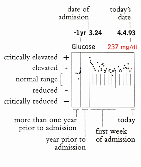
The chart above says, “Uh oh, the patient’s blood glucose is higher than it should be.” It does this by comparing two values: 1) the dots are the patient’s blood glucose measurements, and 2) the series of vertical lines are the target range for those measurements. Ideally the dots fall inside the lines, but for this patient, they’re just above. Separately, neither the dots nor the target range provide much useful information. What matters is the contrast (discrepancy) between the current and goal states.
This contrast is what makes a chart “actionable.” Specifically, the size of the discrepancy supports one of two possible actions:
- If the discrepancy is small, things are good, so the implied action is, “Keep doing what you’re doing.”
- If the discrepancy is large, things are bad, so the implied action is, “Do something different.”
Charts can’t tell you what to do next. That’s not their job. What they can tell you is when action is required (and how urgently).
Contrastive feedback highlights the gap between current and goal states. To the extent that you’re committed to achieving the goal, you respond by adapting your approach toward closing the gap (src, src, src, src, src).
Attention
The blood-glucose chart is one of many. A holistic view of a patient requires considering many similar indicators in parallel. This highlights another important aspect of feedback: no metric stands alone. So, in a sea of competing goals, which ones need your attention right now?
Contrast plays a role here as well. Assuming equally important metrics, the metrics with the largest discrepancies have the most potential for improvement, and are likely worth prioritizing.
Powsner and Tufte’s design amplify this in two ways: 1) the individual charts convey contrast at a glance, making it quick to determine if additional attention is required, and 2) each graph’s y-axis is scaled so that the normal range is a constant height, making the magnitude of discrepancy comparable between the charts, so the (globally) extreme values will look the most extreme on the page.
Contrast → Change
By comparing metrics’ current states and target states, Tufte and Powsner’s charts use contrastive feedback to direct physicians’ gaze toward areas that most need their attention. This contrast creates change by alerting physicians (and patients) to the need for action, enabling them to close the gaps.
Indiegogo and Fundraising Progress
Is positive or negative feedback better? Yes.
The tricky part: “commitment” and “contrast” are often at odds. Feedback that improves commitment can relieve the tension created by contrast, whereas feedback that highlights contrast can damage our commitment.
Balancing commitment and contrast matters when choosing between positive and negative feedback. For example:
- If you’re teaching a child to play piano, you might lean toward positive feedback. Encouraging and rewarding their successes builds their commitment, whereas focusing on mistakes may cause them to give up before they have a chance to improve (children, dolphins and husbands have this in common).
- However, if your student already plays for the philharmonic, negative feedback might be more effective. If they’re already committed and confident in the instrument, highlighting their mistakes surfaces the gap between their current playing and latent virtuosity, helping them improve.
Let’s look at another example. Consider the following common wisdom about fundraising…
Fundraising and the “Green Bar Effect”
"The Green Bar Effect" -- The psychological impact on contributors when you don't set a realistic goal. #IndiegogoTips pic.twitter.com/SDdhsImx
— Indiegogo Reads 🚀 (@Indiegogo) November 28, 2012
If you’ve ever considered crowdfunding, you might know about the “green bar effect.” The non-profit accelerator Fast Forward offers the following advice for fundraisers:
“Set an attainable goal: people want to fund a project that has made significant progress toward its goal. If you set your initial goal too high and haven’t fundraised enough, strangers are less likely to donate (this is the “green bar effect” or the “bandwagon effect”: a progress bar showing 40 percent project funding versus 15 percent is more successful).” (src)
Koo and Fishbach tested the green bar effect in a related experiment. They found that when sending fundraising letters to low-commitment donors, they could increase donations by emphasizing how much money had already been raised (src). Because other people have put up money, it signals that the goal must be important. This perception of importance then, increases donors’ commitment, leading to more donations.
But, what works for low-commitment donors has the opposite effect with high-commitment donors. The most effective letter to the latter cohort highlights how far they still need to go.
The folks at Fast Forward address this indirectly with another tip:
“Pro-tips: aim to have about ⅓ of your goal locked down via commitments from your network before you even open up the campaign. Planning prior to campaign launch is crucial — give yourself at least a month of prep time.”
That is, by getting early donations from your network — presumably from those who are most committed to you and your goal — you’re solving the “green bar effect” problem, but you’re also asking these early donors at exactly the right time to maximize their contributions, when the discrepancy between the current and goal state is largest.
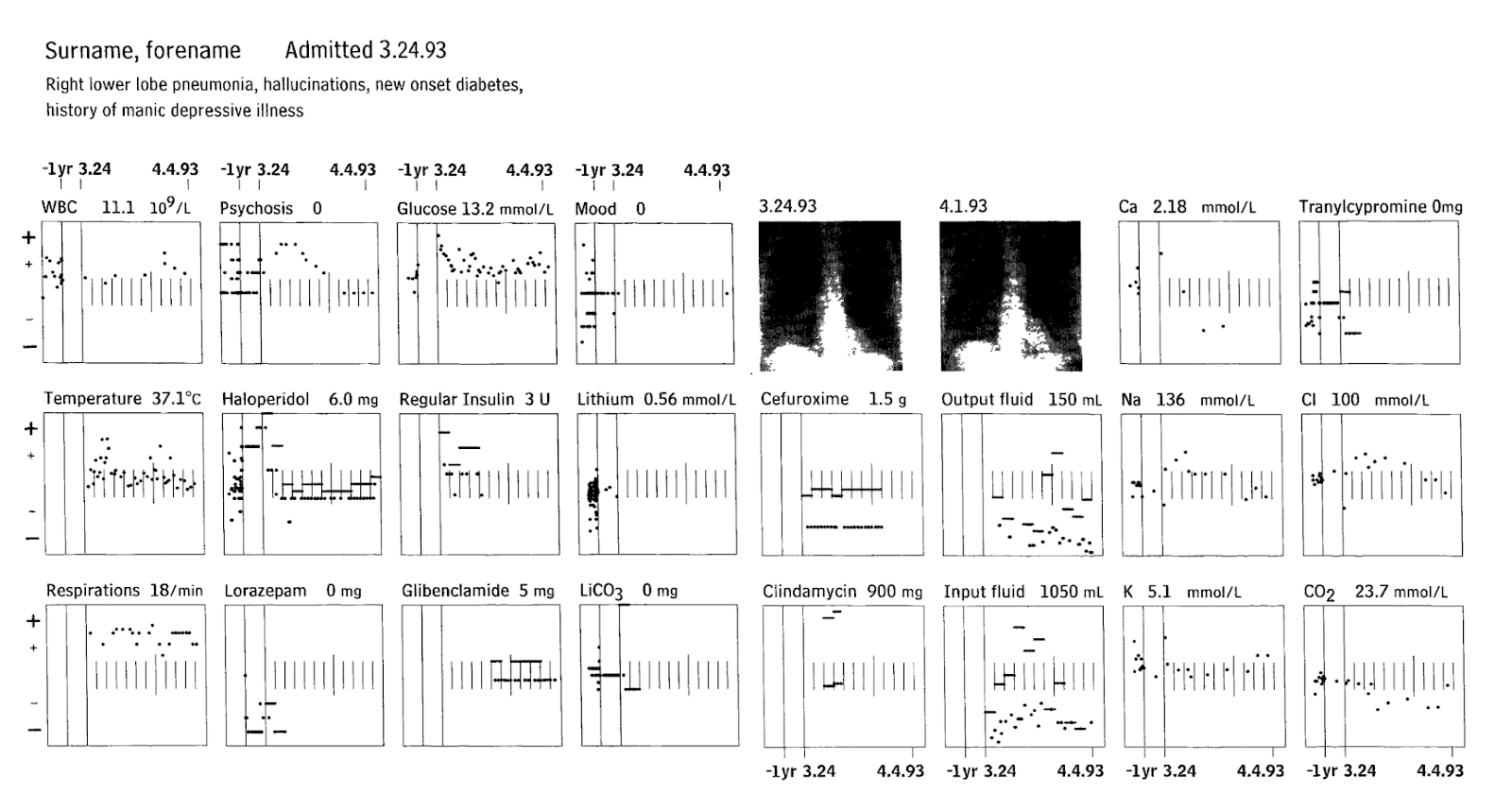
Fundraising Thermometers
The fundraising thermometer is one of the more common visualizations you’ll see implemented with construction paper. But don’t let their humble execution fool you! There are two aspects of this that make it powerful for commitment building:
- The metaphor allows small, incremental notches toward a larger goal. When tracking progress toward a larger goal, these intermediate goals give users a focal point that’s closer and easier to achieve. This proximity boosts confidence. Then, as users accomplish more of these smaller goals over time, they act as a record of past commitment, further propelling their efforts forward.
- The size of these is also an influential factor. By giving this such a large physical presence, it reinforces the importance of the fundraiser to the organization, further building commitment.
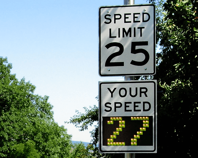
Dynamic Speedometers
Feedback can be surprisingly simple and still effective. Not all instances of feedback need to balance between commitment and contrast.
My favorite example of contrastive feedback is the dynamic radar speed sign. Using just two numbers (hardly a visualization), these clever signs significantly improve safe driving. You can see an example above. The number on top shows the current speed limit. The number at the bottom shows the passing driver’s speed (as determined by a radar gun attached to the sign).
Notably, neither of these signs offer drivers new information. All cars have speedometers built into their dashboards. All (most?) roads have speed limit signs. But, by putting the two numbers side by side, it invites drivers to compare their speed with the speed limit. It creates contrast, encouraging drivers to slow down.
According to Thomas Goetz’s reporting in Wired, officials in Garden Grove, California, used these signs to great success in reducing speeds near school zones. After failed attempts at more heavy-handed approaches (e.g., writing lots of tickets), city officials deployed these driver feedback signs across five different school zones and saw speeds drop 14 percent in nearby areas. According to Goetz, dynamic speedometers have similar effects elsewhere, showing 10 percent speed reductions overall.
A few years later, Stanford researchers Kumar and Kim demonstrated similar results by inverting the roadside dynamic speedometer: they moved the speed limit sign inside the car. Their prototype was a small display, mounted near the car’s dashboard, showing the speed limit for the car’s current location right beside the car’s speedometer. In their (simulator) experiments, their test subjects drove 13 mph slower.
Today speed limit signs are increasingly built into cars’ dashboard displays. Not to be outdone, many roadside signs have upgraded to emoji displays, presumably seeking to add a small dose of guilt to the mix (other evidence suggests this is actually effective).
Atom Trees and why counting is encouraging
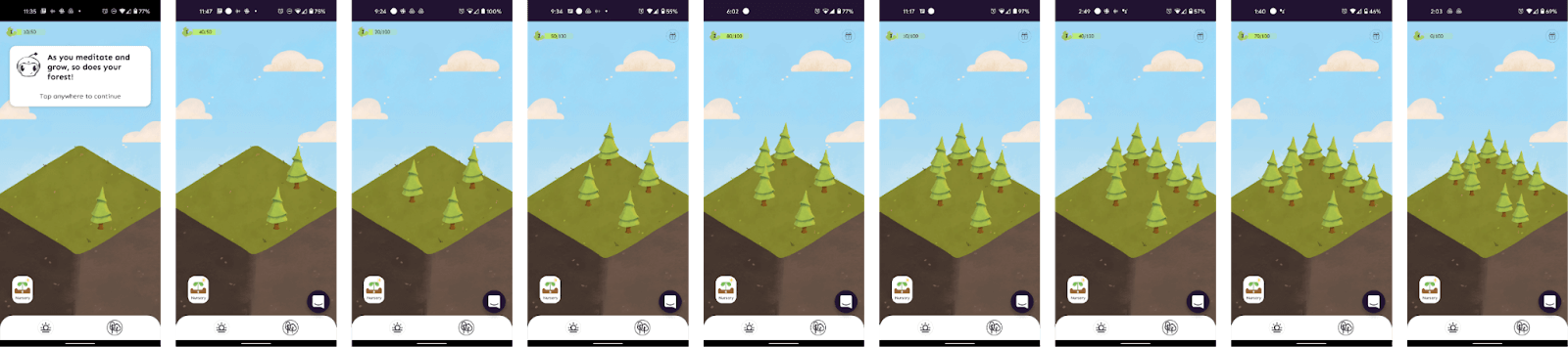
Data visualizations don’t need to be actionable to be influential. Similarly, feedback doesn’t need to be contrastive to encourage positive change. Instead, you can help users strengthen commitment toward a goal by visualizing their past progress.
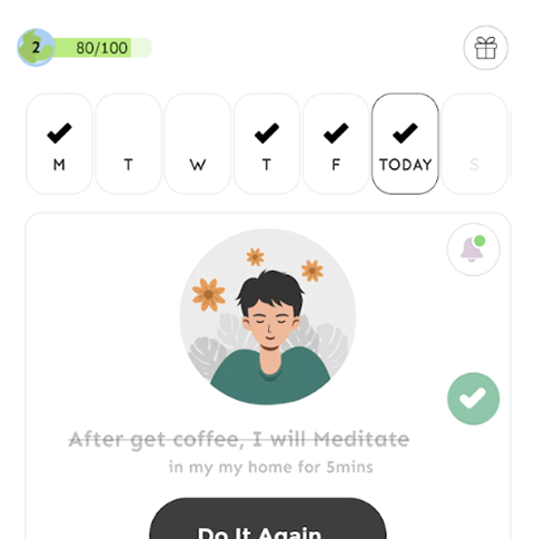
The meditation app Atom offers a recent example of this. In addition to offering guided meditations (ala Headspace), Atom offers two simple ways for users to visualize their progress: a weekly timeline with a simple checkbox for days you’ve meditated (left) and a small, growing forest that adds a new tree for every completed meditation session (above).
Above you can see my tiny grove expanding to nine trees for the nine sessions I’ve meditated. Whereas the timeline shows the gaps in my meditation practice, the trees are purely a count of my successes.
A number of studies have explored metaphorical visualizations for progress tracking (e.g., with fish, gardens, monsters) but there are even more examples where simply counting something is quite encouraging (consider Fitbits and other pedometers, Wii Fit stamps, Snapchat streaks, bullet journals).
- One possible explanation: people like to see themselves as consistent (src), so seeing our past actions might remind us of our past goals which we’d like to carry forward.
- Another reason: it’s fun. It feels good. Atom’s little trees are pleasant and seeing a new one pop up is satisfying. It works the same way chocolate motivates you to open the next door on an Advent calendar. When the feedback itself is rewarding, you associate that positive affect with pursuing the goal.
Feedback can reinforce commitment by memorializing previous activity and by offering a generally pleasant experience.
A Forgiving Weight Graph
Contrast creates change. Highlighting the gap between the current state and a goal state creates awareness and tension that you can then work to resolve. But if closing the gap feels unattainable, people can lose their commitment and give up entirely. This dynamic is critical in the context of weight loss.
Maintaining Commitment
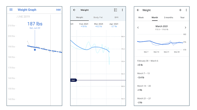
Weight graphs are common in personal fitness apps. They’re typically a line graph, plotting the measurements of users’ weigh ins, helping them visualize progress toward a long-term weight goal. Above you can see three different examples from Noom, Withings, and Google Fit.
Despite the ubiquity of this feature, weight tracking is somewhat controversial. Even though it’s associated with improved outcomes (src, src), many worry that simply stepping on the scale might discourage people enough to give up entirely.
This is called the “what the hell” effect. When you’re trying to do something new and difficult, all it takes is a few examples of discouraging feedback for us to lose our confidence and give up on the journey all together. (This is particularly challenging with weight loss. Our weight varies naturally throughout the day, but this natural variation can look a lot like failure. You haven’t gained weight, you might just need to poop!)
This highlights the tension between commitment and contrast-oriented feedback. The contrast between a user’s current weight and target weight makes weight tracking a useful intervention. It helps build intuition about the relationship between actions (e.g., what we’re eating and doing) and outcomes (e.g., changes in weight). But in the context of weight loss, commitment can be especially fragile.
Presenting contrast is straightforward. The graphs present users’ weight measurements relative to their target weight (e.g., on the Withings chart, middle, you’ll notice a horizontal goal line).
They also preserve commitment in a few subtle ways:
- To build in forgiveness, the graph only shows weigh-in results as small points on a desaturated line. They give the most visual emphasis to a moving average line, designed to rise and fall more slowly, reflecting a more stoic view of users’ weight.
- The graphs all have somewhat exaggerated y-axes for the given values. This further dampens the vertical distance a user would see for any given weigh in.
- At least in Noom, after every weigh in, the app offers positive, process-oriented text feedback, to help users maintain a sense of efficacy and commitment.
Based on user comments, the design seems to be appreciated:
“Another reason that I weigh in every day, quite honestly, I love the way the daily weight line has been changed. I love how it irons out the outliers of the highs and lows and helps you feel not quite so bad about a day where you weighed a few pounds more than before. I really like that.”
Contrastive Feedback at Work
Benchmarks create contrast
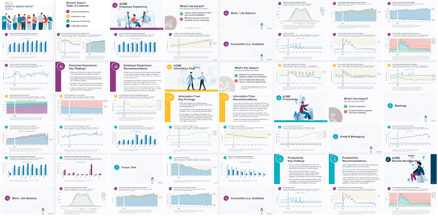
Worklytics helps “people analytics” teams understand what’s happening within their firms by quantifying traditionally hard-to-measure organizational dynamics (e.g., collaboration, communication, employee experience, etc).
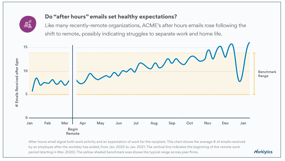
For example, following the pandemic, every big company in the world wanted to know: “Are we doing this ‘remote’ thing right?!” Worklytics’ “Remote Work Analysis” answers that by giving clients visibility into how surprisingly-consequential behaviors like “emails after 6 pm” changed throughout the pandemic (and how they can affect employees’ work/life balance).
(Full disclosure: I work with Worklytics, designing reports like this.)
Previous versions of this slide only included the blue trendline, but not the yellow benchmark range. As you might expect for a B2B data product, when we showed charts like this to clients, the first thing they’d ask — inevitably — was, “Okay, so it’s up, but is that normal?!” Before including the benchmarks, Worklytics’ co-founder, Phil Arkcoll, spent half of every client presentation answering some variation of that same question for every slide.
Is this because business people love benchmarks? Yes. 100%.
What drives this affection? Benchmarks’ popularity stems from contrast. They give users a reference point for comparison, turning a lonely metric into contrastive feedback, therefore making it actionable.
Specifically, benchmarks trigger one of three responses:
- If the metric is outside (worse than) the target range, we’re doing poorly (e.g., worse than the majority of peer firms). The gap between the trendline and the benchmark range highlights: a) there’s room for improvement, and b) how much you can improve. Awareness of this gap creates tension, which leads to conversation, which leads to change.
- If the metric is within the target range, you’re doing okay and this is one less thing you need to worry about. (This might seem trivial, but it’s actually huge. More on this below.)
- If the metric is beyond (better than) the target range, not only do you not need to worry, you have something to brag about! (When “actionable” ⇒ “getting users promoted” you’re on the right track!)
Feedback Determines Focus
Benchmarks help us prioritize.
When presenting performance feedback, it’s easy to forget that you’re not just answering the obvious question (“Are we good/okay/bad?”). There’s also an implied question for every metric: “Do I need to worry about this more or less than the 20 other KPIs I’m tracking?!”
This is especially true for executive teams. When even attention is a scarce resource, it’s actually quite useful for a graph to say, “Nothing to see here!” It lets viewers quickly (and safely) put the question to rest and move on to the next thing (i.e., the other areas with larger opportunities for improvement). Research suggests this phenomenon applies to non-execs as well: When you hear you’re doing well at one goal, you tend to shift your focus to other goals.
This is another area where Worklytics’ benchmarks are effective. Their reports, as you can see above, are comprehensive. Similar to Tufte and Powsner’s “Patient Status” viz, Worklytics’ reports use a common visual language to denote: a) the measurements (blue-ish lines), and b) the benchmarks (yellow areas). So on every slide, users can answer that first implied question at a glance (i.e., “Do I even need to worry about this?”), then quickly move on and identify the areas that need their attention the most.
Since adding benchmarks to their WFH reports, not only has Phil been saved from endlessly answering “is that good or bad?,” clients have also remarked on how the additional contrast helps exec teams make faster, more confident decisions about where to focus their attention.
All organizations do silly things. The bigger they are, the sillier they can get. Given an infinitely-long list of silly things to improve, aligning leaderships’ focus on the right problems is a crucial first step toward positive change.
Recap
“What you measure you improve” is backed by the psychology of feedback. Understanding this can make us more persuasive data designers.
Effective dashboards provide effective feedback and rely on two dynamics: 1) they increase our commitment to a goal, ensuring we’ll stick with it, and 2) they draw contrast between our current state and goal state, helping us see how far we need to go and our biggest opportunities for improvement.
When designing dashboards (or other quantitative feedback systems), there are a lot of different tactics for influencing commitment and contrast:
- You can build commitment by highlighting past progress (e.g., Atom, fundraising progress bars), making the feedback experience itself rewarding or fascinating (e.g., Atom, Robinhood), downplaying failures (e.g., weight graphs), and shrinking the perceived distance to a larger goal (e.g., fundraising thermometers).
- You can draw contrast with as little as two numbers (e.g., speed limit signs), long distance goals (e.g., weight graphs, fundraising progress bars), social comparisons, and various benchmarks (e.g., Tufte and Powsner, Worklytics).