
Introduction
TLDR
- 3iap’s peer-reviewed research was accepted to IEEE VIS 2022
- Social cognitive biases can significantly impact dataviz interpretation
- Charts showing social outcome disparities can promote harmful stereotypes about the people being visualized
- Showing within-group outcome variability can mitigate these risks
- Popular visualizations for showing social inequality can backfire and make it worse. News publishers, public health agencies, and social advocates should consider alternative approaches to minimize harm to marginalized communities (3iap is happy to help).
Last summer, two different clients approached 3iap for help designing and developing DEI-related (diversity, equity, inclusion) data visualizations: one showing outcome disparities in higher education, the other analyzing organizational behavior for signs of systemic racism / sexism in the workplace. These are heavy topics. They require fidelity not just to the data, but to the people behind the data.
And, as we discovered, addressing these specific design challenges also required answering a larger, open research question at the heart of equity-centered dataviz: How do you visualize inequality without promoting it?
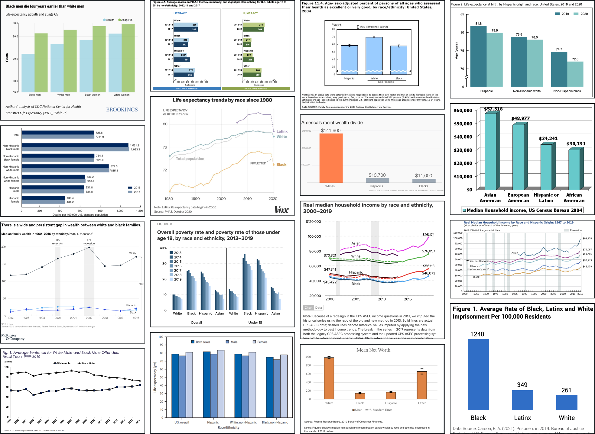
The problem seems simple. To raise awareness about inequality, simply highlight the (stark) differences in outcomes between groups (e.g. income, life expectancy, educational attainment, etc). You might try a chart like one of the above and simply decompose the outcome in question into averages for each group of interest (e.g. splitting the data by race, gender, income, age, etc). As you can see, this is a popular approach!
However, as first noted by Pieta Blakely, when people see charts like the above, they can reach some surprisingly toxic conclusions: They blame the outcomes on the groups themselves, mistakenly assuming that groups with better outcomes are somehow better people (and groups with worse outcomes are somehow personally deficient). In their attempts to highlight outcome disparities, these charts reinforce the stereotypes that make disparities possible.
In their attempts to highlight outcome disparities, these charts reinforce the stereotypes that make disparities possible.
This seemed like a bold claim, especially since charts like the above feel so familiar and intuitive (e.g. “how could bar charts be racist?!”). Others in the dataviz community were skeptical (including myself and at least one of our clients). However, Jon Schwabish and Alice Feng lent support in their authoritative “Do No Harm” guide. And Pieta’s argument is consistent with a wide body of research across social equity, social psychology, and data visualization.
Given the uncertainty, the high stakes, and the ubiquity of these potentially troublesome charts, the issue begged further investigation.
So over the last year, 3iap designed and ran a series of experiments to understand the question empirically. Then in collaboration with Cindy Xiong, of UMass’ HCI-VIS Lab, we analyzed the results and uncovered some compelling findings. We’ve submitted the study for peer review and publication, but we’ll cover the main questions and results here.
- Eli and Cindy’s paper was peer-reviewed and accepted to the IEEE VIS2022 conference. It’s available here: “Dispersion vs Disparity: Hiding Uncertainty Can Encourage Stereotyping When Visualizing Social Outcomes.”
- All of the code, data, stimuli, analysis, etc. to reproduce the experiment are available here on OSF: Dispersion vs Disparity Materials.
- Eli is also available for workshops and training sessions to help other data communicators apply these findings. If you’re part of a data, design, or analyst team interested in this topic, please get in touch!
Research Questions
The results are summarized below, organized by question. Click a link to navigate within the page.
- Theory: How could visualizing social outcome disparities reinforce harmful stereotypes? Is there a plausible pathway between “bar chart” and “perpetuating systemic oppression?”
- Measurement: How do we measure a chart’s impact on stereotyping? How do we operationalize “deficit thinking?” What would an experiment look like?
- Impact: Is this a big problem? Do people in the wild actually misinterpret dataviz in ways that are consistent with deficit thinking?
- Design Impact: Can dataviz design choices impact stereotyping? Can the way data is presented help (or hurt) audiences’ tendencies toward stereotyping?
- Generalizability: Are these results generalizable outside the experiment?
- Design Implications: What should data visualization designers do differently?
Q1: Theory: How could visualizing social outcome disparities reinforce harmful stereotypes?
Is there a plausible pathway between “bar chart” and “perpetuating systemic oppression?”
Dataviz & Deficit Thinking
Practitioners have previously argued (src, src) that charts like the above encourage a form of “deficit thinking” — by emphasizing direct comparisons between groups, they create the impression that the groups with the worst outcomes (often marginalized groups) are personally deficient relative to the groups with the best outcomes (often majority groups).
According to equity scholars Lori Patton Davis and Samuel D. Museus, “Deficit thinking” encourages “victim blaming;” it favors explanations that hold group members personally responsible for outcomes (e.g. “It’s because of who they are”), as opposed to explanations related to external causes (e.g. “It’s because of systemic racism”) (src).
Victim blaming can lead to two further harms:
- Since it’s a cognitively easier explanation (src, src), victim blaming potentially obscures external causes, leaving widespread, systemic problems unconsidered and unaddressed (src).
- It also reinforces harmful stereotypes, setting lower expectations for minoritized groups that become self-fulfilling prophecies (src).
Stereotyping & Social Psychology
Stereotypes are over-generalizations about a group of people (src). Stereotypes are harmful when we let them determine our expectations about individual members of a group (src).
Stereotyping is facilitated by perceptions of group homogeneity. When we overestimate the similarity of people within a group, it’s easier to apply stereotypes to individual members of the group (src). Unfortunately we’re predisposed toward overestimating group homogeneity for other groups than our own (src, src).
Our faulty judgements about other people reinforce stereotypes. For example, we often attribute others’ successes or failures to personal qualities, even when the outcomes are obviously outside their control (src). (This leads to blaming.) Compounding this, when we observe something negative about a person from another group, we tend to associate similar negative attributes with other members of the group (reinforcing stereotypes) (src, src).
These biases help explain the risks of deficit-framing. By emphasizing between-group differences:
- perceptions of within-group homogeneity become exaggerated,
- the lower-outcome groups (subconsciously) take the blame, and
- the faulty personal attributions are then amplified to the entire group.
Prejudicial tendencies can be overcome. The more exposure we have to people from other groups the less likely we are to stereotype them (exposure helps us appreciate group heterogeneity) (src, src).
Dataviz & Uncertainty
Summary statistics are like stereotypes for numbers. Like stereotypes, summary statistics can be harmful when they lead us to overlook underlying variability (i.e. discounting outcome uncertainty) (src, src, src). People already tend to discount uncertainty (src), but dataviz design choices also make a difference (src, src).
In the same way exposure alleviates stereotyping, exposure to the underlying distribution helps viewers see past point estimates and appreciate uncertainty.
Several studies suggest that a visualization’s expressivity of uncertainty impacts understanding (src, src). For example, gradient and violin plots outperform bar charts (even with error bars) (src), Hypothetical Outcome Plots (HOPs) outperform violins (src). Even showing predicted hurricane paths (as ensemble plots) improves understanding compared to monolithic visualizations (src, src).
Xiong et al show a link between granularity and causation (src). More granular charts (less aggregated) reduce tendencies to mistake correlation for causation. Since illusions of causality stem from oversensitivity to co-occurrence, perhaps more granular charts work by exposing users to counterexamples (src, src).
Finally, Hofman et al show that when viewers underestimate outcome variability (by mistaking 95% confidence intervals for 95% prediction intervals), they overestimate the effects of certain treatments (src). They also speculate that a similar effect might contribute to stereotyping. When viewers underestimate within-group outcome variability (overestimate group homogeneity), they overestimate the effect of group membership on individuals’ outcomes.
Dataviz & Stereotyping
Ignoring or deemphasizing uncertainty in dataviz can create false impressions of group homogeneity (low outcome variance). If stereotypes stem from false impressions of group homogeneity, then the way visualizations represent uncertainty (or choose to ignore it) could exacerbate these false impressions of homogeneity and mislead viewers toward stereotyping.
If this is the case, then social-outcome-disparity visualizations that hide within-group variability (e.g. a bar chart without error bars) would elicit more harmful stereotyping than visualizations that emphasize within-group variance (e.g. a jitter plot).
Q2: Measurement: How do we measure a chart’s impact on stereotyping?
How do we operationalize “deficit thinking?” What would an experiment look like?
Each participant saw a chart like one of the above, showing realistic outcome disparities between 3 - 4 hypothetical groups of people. Then they answered several questions about why they thought the visualized disparities existed.
- Half of the questions offered a “personal attribution” - they implicitly blamed the people themselves for the disparities (e.g. “Based on the graph, Group A likely works harder than Group D.”).
- The other half of questions offered an “external” attribution - they suggested that the group’s environment or circumstances caused the disparities (e.g. “Based on the graph, Group A likely works in a more expensive restaurant than Group D.”).
Since the participants weren’t given any other information about the groups of people in the charts, the only “correct” response was to disagree or say “I don’t know, there’s not enough information.” That is, any amount of agreement indicates bias. (As we’ll see below, these “correct” responses were relatively rare).
To evaluate stereotype-related beliefs, we’re mainly interested in participants’ personal attribution agreement. Personal attributions, in this case, indicate deficit thinking, or a negative belief about some of the groups in the chart. For example, agreeing that “Group A did better than Group B because they work harder” implies a belief that people in Group B aren’t hard workers.
So if a chart like the above leads viewers to agree with personal attributions for the outcome disparities, then it supports harmful stereotypes about the groups being visualized. Charts that lead to stronger personal attribution indicate stronger encouragement for stereotypes.
Interpreting external attribution agreement
External attributions for these charts are equally “incorrect” readings of the data. These would only indicate stereotyping if personal and external attributions were mutually exclusive. Some scholars implicitly argue that this is true, and some studies on correspondence bias assume they’re diametrically opposed, but at least based on our data, this doesn’t seem to be the case. For our purposes, external attributions might indicate a more empathetic outlook (e.g. seeing yourself in another person’s situation) but we mainly use them as a baseline for comparing personal attributions.
Q3: Impact: Is this a big problem?
Do people in the wild actually misinterpret dataviz in ways that are consistent with deficit thinking?
The good news: Most participants’ responses indicated more empathy and understanding and less personal blame.
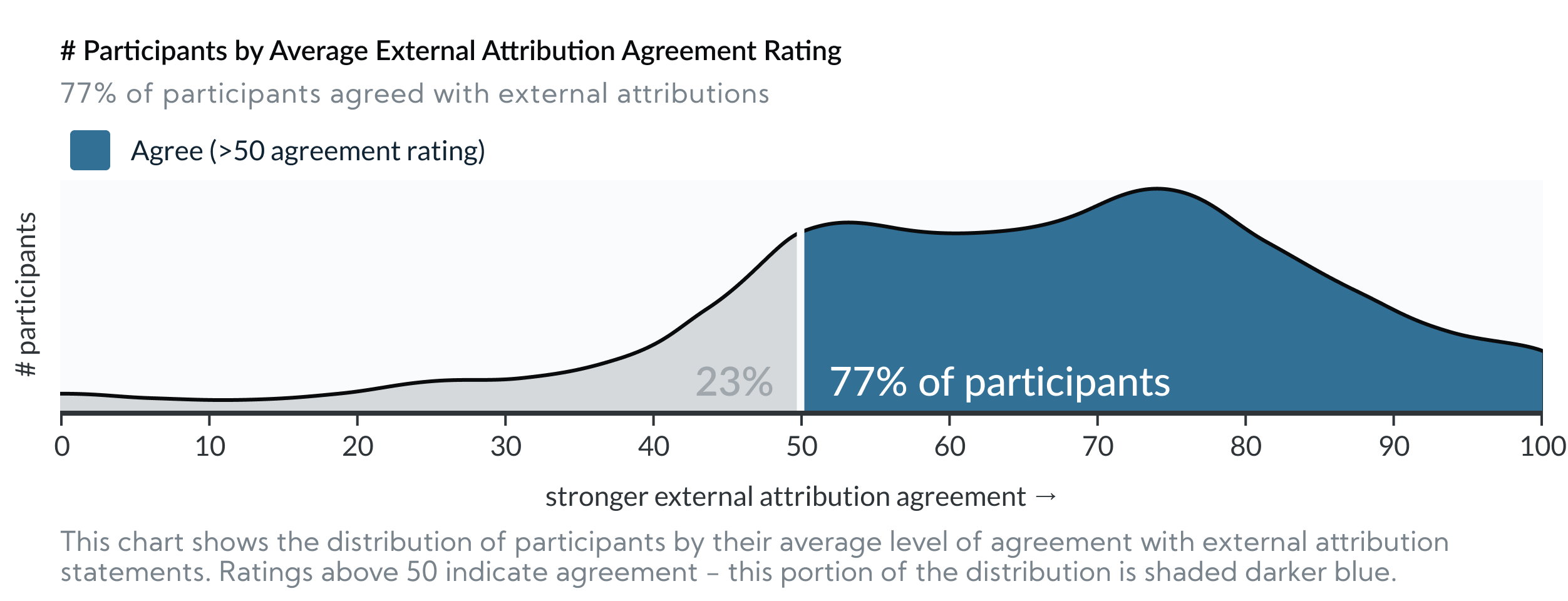
In our last 3 experiments, across all conditions, 77% (542/709) of participants agreed with external attributions to explain the visualized disparities (i.e. they agreed that the results above were at least partially caused by external factors outside group members’ control. e.g. “Based on the graph, Group A likely works in a more expensive restaurant than Group D.”)
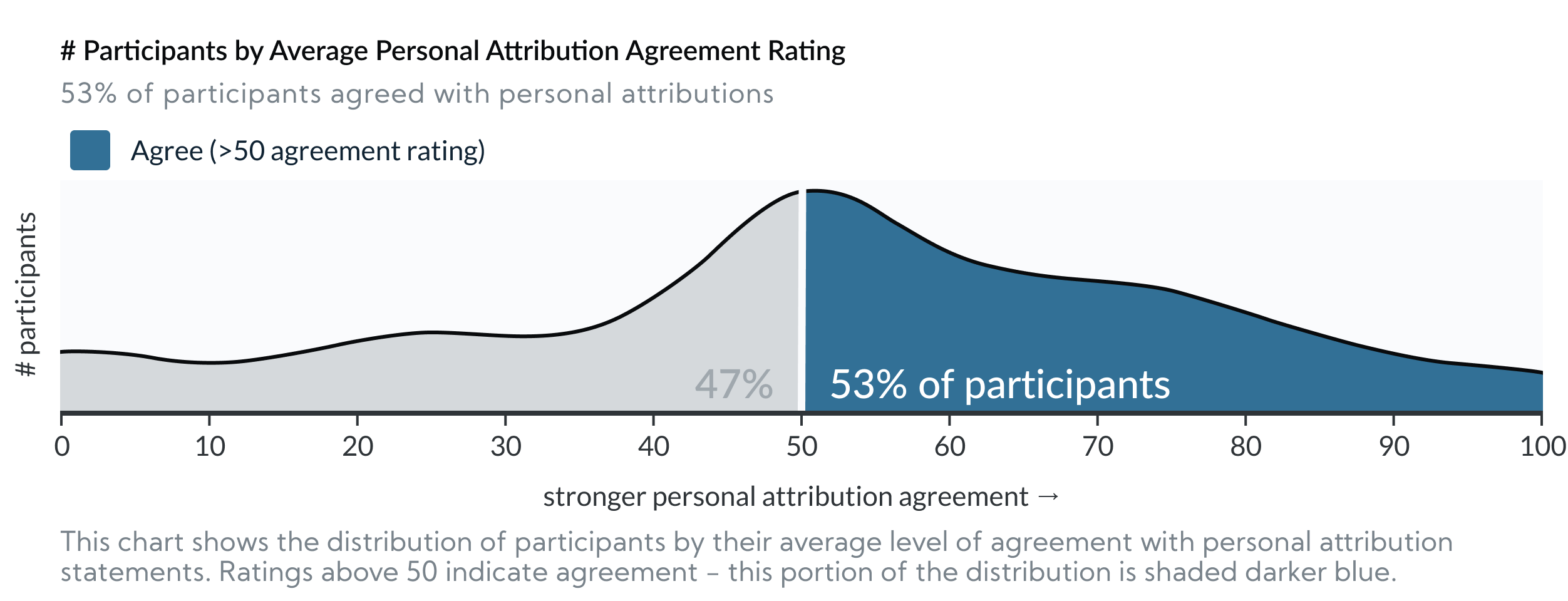
The bad news: In those same 3 experiments, 53% (377/709) of participants agreed with personal attributions to explain the visualized disparities (i.e. they agreed that the results above were at least partially caused by personal characteristics of the people in the groups e.g. “Based on the graph, Group A likely works harder than Group B.”).
This supports the hypotheses that visualizing social outcome disparities can encourage deficit thinking. The charts offered no information as to why the outcomes occurred, but still just over half of participants agreed with explanations that “blame” the outcomes on the people being visualized.
Interpreting overlapping personal and external attribution agreement
Note: Many participants agreed with both external and personal attributions. This implies that the two beliefs aren’t mutually exclusive (e.g. it’s possible to believe that restaurant workers from Group A are harder workers and they work in nicer restaurants). It’s also worth noting again that neither of these conclusions are rational without more information, which the charts don’t provide.
Q4: Design Impact: Can dataviz design choices impact audience stereotyping?
Can the way data is presented mitigate (or exacerbate) audiences’ tendencies to stereotype?
In 3 out of 4 experiments, we found statistically significant differences in personal attribution agreement between the designs we tested. This indicates that some designs are better than others for mitigating the “blame” associated with stereotyping.
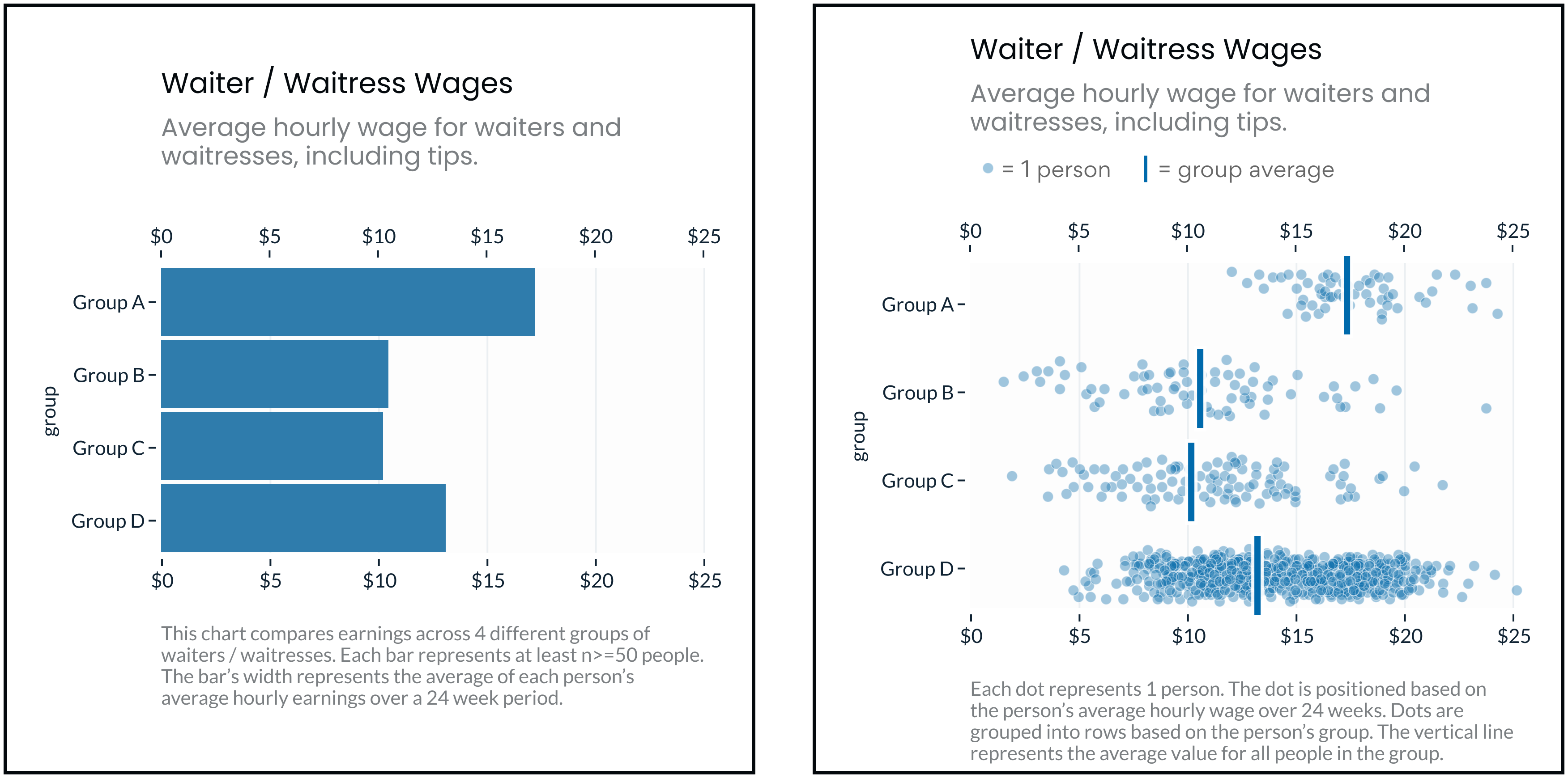
Experiment 1: Bar Charts vs Jitter Plots
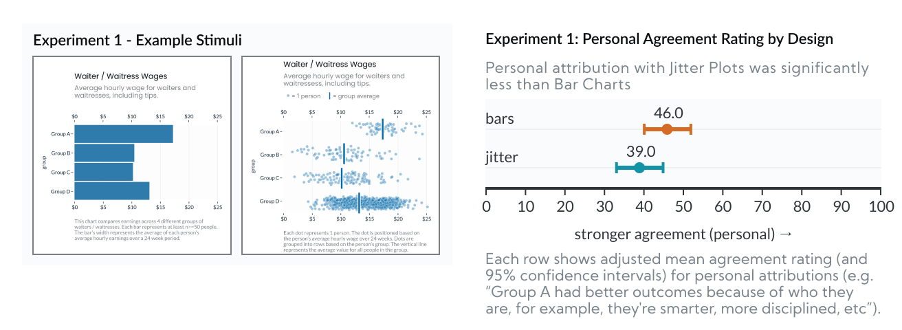
In Experiment 1 we found that Jitter Plots reduced personal attribution (i.e. blame) by 7.0 points, relative to Bar Charts (p=0.0011).
This experiment looked at Bar Charts v.s. Jitter Plots. This comparison is important because bar charts (as designed here, without any indication of uncertainty) represent the status quo for how this type of data is commonly presented. So, if we can show that another type of chart gets better results, we can establish that there’s room for improvement. Jitter plots are a good candidate for a “better” design for a few different reasons:
- They still prominently feature group averages (the vertical bars), but strongly emphasize outcome uncertainty (the dots, in aggregate, show the rough shape of the outcome distribution).
- They’re symmetric. Bar charts are asymmetric and have a “within the bar” bias, because all of their “ink” is between 0 and the average outcome, people mistakenly assume that individual outcomes fall below the mean. Jitter plots, however, are symmetric, and show the full distribution on either side of the average marker.
- They’re “unit” encoded and possibly anthropomorphic. Because each dot represents a “real” person’s outcome, the results are less hidden behind an abstract calculation (e.g. the group average). And, because the dots are people, it might help viewers feel more empathy (though other studies show anthropomorphism’s effects on empathy are very limited).
- They communicate sample size. In the Jitter plot above, Group D shows more dots because there are more people in Group D.
So, for these reasons, Jitter Plots should perform better than Bar Charts. And, based on our results, they do. The next question is why? Which of these factors (e.g. outcome uncertainty, symmetry, anthropomorphism) is most influential? We isolate these in the next experiment.
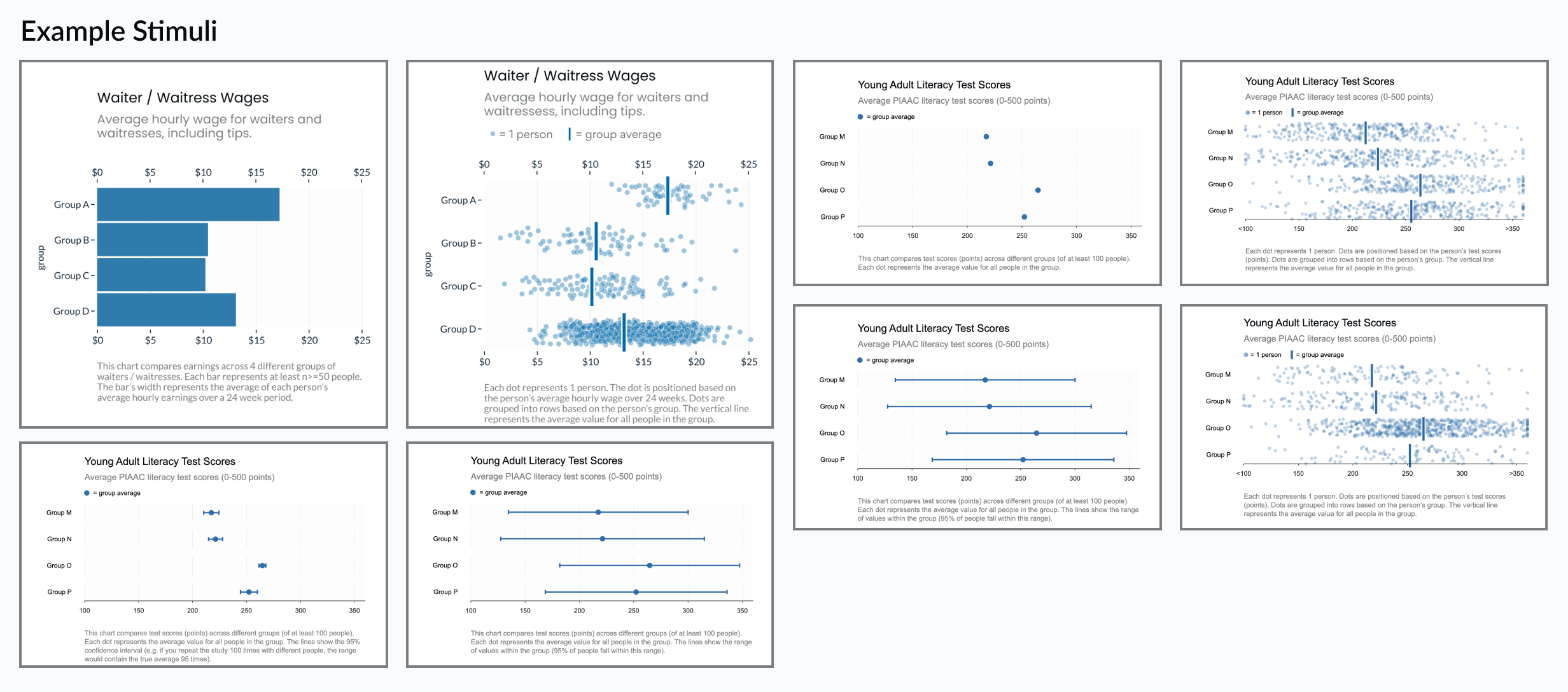
Experiment 2: Dot Plots vs Prediction Intervals vs Jitter
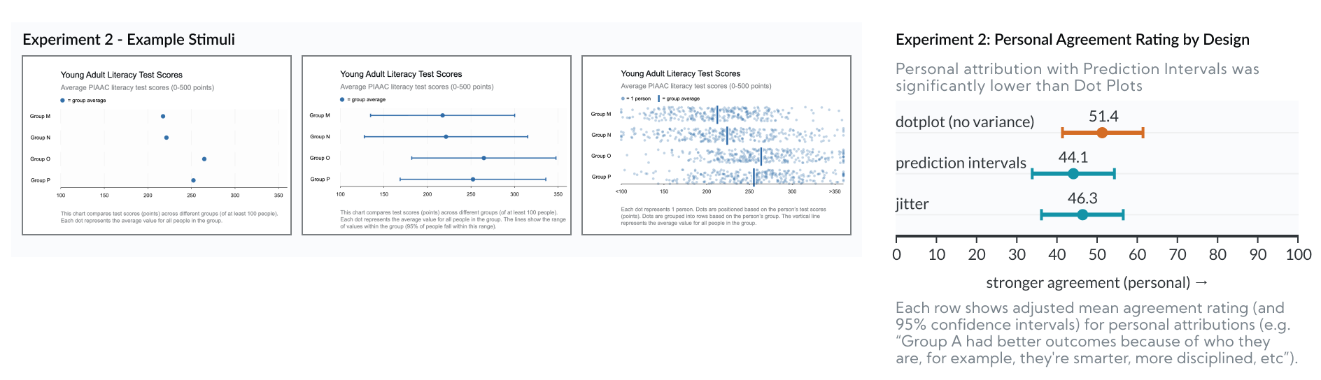
In Experiment 2 we found that Prediction Intervals reduced personal attribution (i.e. blame) by 7.3 points, relative to Dot Plots (p=0.0045).
This experiment looked at Dot Plots vs Prediction Intervals vs Jitter Plots. Whereas Experiment 1 tried to “stack the deck” to test for any difference, Experiment 2 was designed to isolate why some charts perform better than others.
- All three charts are symmetrical and prominently feature “dots” as encodings.
- Dot Plots are similar to Experiment 1’s Bar Charts because they both encode the group average, but neither communicates uncertainty.
- Prediction Intervals are similar to Jitter Plots, but they encode outcome uncertainty (the range of possible outcomes) with a monolithic interval, so they don’t benefit from unit-encoding or anthropomorphism. (Note that “Prediction Intervals” are distinct from “Confidence Intervals” which we explore in the next experiment.)
- The Jitter Plot in this experiment is slightly different from Experiment 1. In Experiment 1, the Jitter plot showed unequal sample sizes between rows. In Experiment 2 the Jitter plot shows an equal number of dots per row. So none of the 3 charts in this experiment communicate sample size differences, letting us rule that out as a factor (we explored this further in Experiment 4).
- So if we see differences between Dot Plots and either of the other two designs, we’d know the improvement is caused by communicating uncertainty.
- If we see differences between Jitter Plots and Prediction Intervals, we’d know the improvement is caused by anthropomorphism.
Since there were no significant differences between Prediction Intervals and Jitter Plots (and Prediction Intervals actually did slightly better), we can rule out anthropomorphism and unit encoding as the influential factor.
Since Prediction Intervals and Jitter Plots performed better than Dot Plots (though only Prediction Intervals v.s. Dot Plot differences were significant), we can reasonably conclude that the improvement is related to visualizing uncertainty.
The next question, then, is what kind of “uncertainty” makes a difference? We unpack this in Experiment 3.
Experiment 3: Confidence vs Prediction Intervals
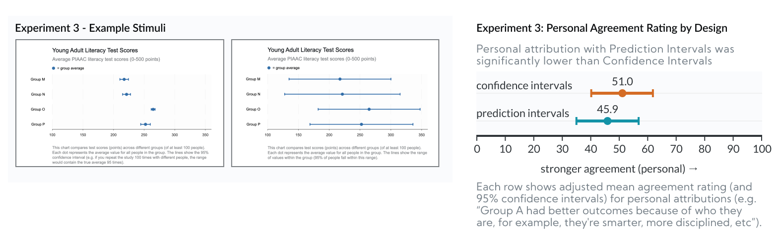
In Experiment 3 we found that Prediction Intervals reduced personal attribution (i.e. blame) by 5.1 points, relative to Confidence Intervals (p=0.0424).
In the previous 2 experiments, we show that visualizing uncertainty reduces personal attribution (e.g. Prediction Intervals and Jitter Plots show outcome uncertainty, while Dot Plots and Bar Charts don’t). “Prediction Intervals,” however, represent a different “type” of uncertainty than the more conventional “Confidence Intervals.” Since other research shows that Confidence Intervals bias users in ways that might affect perceptions of group homogeneity, we need to isolate the type of uncertainty that helps mitigate personal attribution.
- The Prediction Interval charts in this experiment are identical to the previous experiment. Their bars represent “outcome uncertainty” - that is, the range of outcomes that a real person might experience.
- Confidence Intervals, however, represent “inferential uncertainty” - that is, their bars represent uncertainty in estimating the group average. They only show outcome uncertainty indirectly.
- Importantly, Confidence Intervals are based on standard error of the mean and can be made arbitrarily small with a large enough sample size. Whereas Prediction Intervals are based on standard deviation of the outcomes, they’re not sensitive to sample size, and will generally appear wider. This means that when viewers mistake a Confidence Interval for a Prediction Interval, they’d get the false impression that outcome variability is quite low (i.e. that group homogeneity is high). That is, Confidence intervals hide the fact that there is so much overlap in outcomes between groups.
Since Prediction Intervals performed better than Confidence Intervals, we can conclude that the type of uncertainty visualized makes a difference. The improvement is related to visualizing Outcome Uncertainty. This implies that the improvement is related to viewers’ impressions of group homogeneity, as we’d expect from prior work.
Q5: Generalizability: Are these results generalizable outside the experiment?
We took several steps to make this more robust:
- Experiment #1 tested charts with 2 different group types: one was race, the other was arbitrary letters. The results were actually stronger when the groups were defined with meaningless letters. An optimistic read of this: If charts are actually about racial groups, people are less likely to “blame” the groups. More likely though, we suspect that the meaningless letters condition showed larger differences because racial groups triggered participants’ social desirability biases, meaning the letters case is closer to reality. In either case, this implies designs’ effects on personal attribution aren’t strictly tied to charts about racial disparities (e.g. could apply to gender, age, class, income, etc).
- Across the 4 experiments, we tested 4 different “topics” with unique datasets. Experiment 1 covered hypothetical waitstaff pay disparities. Experiments 2-4 randomly assigned one of three topics: household income, life expectancy or literacy test scores. We based the data in each chart based on actual disparities documented for similar outcomes.
- Our participants were drawn from Mechanical Turk and screened based on their ability to correctly read a graph. This helps control for results related to misunderstanding the data. This implies a selection bias toward participants who are potentially more educated (and liberal) than the general population of the United States. Education levels and politics are correlated with reduced stereotyping, so our audience might be less likely to stereotype regardless of the charts.
Q6: Design Implications: What should data visualization designers do differently?
When visualizing data about social outcome disparities, how can designers (significantly) reduce dataviz audiences’ biases towards stereotyping?
- Even if the purpose of the visualization is to raise awareness about disparities between groups, designs should still make it obvious that there are also wide differences in outcomes within groups. This disrupts false conclusions of group homogeneity and therefore tendencies to stereotype.
- Favor visualizations that emphasize within-group variability, like Jitter Plots or Prediction Intervals.
- Avoid charts that only show (or over-emphasize) groups’ average outcomes, like Bar Charts or Dot Plots. Even if these include error bars (e.g. as confidence intervals), they’ll likely still encourage more personal attribution than alternatives that emphasize outcome uncertainty.