Introduction
TLDR
- User-testing dataviz is uniquely important (and uniquely challenging) relative to other types of design
- After hundreds of hours user-testing dataviz, a few high-leverage questions emerge as revealing and widely applicable
- These questions will lead to more effective designs and, over time, more effective data design teams
- 3iap is happy to help with training workshops or custom design research.
After hundreds and hundreds of hours watching users misunderstand data visualizations, you might find user testing strangely addictive.
It’s fascinating how even the simplest charts and graphs can be so frequently misinterpreted. This isn’t just Fox News’ crimes against y-axes, which are purposefully designed to mislead. This can include basic bar charts, composed by smart designers, that still lead otherwise smart users to unexpected interpretations of the underlying data.
The first challenge: The tiniest design elements can unexpectedly impact users’ mental models and cause irrecoverable confusion. Many talented practitioners offer principles for presenting data visually, but with so many moving parts to consider, it’s impossible to predict the combined effect without actually testing it.
The second challenge: Data visualization is fundamentally different from other types of design. So it follows that it requires a different approach to test it and validate that it works.
If we want data to be impactful, it has to be understood. If we want it to be understood, it must be tested with real users. If we want to user test data visualization, we need to consider more than just usability.
What to look for when user testing data visualizations?
In testing visualizations, we’re typically checking for:
- Comprehension: The visualization communicates what we think it does
- Explainability: Users can relate the visualization to the underlying phenomena being measured (e.g. what’s happening in the real world?)
- Affect: Users understand conclusions intellectually and they can feel it in their gut. It instills an appropriate sense of urgency.
- Actionability: It nudges users towards a specific course of action.
The questions below are 3iap’s toolkit for validating these criteria.
1. “What do you see here?”
“People often ask me: ‘What’s the most important thing I should do if I want to make sure my Web site is easy to use?’ The answer is simple. It’s not “Nothing important should ever be more than two clicks away,” or “Speak the user’s language,” or even “Be consistent.” It’s… ‘Don’t make me think!‘” (Steve Krug, “Don’t Make Me Think”)
What was true for Steve Krug in 2000 is still true for design today: To make something accessible, optimize for reducing cognitive load.
This may seem unintuitive for tools that only exist for navigating complexity. You might even say “but this data is meant to be thought-provoking!” But just because the story is complex, doesn’t mean the presentation should be.
To validate this, you want to test what users conclude from a visualization if you weren’t sitting there with them. (Steve calls this “get it” testing.)
So, just like you would in a typical user test, start with open-ended questions like “What are you seeing here?” or “What is this graph trying to tell you?” It’s a gentle nudge to see how users respond, free of any prompting, priming or bias.
This gives you a signal of what captures their attention and the conclusions they might draw on their own.
What to look for?
- Good: They quickly recite the intended conclusions, in priority order. They’re not squinting. “I did a good job today, I walked 10k steps”
- Trouble: They’re distracted by minutia. They imagine spurious contradictions. “This says I walked 2km. Is that today or this week? I only burned 500 calories, but it’s green so I guess that’s good? Also, how long is a km again?”
- Tip: 50% of people will recite literally what they’re seeing on the screen (e.g. “I see a blue chart that says ”# of steps today. Then a green graph that says ”# calories. I like the colors!”). Just re-ask a different way to nudge toward interpretations (e.g. “What is this screen trying to tell you?”).
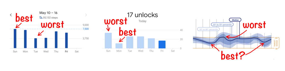
2. “What was the best [x]? What was the worst [x]?”
To be truthful and revealing, data graphics must bear on the question at the heart of quantitative thinking: “Compared to what?” (Edward Tufte, “The Visual Display of Quantitative Information”)
The whole point of visualization is comparing quantities visually. Our brains understand geometry better than abstract numbers, so we visualize.
Testing is simple: Ask users questions about the data. One of the more reliable: ask them to identify the extremes (e.g. “What day was your healthiest day? What day was your least healthy?” or “When did you make the most sales? When was the slowest?”).
You might also consider phrasing this in terms of value judgements (e.g. “best, worst”, not “largest, smallest”), to make sure they’re able to differentiate quantities and draw appropriate conclusions. This is particularly important when “good” isn’t necessarily the highest or lowest values presented (e.g. blood-glucose levels).
You can also follow this up with similar quiz-like questions, such that, if they understand the data, they should be able to easily answer the question (e.g. “During which period(s) was there a decline in the number of births?”). See this writeup on questions used in data-literacy studies for more examples.
Hearst & friends explore this further and find that having people answer questions about complex visualizations helps make designers “aware of the problems that might arise in actual use of their design.” (src)
Answers to these questions might be obvious when testing simple representations, like a single bar chart. But the more you stray from simple representations, the more they’ll struggle. For example, see NYTimes’ exploration of Elizabeth Warren’s 2019 policy proposal costs. You could expect people to struggle with determining if “Housing” or “Other” are the smallest portions. That’s not always a bad thing, it just depends on the level of precision required to tell the story.
What to look for?
- Good: They should be able to answer these quickly. They can spot ambiguity, if it exists. There’s little trouble relating quantities to labels.
- Trouble: More squinting. Mistaking highs for lows. Tracing with fingers.
3. “What caused the data to have this shape? What happened in real life that affected the numbers you’re seeing here?”

“Abstraction makes it harder to understand an idea and to remember it. It also makes it harder to coordinate our activities with others, who may interpret the abstraction in very different ways.” (Chip & Dan Heath, “Made to Stick”)
Data visualization is, by nature, abstract. Becoming too abstract is a persistent risk. This makes it difficult for people to relate the visualization with what they might experience in real life, ultimately limiting the impact of the data.
For example, the Covid Tracking Project recommends against abstracting away death counts that mute the emotional impact of Covid-19 deaths.
“We recommend using total numbers for plotting deaths to compare one US state or territory against another. In this case, adjusting per capita adds a layer of abstraction to the graphic. This reduces the data’s power and the reader’s comprehension.” (Covid Tracking Project “Visualization Guide”)
But it’s not just abstraction that can mask the underlying phenomenon.
Sometimes telling the complete story requires additional context. For example, charts from St Louis Fed’s FRED show overlays for recessions, giving additional context to properly interpret the data.
Or, sometimes the complete story can be hidden under a homogenous curve. For example, if you were to look at the curve of US Covid-19 cases, you might think the case-count is declining across the country. In reality, most of that drop is due to just 2 states (New York and New Jersey), while case-counts across the rest of the country remain relatively flat.
By asking people to give an explanation for the underlying phenomenon, you can determine how easily they relate the data to their own lives. This can indicate the need to simplify, decompose or supplement the visualization with added context.
What to look for?
- Good: They relate the data back to personal experiences (if personal data), they can offer plausible explanations (e.g. “This week was probably bad for Snow Cone sales because it’s December and it’s 27 degrees outside?”), or at least they can interrogate the data to learn more (e.g. tapping a bar on a bar chart to decompose it).
- Trouble: Non-answers. They say “well it depends…” (indicating ambiguity). They hunt around for context clues but come up short.
4. “Overall, is this good or bad?”
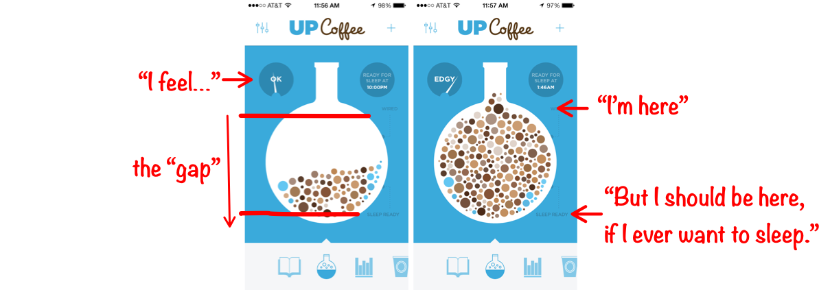
“Because visceral design is about initial reactions, it can be studied quite simply by putting people in front of a design and waiting for reactions.” (Donald Norman, “Emotional Design: Why We Love (or Hate) Everyday Things”)
To persuade, it’s important to appeal to audiences both rationally and emotionally. Data, when well-presented, can accomplish both. To do this, the visualization should create a sense of tension by highlighting the difference between “this is how things are now” and “this is how much better they could be.”
This works for both for personal, performance visualizations (e.g. Fitbit creates tension between your current step count and the magical 10,000 steps) and for more objective, journalistic work (e.g. looking at this graph, Americans might feel tension: “Denmark, Italy and Canada are beating the US in testing?”).
When this is well-executed, you can expect an almost visceral reaction from your users. Not only do they intellectually understand the “gap,” they feel it.
To verify this, simply ask your test subjects to judge for themselves (e.g. “Do you think this is good or bad?”).
What to look for?
- Good: At the very least, they should be able to identify the “gap” and say whether the data presents a scenario that is good or bad. Ideally, they can speak to the magnitude of the difference. Even better, their own emotional arousal matches that magnitude.
- Trouble: Hesitation. Guessing. Mistakes. Apathy.
5. “What might you do differently to change these numbers next [week/month/year]? How would this information influence your approach?”
“There are really only three basic reasons why information ever has value to a business: 1. Information reduces uncertainty about decisions that have economic consequences. 2. Information affects the behavior of others, which has economic consequences. 3. Information sometimes has its own market value.” (Douglas Hubbard, “How to Measure Anything”)
Data is “actionable” if a reasonably savvy user would do something different as a result of consuming it. This is what Hubbard’s 1st and 2nd reasons refer to.
Testing for “actionability” is important for 2 reasons:
- You want to make sure the visualization helps users understand the data well-enough to inform their future actions. This is a prerequisite for users to act. (i.e. The steering wheel is useless if you can’t see through the windshield.)
- You also want to make sure you’re not overloading people with useless data (i.e. data vomit). If data doesn’t inform some decision or behavior, you probably don’t need to visualize it.
Validating actionability is slightly more tricky. First, identify several scenarios where, given scenarios A, B, and C, a reasonably informed person would tell you to do X, Y, Z (e.g. “Thermometer says 0 degrees” → “Wear a coat”; “Thermometer says 100 degrees” → “Stay inside”).
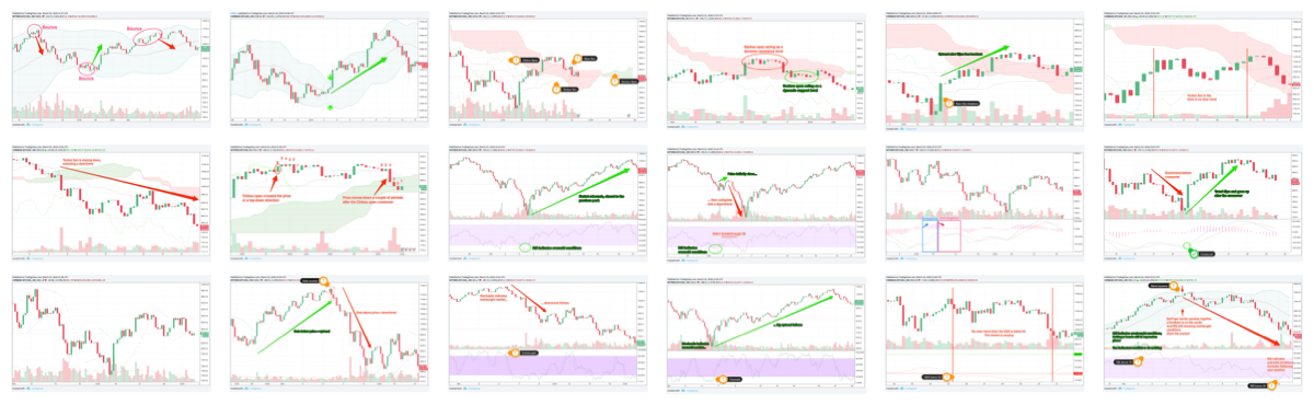
Second, make sure you’re testing with “reasonably savvy” testers. This is important: Even an objectively effective visualization won’t seem actionable to users who are inexperienced in the problem domain (e.g. the trading graphs above look like nonsense to me, but that doesn’t mean they’re ineffective for technical traders). Unless these non-experts are your audience, they’re only going to give you false negatives. So make sure you’re testing with folks who would know what to do with the information (i.e. users who, when presented with scenarios A, B and C, know to proceed with actions X, Y and Z)
Once you have your scenarios and reasonably informed test users, walk the testers through each scenario, as represented by the visualization, and ask them what they would do. Their answers might differ (e.g. “100 degrees” might mean “stay inside,” “wear sunscreen,” “stay hydrated”), but each of the responses should indicate whether or not the person knows it’s hot enough that they should do something different.
What to look for?
- Good: Your experts can translate the scenario you’re presenting to a specific course of action.
- Trouble: “I don’t know.” This can indicate a) the person isn’t an expert or b) the data presented isn’t sufficient to determine an action or c) the data wouldn’t actually have any bearing on downstream actions. (C. is the one to watch out for. That’s the sad path to data-vomit.)
- Tip: Initial responses will sometimes be vague (e.g. “if the cookies aren’t selling, those lazy girl scouts need to try harder.”), so be ready to follow it up (e.g. “Sure. But based on what you’re seeing here, is there something else they might try?”). Then they might say “Oh, I see all they have left are Trefoils. No one eats that garbage. Get those girls some Thin Mints!”
Takeaway
Design is iterative. Data design is no exception. Ask just a handful of test users these 5 questions and, not only will you learn how to improve your visualizations, you’ll also spark great conversations that help you better relate to your users and ultimately make the work more understandable, relatable, impactful and actionable.