Data is silly.
People are too.
Notes for MICA Data Analytics and Visualization students toward more humanistic people visualizations.
Thank you for the chance to share how our social reality shapes our views of people, data, and the world around us. Notes and materials are below for reference.
Please feel free to reach out with questions!
Please feel free to reach out with questions!
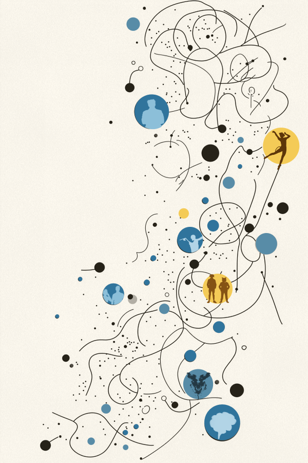
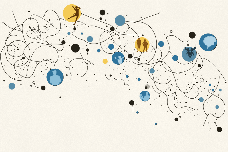
Considerations for
People Visualization
People Visualization
People are silly about data.
It’s not what you show, it’s what people see.
Remember there’s a gap between what viewers should conclude from the data, compared to how it actually influences their beliefs. For example, correlation shouldn’t imply causation, but it often does. Just because data has a halo of objectivity doesn't mean that it's free from the power of suggestion.
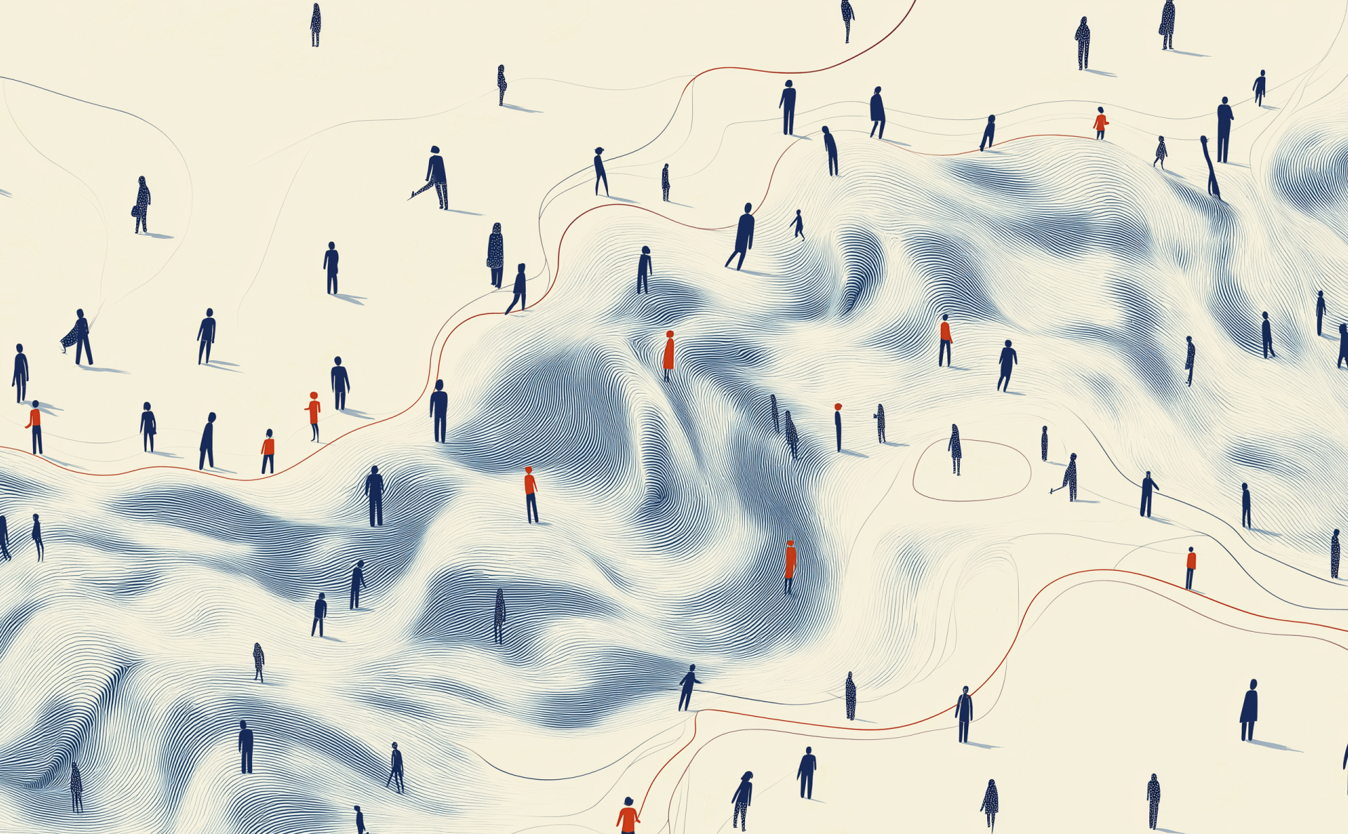
People are silly about other people.
Blame systems, not people.
When explaining other people's behaviors or outcomes, our first instincts are often biased toward personal blame. Understanding the full story requires conscious effort to consider external influences.
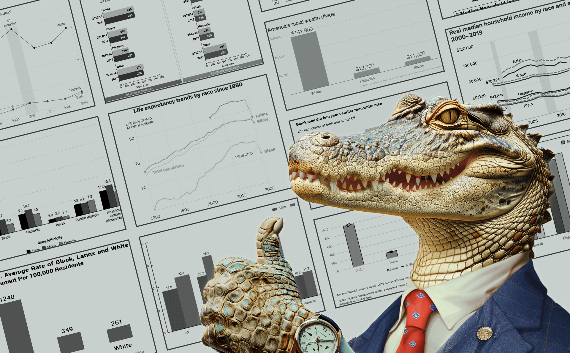
People are silly about data about other people.
Social bias is data bias.
Social cognitive biases can interfere with viewers' perceptions of dataviz. For example, health disparity charts may be accurate and easy to read, while still biasing viewers' causal explanations toward blaming the groups being visualized, instead of external factors like social determinants of health.
Silliness is serious.
Showing reality shapes reality.
Social outcome disparity charts risk creating self-fulfilling prophecies. Because social misbeliefs like victim blaming and harmful stereotypes play an active role in perpetuating social inequality, charts that encourage these misbeliefs are also indirectly influential in creating these harmful downstream consequences.
Silliness is contagious.
Visualizing social norms
helps them spread.
helps them spread.
We tend to match our attitudes, beliefs, behaviors, and values with the people around us. So when charts show outcomes for certain identity groups, we can expect viewers from those same groups to conform toward the norms of their visualized peers.
Silliness comes from within.
Charts are windows.
Charts are mirrors.
Charts are mirrors.
Instead of revealing new insights about the outside world, confirmation biases mean that ambiguous data can be co-opted as evidence to support the things we already believe.
Silliness is a design choice.
Your designs can help,
or they can hurt.
or they can hurt.
It’s possible to design charts that are less toxic, and still effective for their original communication goals. Data designers have a choice, and a responsibility, in how they visualize people.
Related Material
Talks and Workshops
Visual Villainy
Miscellaneous Related Writing