Introduction
tldr:
- Baseline numeracy in the United States is not great. There are surprisingly basic interpretations that many struggle with.
- Graph comprehension depends on both viewers’ numeracy and charts’ “read” complexity.
- To reach more people, don’t just plot, write.
A few months into the pandemic, Alessandro Romano and others surveyed 2,000 people to demonstrate that ”the public do not understand logarithmic graphs used to portray COVID-19.” They found that just 41% of participants correctly answered basic questions about log-scaled graphs, compared to 84% for linear.
But the problem is bigger than log scales. As we’ll see below, much of “the public” struggle with even the most basic charts and graphs, let alone complex visualizations.
The Curse of Knowledge
A note in the comments stands out:
“As a former infographics editor at a major newspaper, I always thought one of my strengths was a lack of math skills. If I could understand a chart, perhaps readers could, too. And yeah, I never used a log chart.” - Robert B.
This raises more questions: How many data journalists think like Robert B.? Or, as Romano & friends suggest, do people in the mass-media “routinely” assume log scale axes are widely comprehensible? If it’s the latter, and they’re overestimating the world’s quantitative abilities, how many other important data stories are lost on general audiences?
For data folks, this is an easy mistake to make. If a big chunk of your day is spent in a python notebook or your lunch conversations often veer toward what’s new on arXiv, you might be in the same boat.
The Heath brothers call this the “Curse of Knowledge.”
“Once we know something, we find it hard to imagine what it was like not to know it. Our knowledge has ‘cursed’ us. And it becomes difficult for us to share our knowledge with others, because we can’t readily re-create our listeners’ state of mind.” - Chip & Dan Heath, Made to Stick
That is, if you’re highly numerate, it’s often difficult communicating with people who are not.
To cure the “Curse of Quantitative Knowledge” and see the world of data through the eyes of a more typical, less savvy audience, we’ll look at 3 different studies exploring numeracy and graph literacy at scale.
Then to make it concrete, we’ll also look at 10 specific questions from those studies and I’ll provide estimates for a) how accurately a typical user might interpret them and b) what % of US Adults would be able to reliably interpret them correctly.
These benchmarks will hopefully give a more intuitive sense of the needs for wider audiences, and the importance of pairing dataviz with other modes of communication. For example, if you want to make your (hard-earned) insights approachable, good writing is just as important as good charts.
The Numeracy Problem
Numeracy isn’t innate.
Apparently babies and rodents are both able to differentiate simple quantities. Given a choice between two stacks of crackers, babies know to choose the bigger stack (src). Rats can learn to press a bar 8 or 16 times to receive snacks (src).
But that’s roughly the extent of our innate abilities with numbers. The rest, including basic concepts like ratios and negative numbers, are learned.
The PIAAC studies “numeracy” across 38 countries.
Every few years, the OECD runs a large study called “The Program for the International Assessment of Adult Competencies” (PIAAC). It examines basic skills of adults around the world, one of which is numeracy.
The researchers sit down with ~245k people across 38 countries, for about an hour each and quiz them. They calculate their scores on a scale of 1–500, where 500 is a perfect score. Those scores are then bucketed into one of five levels, where Level 1 is least proficient and Level 5 is most proficient.
Level 3 seems to be an important threshold for proficiency. A typical “level 3” person scores between 276–326 points (src, pg 71) and they can answer “level 3” questions 67% of the time (src, pg 64). We’ll explore examples questions later, but the PIAAC describes Level 3 questions as:
Tasks at this level require the respondent to understand mathematical information that may be less explicit, embedded in contexts that are not always familiar and represented in more complex ways. Tasks require several steps and may involve the choice of problem-solving strategies and relevant processes. Tasks tend to require the application of number sense and spatial sense; recognizing and working with mathematical relationships, patterns, and proportions expressed in verbal or numerical form; and interpretation and basic analysis of data and statistics in texts, tables and graphs. ( src , pg 71)
How numerate are US Adults according to the PIAAC?
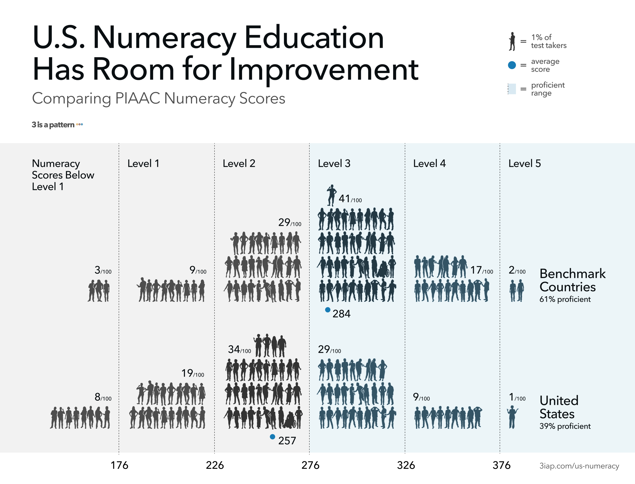
Numeracy rates in the United States are middling compared to other countries surveyed, and much lower than numeracy leaders like Japan, Finland, and the Netherlands (“Benchmark Countries” above, per src). For 2012–2014 results, a typical US Adult’s score was 257 (src), putting them solidly in the Level 2 range (226–276 points, src, pg 71). Just 39% of US adults tested as proficient (level 3 or higher), compared to 61% for the benchmark countries (src).
So if just four in ten US adults perform above Level 3, then six in ten struggle to “recognize and work with mathematical relationships, patterns, and proportions expressed in verbal or numerical form; and can interpret and perform basic analyses of data and statistics in texts, tables and graphs.”
“These results are another signal that many Americans struggle with the most basic of math skills,” says NCES Associate Commissioner Peggy Carr (src).
“But my audience is smart”
Assuming audiences are smart and well-intentioned is a good practice. It’s important to treat viewers respectfully. But even “smart” audiences aren’t always quantitatively savvy.
There is a strong relationship between numeracy and education, but there are exceptions. For example, even among those with more than a high school education, 47% still performed at Level 2 or below on the PIAAC (src).
In 2008, Hawley & friends found that even among participants with at least a bachelor’s degree, 33% were classified as low numeracy (src). In a 2001 study of the “highly educated,” Lipkus & friends found that 16–20% of participants incorrectly answered very basic questions related to risk magnitudes (e.g., “Which represents the larger risk: 1%, 5%, or 10%?”) (src).
Even doctors struggle. Rao’s 2008 review highlights (src) a survey of family physicians, showing that despite 95% of participants affirming the importance of understanding biostatistics, only 25% reported confidence in the subject. Based on the test results, their lack of confidence was well-founded: They averaged just 41% correct answers. Granted, biostatistics is a higher bar, but hopefully this illustrates that even advanced audiences aren’t always as advanced as they’d like to be.
Graph Comprehension
How does numeracy relate to communicating data?
Galesic and Garcia-Retamero’s work suggests that, not only does low-numeracy limit a person’s math capabilities, it also correlates strongly with their “graph literacy,” or their ability to interpret charts and graphs (src).
According to their study: “The same meta-cognitive abilities that lead to high numeracy scores also foster good graphical literacy skills.” And the reverse is true: Of the 261 “low numeracy” US Adult participants, only 89 (34%) exhibited high graph literacy.
How will users “read” the data?
Another insight from Galesic and Garcia-Retamero: Graph comprehension isn’t solely based on the reader’s abilities, it also depends on interpretation task. They suggest 3 ways people “read” a graph. A user can:
- “Read the data,” identifying specific values on a graph
- “Read between the data,” finding relationships in the graph’s data
- “Read beyond the data,” making inferences from the graph’s data
Each of these levels is successively harder, and this is reflected in their results. US participants could correctly “read the data” in 86% of responses, “read between” in 67% of responses, and “read beyond” in 63% of responses.
Note, these results appear more positive than the PIAAC suggests. To get a better sense of what data-readers can actually handle, let’s look at some of the underlying questions from the 2 studies.
How much complexity can people handle?
Let’s look at some graph comprehension questions & results from the PIAAC, the National Adult Literacy Survey Questions and Galesic & Garcia-Retamero’s “Graph Literacy” study.
PIAAC Sample Questions
We’ll start at Level 3, the “medium difficulty:”
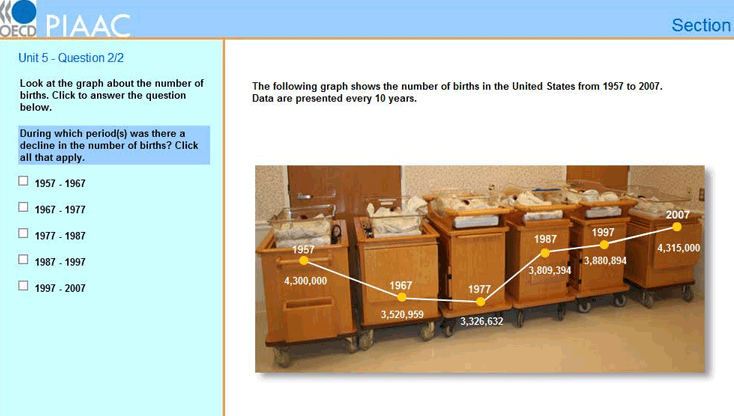
A Level 3 Question: For a time series line graph: “During which period(s) was there a decline in the number of births?”
The typical PIAAC numeracy score for a US adult was 257/500.
- Therefore the average US adult has a ~26% chance of answering a Level 3 question correctly (src, pg 72).
- A “Level 3” person, whose scored between 276–326 points, would answer this correctly 50–80% of the time.
- Since 37% of US Adults scored at Level ≥3, we can say that just 4 in 10 US Adults can reliably answer a question like this.
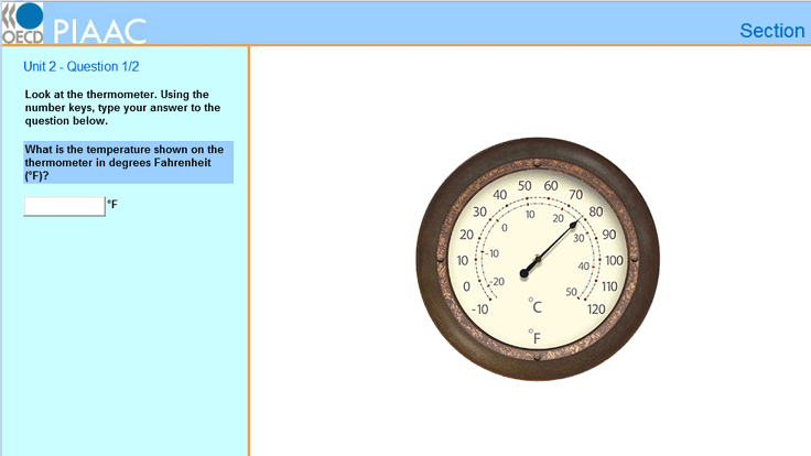
Questions for a dial thermometer:
- Level 1: “What is the temperature shown on the thermometer in degrees Fahrenheit (F)?”
- Level 2: “If the temperature shown decreases by 30 degrees Celsius, what would the temperature be in degrees Celsius?”
These appear to be Level 1 and Level 2 questions.
- A typical US adult will answer a Level 1 question correctly 89% of the time (92% of US Adults are Level ≥1 and will answer this correctly most of the time).
- They’ll answer a Level 2 question correctly 66% of the time (70% of US Adults are Level ≥2 and will answer this correctly most of the time).
(Note: NCES site lists these as Level 3, but the reader companion lists similar questions as “low difficulty” or Levels 1/2)
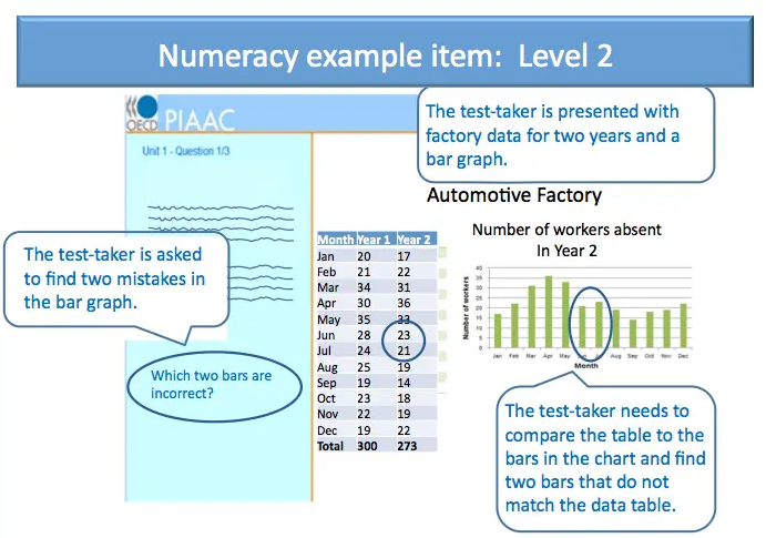
For a table and bar graph: “Which two bars are incorrect?”
This is a “level 2” Question. A typical US adult will answer this correctly 66% of the time (70% of US Adults will answer this correctly most of the time).
The National Adult Literacy Survey Questions
An earlier study in the United States, “the National Adult Literacy Survey,” suggests that the typical US adult would be able to “identify information from a bar graph depicting source of energy and year” only ~50% of the time. They’d be able to “use a table of information to determine patterns in oil exports across years” only ~25% of the time (src).
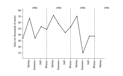
Level 2 Question: “You are a marketing manager for a small manufacturing firm. This graph shows your company’s sales over the last three years. Given the seasonal pattern shown on the graph, predict the sales for Spring 1985 (in thousands) by putting an ‘x’ on the graph.”
An average US adult answers this correctly ~60–80% of the time. (src, pg 102)

Level 3 Question: “Suppose that you took the 12:45 p.m. bus from U.A.L.R. Student Union to 17th and Main on a Saturday. According to the schedule, how many minutes is the bus ride?”
An average US adult answers this correctly ~35–65% of the time (src, pg 102).
“Graph Literacy: A Cross-Cultural Comparison” Questions
In “Graph Literacy: A Cross-Cultural Comparison” Galesic and Garcia-Retamero tell us “even the simplest graphs may be difficult to understand for many people” (src).
A few example questions and expected results:
- Reading off a point on a bar chart (left chart): “What percentage of patients recovered after chemotherapy?” - 85% US adults answered correctly.
- Determining difference between 2 bars (left chart): “What is the difference between the percentage of patients who recovered after a surgery and the percentage of patients who recovered after radiation therapy?” - 70% US adults answered correctly.
- Comparing slopes 2 intervals of a line (middle chart): “When was the increase in the percentage of people with Adeolitis higher? (1) From 1975 to 1980, (2) From 2000 To 2005, (3) Increase was the same in both intervals, (4) Don’t Know” - 62% US adults answered correctly.
- Determining difference between 2 groups of icons (right chart): “How many more men than women are there among 100 patients with disease X?” - 59% US adults answered correctly.
Takeaways
- When communicating data, the questions above offer useful benchmarks for determining your addressable audience size given the complexity of your data story:
- If it’s roughly as complex as identifying and subtracting two values (e.g. “What is the difference between the percentage of patients who recovered after a surgery and the percentage of patients who recovered after radiation therapy?”), then you’re speaking to ~7 in 10 people.
- If it’s roughly as complex as identifying trends on a line-graph (e.g. “During which period(s) was there a decline in the number of births?”), then you’re only speaking to ~4 in 10 people
Based on these, you can adjust your presentation of the data accordingly. If you know you’re only speaking to an advanced audience, you’re good to go. But if you’d like to reach a wider audience, there may be chart choices that are more accessible, but you’ll also need to supplement the data with other modes of communication like interpretive text or narrative storytelling.
What can we do better?
Keeping our audiences in mind matters now more than ever. Covid-19 is a tornado of numerical concepts and conditions that people struggle with (e.g. large numbers, exponential curves, politics / emotion, etc). Further, the communities that are most impacted by the virus are also the most underserved in terms of numeracy education. Both of these issues raise the bar for communicators to make their insights more accessible.
So what can we do to solve the “Curse of [Quantitative] Knowledge?”
- Don’t assume widespread numeracy. Be conscious of your audience’s appetite for complexity.
- User test your work on real people. There’s nothing like user feedback to surface areas that can be further clarified.
- When data needs to be accessible to the majority of the population (at least of US Adults), ask yourself: Is this more or less complex than subtracting two values from a bar chart? If so, charts alone won’t be enough.
- Annotate everything. Whenever possible, provide written instructions on how to interpret your visualizations and supplement visualizations with narrative descriptions on key takeaways.
- If you know something like log-scale axes won’t be widely understood, do it anyway. Many folks argue that exposure to more difficult graphs actually helps improve graph-literacy, so maybe take one for the team?

