Introduction
In these uncertain times, the world needs hard-hitting data journalism now more than ever. This is not that.
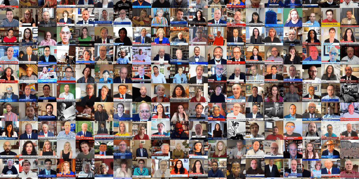
Instead, I’ve analyzed 1,321 Tweets to answer a question many of us pandemic-bound remote-workers have wondered since Zoom became part of our daily lives: Do people like my room?!
Unlike Animal Crossing, there’s no authoritative raccoon we can rely on for objective feedback about our decoration skills.
Instead, here in the real world, the closest thing we’ve got is Room Rater (@ratemyskyperoom). As more and more (famous) people are revealing their homes via the laptop lens, Room Rater has stepped up to judge them, publicly and quantitatively.
Not all of our homes will be broadcast on national TV. At least not in the near future. But we can all agree, when that day comes, we want the world to see our rooms (and, by extension, our very beings) as worthy of a 10/10.
So I ask: “What does it take to get a 10/10 rating for my room?!”
To find out, I pulled down all of @ratemyskyperoom’s 1,321 room rating tweets from May 2020 to July 2020, parsed out the ratings, then looked at the content of both the images and text for each of their tweets.
Below are the critical, profound and stirring insights I’ve found in the data.
Insight #1: It’s not terribly difficult to get a good rating.
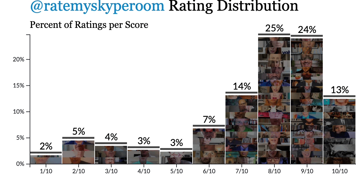
The good news: It’s apparently not hard to get a high score. The average rating is 7.5/10 and they hand out 8/10s like candy. In fact, most of the ratings are at least 8/10.
Room Rater talks a tough game, but deep down they’re softies.
Insight #2: Second chances offer a path to redemption (or not)
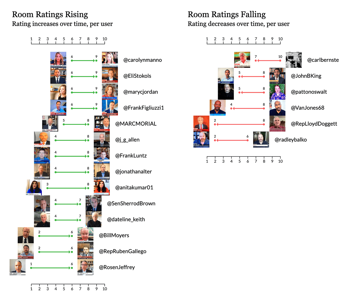
Even if your first rating is low, you’ve always got another chance on your next TV appearance. At least 83 people’s rooms have been rated on more than one occasion.
Whether you come from the hard streets of Scranton or Sesame (@JoeBiden +1, @elmo +1), whether you’re a politician, press, pollster or professor (@RepKarenBass +2; @marycjordan +3, @FrankLuntz +3; @j_g_allen +4), Room Rater is willing to give your room a second chance. Above, you can see the 14 people on the left who improved their rating by at least 3 points between their first and last appearances. The awards for most improvement go to @anitakumar01 and @RosenJeffrey (+5 each).
But beware! What Room Rater giveth, Room Rater taketh away. At least 6 people scored worse between their first and last ratings. Sorry @pattonoswalt!
What’s the secret to Room Rating success?
To understand this, I looked at 2 sources: The room images and the text of each tweet. To analyze the images, I ran each one through the AWS “Rekognition” image recognition APIs. To analyze the text, I looked at single word usage (e.g. “wu” and “tang”, not “wu tang”). Neither of these methods are particularly robust, but there were still some interesting findings.

What can image recognition tell us about high quality skype rooms?
Not much. The AWS Rekognition algorithm seems well-tuned for differentiating broad categories of things, but this isn’t super helpful when the domain of images is already somewhat narrow. Above you can see the results for a few sample images. I was hoping for results closer to “Hey look, @todrick has ice cream on the walls!” But at least it’s good at spotting people with human faces…
That’s not to say it was completely devoid of insight. Let’s look at one example.

Insight #3: Puppies make for Great Skype Rooms.
Our first fun fact: the Room Rater judges are quite fond of rooms with animals. On average, rooms with animals were rated 1.2 points higher than rooms without animals. This could include artwork with animals, sculptures of horses or actual pets lounging around in the person’s background.
Above we have 3 graphs. The graphs on the far left and far right, labeled No Animals and Animals show the distribution of ratings for rooms that do not have Animals in them v.s. rooms that do have Animals in them (at least as far as AWS is concerned). The images overlaid on the bars include a sample of the images from the original tweets. (If you go to the Notebook here you can click the images on the graphs and see the animals)
The graph in the middle, labeled No Animals v.s. Animals, shows the same data from the other two graphs, overlaid on top of each other. The middle graph also includes little notches in the bottom showing the average for each distribution (in this case No Animals averaged 7.4 and Animals 8.6).
Insight #4: Confirmed: Plants, Art and Books make for nicer Rooms.
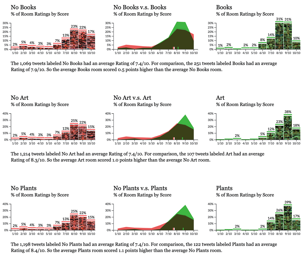
This is nothing groundbreaking, but certainly reassuring. The photos where AWS’s algorithm could identify Plants, Art or Books got higher ratings than the room photos without Plants, Art or Books.

Odd: Male speakers’ rooms are rated more often, but Female speakers’ rooms are better.
Male speakers appear in the ratings almost 2x more than female speakers (842 ratings for men, 425 for women), but on average the women’s rooms are 0.3 points nicer. (*Caveat: Here “male” and “female” are based on AWS’s prediction of the person’s gender from the image.)
What does @ratemyskyperoom’s written feedback tell us about earning a high-scoring room?
There were no life-altering revelations from the images, but maybe we can look to Room Rater’s written feedback directly for some insights…
Insight #5. First, get the basics right.
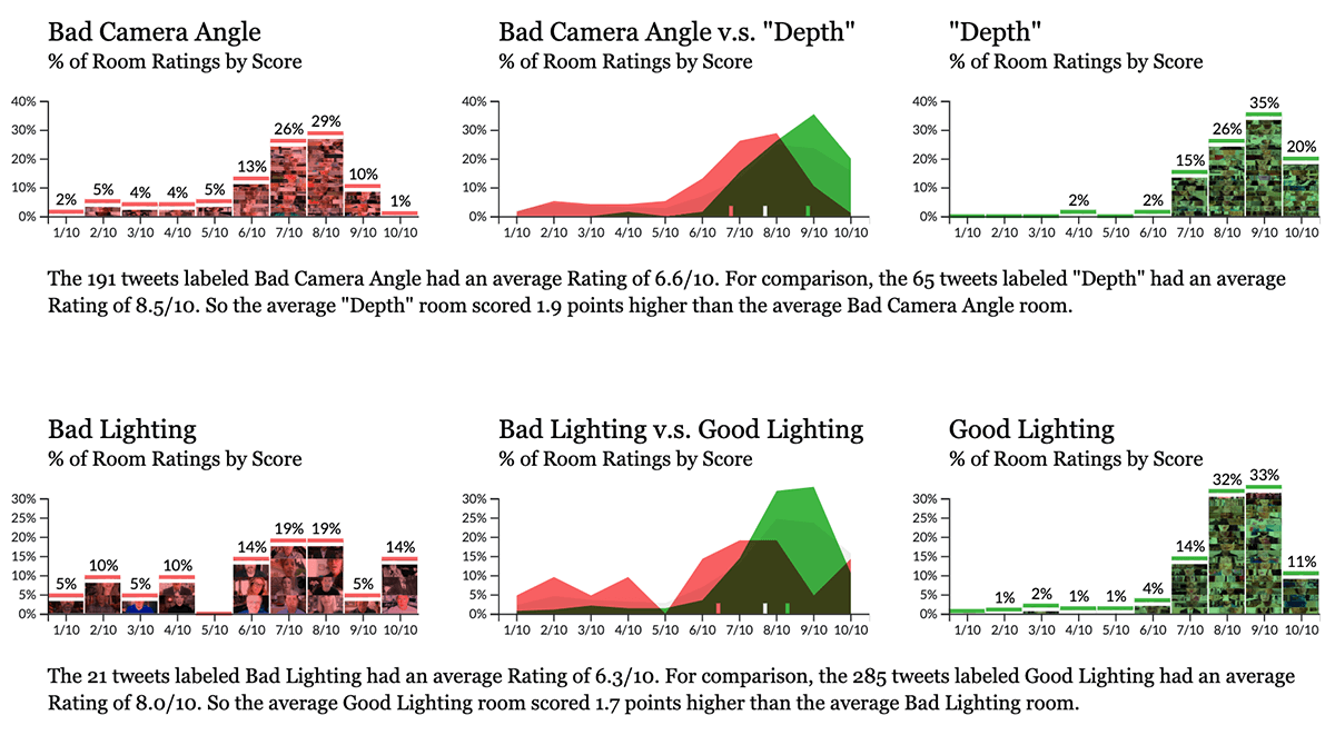
It’s important to get the basics right. That is, frame the camera correctly and check your lighting. When Room Rater’s written feedback mentions reframing the camera (words like “reframe,” “crop,” “camera,” “ceiling,” etc.) it’s usually for lower scoring rooms. While creating a sense of ”depth” is a sure win.
Good lighting is similar. Feedback including words like “dark” or “backlit” are a bad sign, so make sure you’re not sitting in the dark.

Insight #6. Succulents are good. Orchids are better.
While Room Rater is quick to suggest getting a Succulent for your room, or any plant in general, they actually seem much more fond of Orchids.

Insight #7. Clarifying Books v.s. Booker.
Room Rater approves of rooms containing “Books.” They do not approve of rooms that contain Cory Booker. (Subtle difference.)

Insight #8. “Historic” is better than “Hostage.”
Perhaps the largest success factor is learning the difference between ”Hostage” and ”Historic.” As if being abducted isn’t bad enough, Room Rater is quite judgy about seeing these victims on the airwaves. To their credit, they do offer followers an extensive set of “Historic Skype Rooms” for viewers to emulate when designing their own rooms.
Insight #9. Easy wins for boosting your Room Rating.
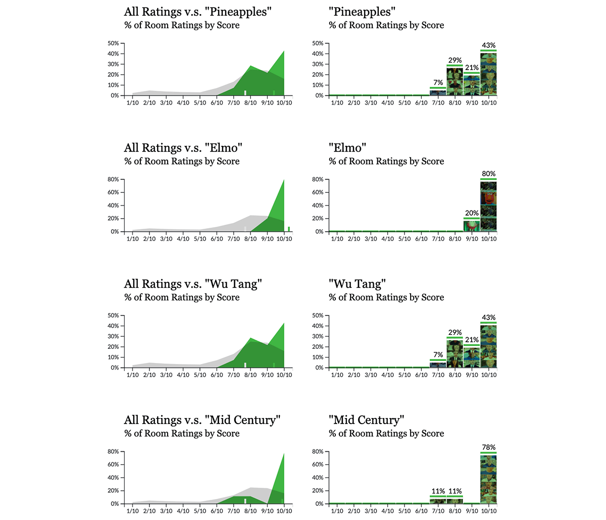
And, finally, if you need a quick boost before you go on air, the Room Raters are quite fond of Pineapples, Elmo and the Wu Tang Clan, so you may consider working those themes into your Mid Century modern decor and you’ll be scoring 10/10 in no time.
Takeaways
- If you’re feeling stressed because the world is ending, elaborate and pointless data exploration can be a fantastic coping mechanism.
- The secrets to @ratemyskyperoom success: Good lighting, good camera framing, plants, art, books, animals, pineapples, Elmo and Wu Tang. It also helps if you’re not Cory Booker and you have not been taken hostage.

