Context
Clients
Graphicacy + client (a survey analytics product platform, used by the world’s leading polling & market research firms).
Prompt
How might we build robust, product-ready polling data visualizations?
Background
The client’s product is a purpose-built analytics tool for pollsters and market researchers to visualize and analyze large-scale survey results. Because surveys unfold over time (e.g. for longitudinal studies, research panels), time is an important component in comprehending survey data. Given the importance of time series data and growing pains with their off-the-shelf charting library, the client saw time series use-cases as an opportunity for improving both comprehension and UX.
Challenges
- Time series analysis was an important use-case for the client’s users, but Plotly (their off-the-shelf charting library) didn’t provide the flexibility or interactivity to deliver on the needed UX.
- Graphicacy wanted expertise on delivering their designs as embedded, in-product data visualizations that played nicely with the client’s existing react codebase.
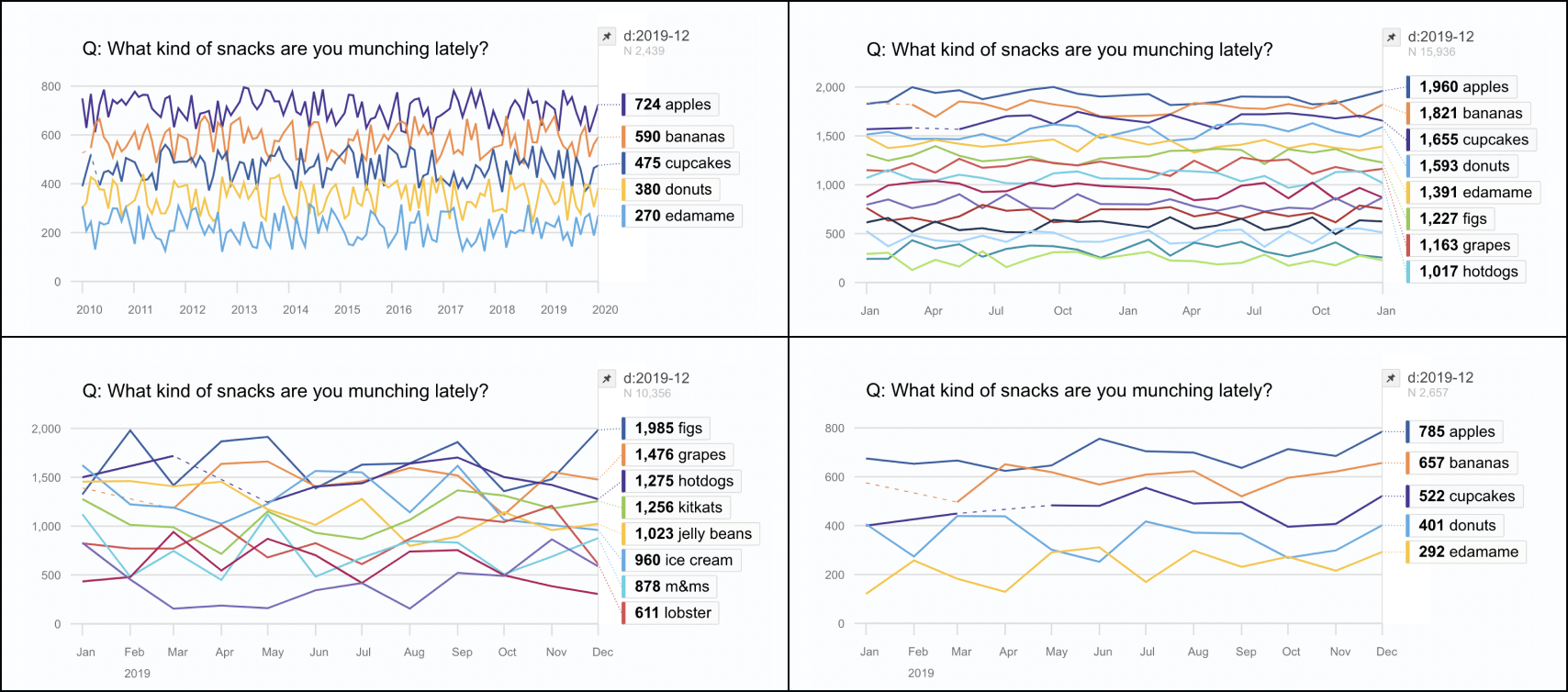
- Survey data, like all data, can be messy. The visualization needed to be robust against missing or misformatted data and a variety of users.
Design
Insight
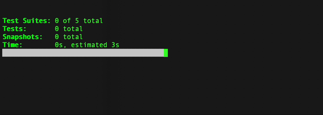
Embrace the chaos! In-product dataviz is only as good as the test dataset. In addition to developing the visualization components, automated tests can ensure the dataviz renders properly in even the weirdest conditions, so edge-cases won’t creep through to end-users,
Solutions
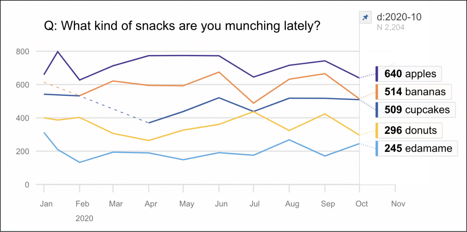
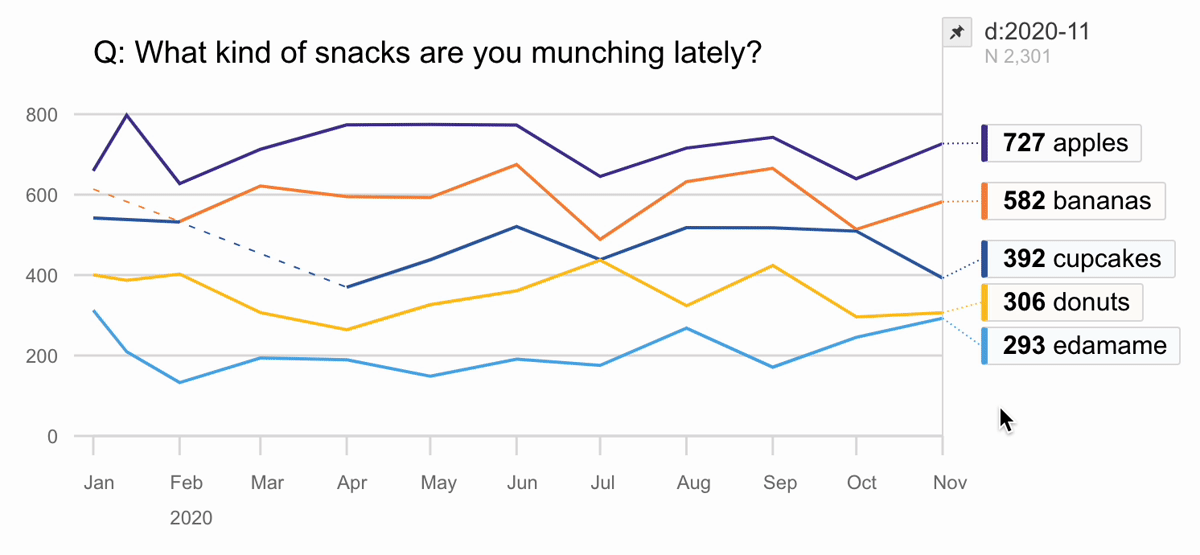
- Developed a custom, dynamic time series graph as configurable, maintainable React components, fully integrated into their existing codebase.
- Developed a test framework and full coverage of automated tests so issues are spotted early and effortlessly and their engineers can maintain the code with confidence.
Results
“We were looking for help developing an in-product data visualization for one of our clients. We needed to make sure it was well-architected, robustly tested, and performant. We're very happy we worked with 3iap. Eli understood exactly what we needed, kept us updated at every stage of the development process, and even helped us clarify the open UX questions. The results were great, the final product worked well, looked clean, and gave us a happy client."