Talk Recording
Context
Collaborators
This was a collaboration between Eli Holder (3iap), Cindy Xiong Bearfield (Georgia Tech), and Gabrielle Merite (Figures & Figures).
Prompt
How might we present new research about data visualization and political polarization in a way that’s sufficiently contextualized, but still engaging and approachable?
Background
Public opinion polling charts dominate U.S. media coverage. While these visualizations drive engagement for news publishers, our 2023 IEEE VIS study “Polarizing Political Polls” found they may undermine the democratic process by reinforcing misbeliefs, promoting unconsidered policy judgements, and even encouraging political polarization.
We wanted a way to communicate these findings to non-expert audiences (i.e. non social scientists at the 2023 VIS conference in Melbourne), while navigating political sensitivities and conveying the gravity of our research.
Key Challenges
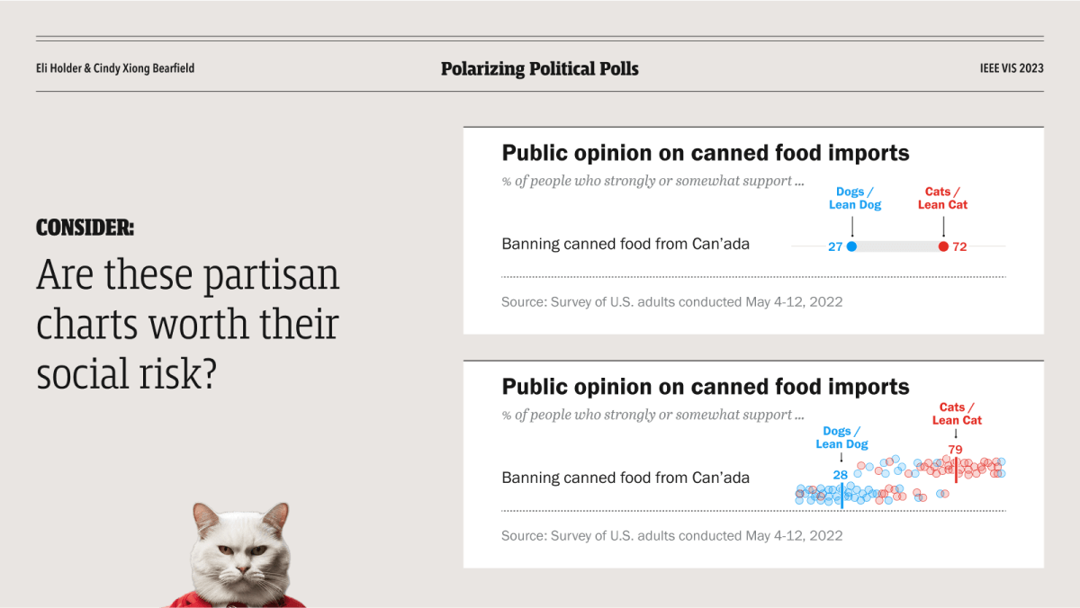
The presentation needed to solve for three key challenges:
Complex subject matter. Some social psychology concepts like attitude change are deceptively complex. While social conformity might be simplified to “monkey see, monkey do,” understanding our research required an intuitive sense of more precise, dynamic models (i.e. Sherif and Sherif’s Social Judgement Theories on interpersonal influence).
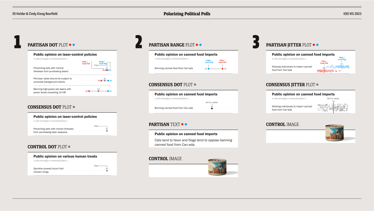
Complex data. The main results were based on 1,962 participants’ responses to 7,560 dynamically generated charts, looking across 5 political policy topics, 6 different charts types, and multiple signals of political ideology. Much to the chagrin of “Reviewer #2,” our models were necessarily complex. While scatter plots and regression lines could straightforwardly show charts’ influences on participants’ attitudes, showing unexpected emergent effects like “polarization” meant capturing aggregate, relative changes between groups.
Politics are exhausting. No one wants to talk about politics at a dataviz conference. Even in 2023, the emotional landscape of political beliefs and polarization were distressing, precarious, and intrinsically divisive. And charged issues risk emotional barriers to learning.
Design
Insights
Narrative. While social influence could be modeled as a complex network of causes and effects, our simple human brains prefer stories. Narratives can be a surprisingly effective way to convey complex causal influences (Sloman 2017, Niederdeppe 2013).
Motion. Change is easy to comprehend when you can see it happening. Animated visualizations can help audiences grasp dynamic systems more intuitively than static charts alone.
Fables are safe. Animals are cute. Following storytellers from George Orwell to Sesame Street, sensitive topics are more easily discussed in the animal kingdom. While divisions between “Democrats vs Republicans” are tired and painful, “Cats vs Dogs” are an even more recognizable rivalry, evoking similar loyalties, but with much lower stakes.
The Presentation
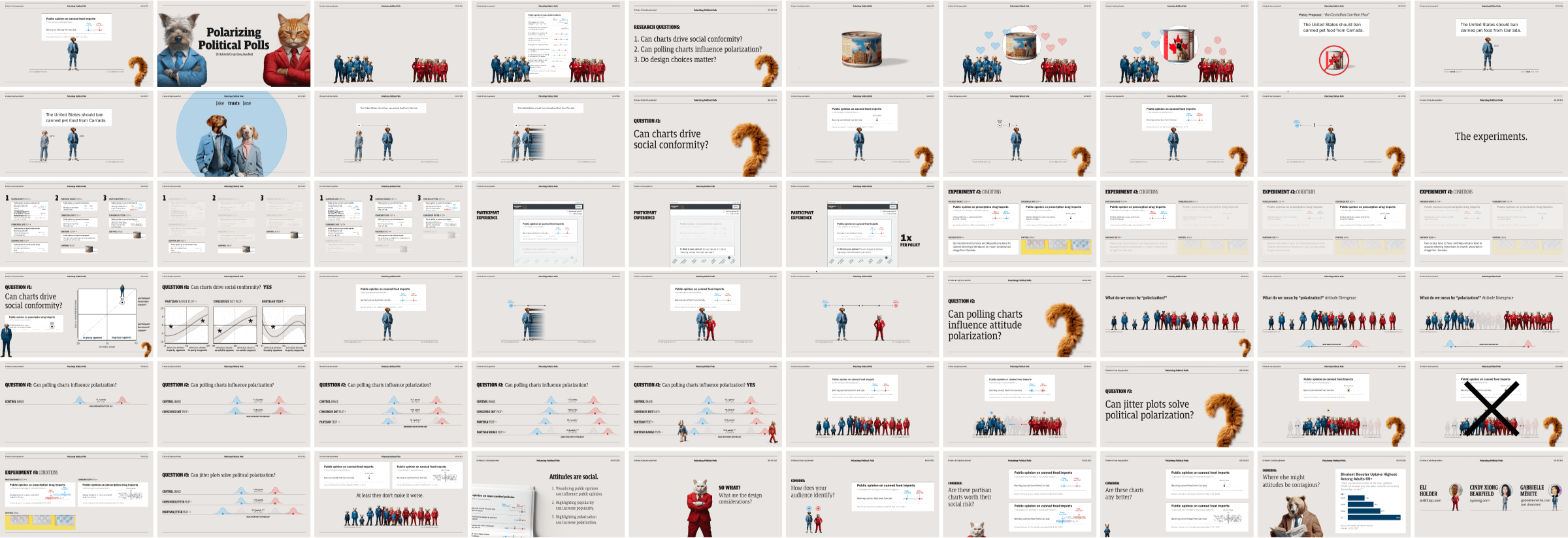
The talk followed the classic arc of research presentations: Motivating context and key concepts up front, create tension with a knowledge gap, then get to the science.
Motivation And Key Concepts
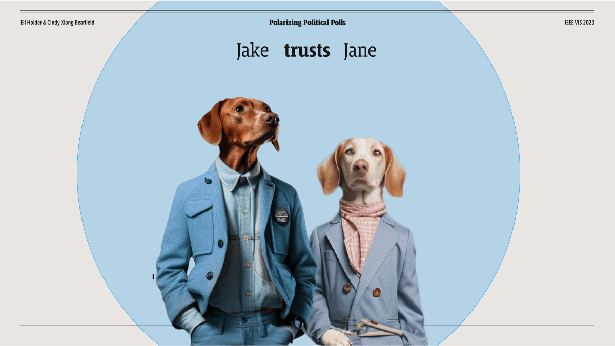
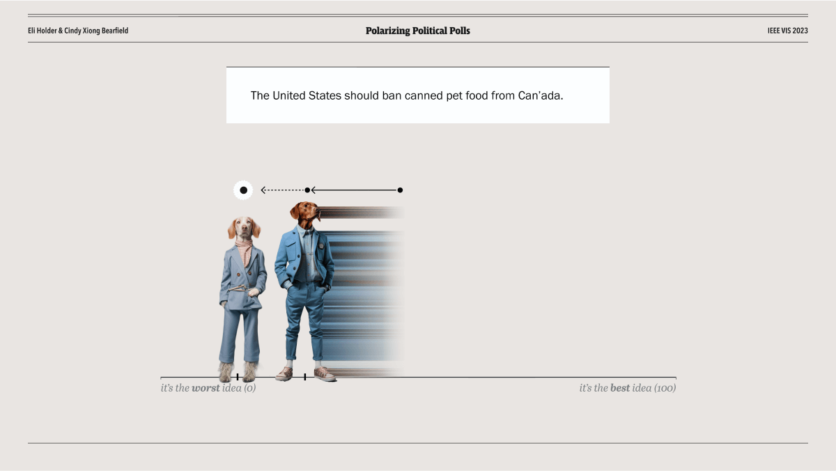
To motivate the study and cover background concepts, we started with a story about a controversial policy in the animal kingdom (“The Canadian Can Ban Plan”) and then introduced our characters: Jake the moderate dog, Jane the wise influencer (also a dog), and Tom the moderate cat. We used visual metaphor to cover attitude conformity in the model of Sherifs’ Social Judgement Theory: We posed Jake and Jane on an attitude scale, then literally shifted Jake toward Jane, as his attitude converged towards hers.
We used this same narrative world to introduce the stimuli charts and open questions for the research (e.g., “Could charts influence Jake like Jane did?”). And as the questions became more complex we built up more complex diagrams iteratively (i.e. adding more cats and dogs to represent the group dynamics).
Visualizing The Results
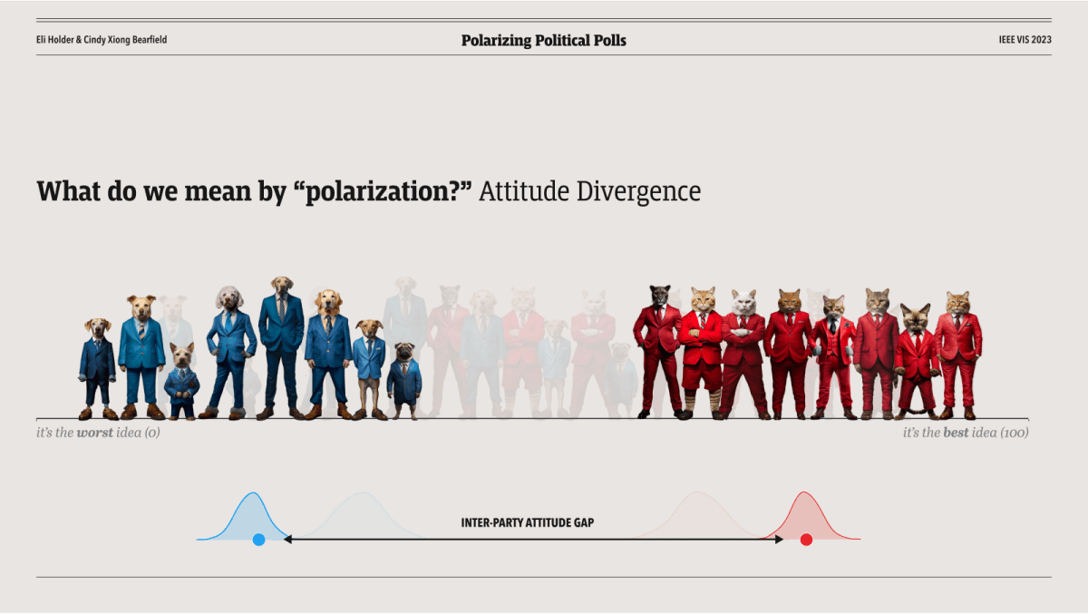
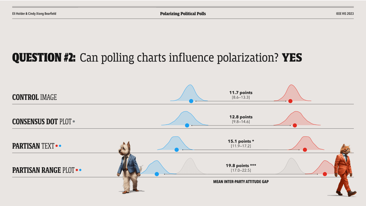
There were two important parts to showing the polarization dynamics.
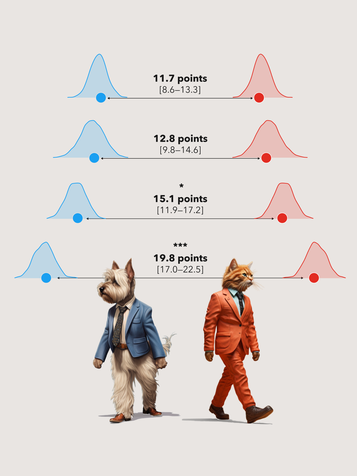
First, the “attitude gap” chart shows the amount of polarization driven by each stimuli chart, encoded as the distance between the blue and red dots on each row.
This chart could have been a bar chart. Showing these values as left-aligned bars would even make the gap sizes easier to compare. However, given this dataset with such obviously wide gaps for the partisan charts, we chose a non-traditional approach to afford a more immediate gist read.
- We split the uncertainty distributions to either side and, even though they aren’t specifically tied to either party, we colored them blue and red to signal that the gap is indeed between Democrats and Republicans.
- The plots are also centered horizontally to avoid implying that one party was more susceptible to this influence than the other, a more subtle question not answered by this analysis.
- This also parallels the visual metaphor we used for showing influence on Jake and his animal friends.
While these choices preclude conventional affordances (e.g. an x axis scale), we consider them worthy tradeoffs for an easier gist read, making it unavoidably clear that partisan charts increased partisan polarization.
Second, pairing the divergence diagram with our friends from the animal kingdom created a natural way to teach audiences how to read the charts, in real time. We also show the same movement again after showing the results slide, to reinforce the impact of the specific partisan chart we studied.
Results
The combination of narrative elements, illustrations, and atypical data visualizations enabled us to:
- Make complex social psychology concepts accessible
- Keep audience engagement through emotional safety and humor
- Demonstrate complex results through approachable visual metaphors
This let us convey both the depth of our research and its broader implications for data design and democratic discourse.


