Context
Client
Temple University’s Center for Public Health Law Research, in partnership with Graphicacy
Prompt
How might we increase LawAtlas adoption, democratize policy surveillance data, and help public health analysts advocate for more effective health policy?
Background
LawAtlas rests on a profound insight: With careful analysis, the gray areas of the law can be distilled into simple sets of yes / no questions.
Even though the text of a law can vary from state to state, experts in the field are more than capable of judging their most important attributes. This allows comparison across jurisdictions, supports a wide range of public policy analyses, and ultimately promotes smarter policy decisions.
Key Challenge
With 137+ datasets, and more added every year, it’s difficult for researchers and analysts to discover the datasets that are most relevant for their open-ended research questions.
Design Goals
Burning Questions:
The first priority of any data discovery tool is answering users’ questions. While LawAtlas data supports a long tail of analyses, a few question templates jumped out as common and important:
- How widespread is a particular policy? e.g. “How many countries ban or restrict abortion?”
- How do specific policies overlap and intersect? e.g. “During Covid, how many states closed public OR private schools AND required indoor masking?”
- How has adoption changed over time? e.g. “Which areas adopted Good Samaritan laws first?”
Other Considerations:
The product design centered around answering these key questions, while also:
- Enabling frictionless search & discovery. With 100+ datasets, across a number of different topics, finding data of interest can be hunting for a needle-in-a-haystack.
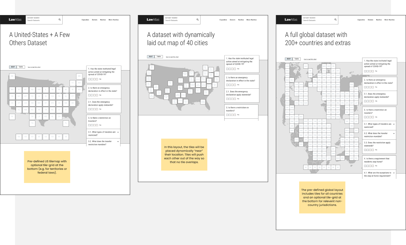
- Supporting a variety of jurisdictional levels, including cities, states, territories and countries.
- Handling heterogeneous dataset. While datasets are similarly structured, they’re not identical, so any visualization needs to gracefully handle outliers.
Insights

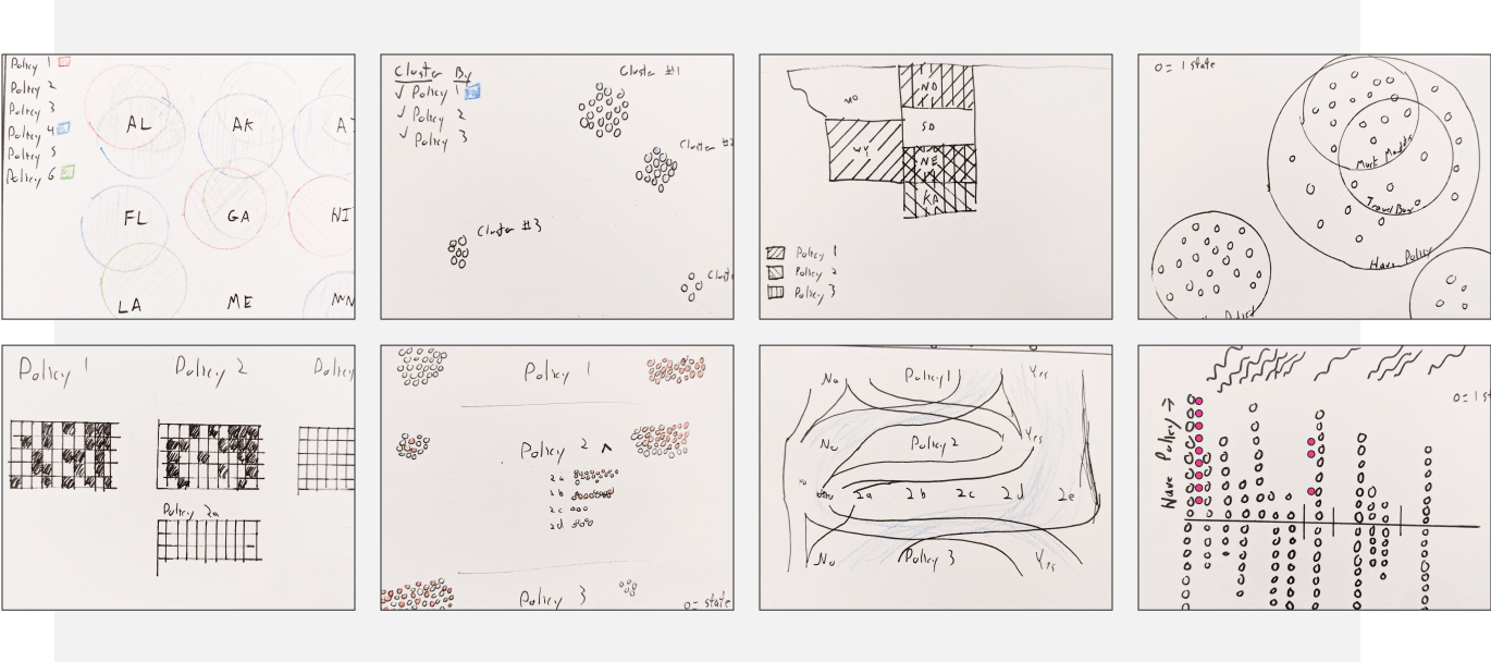
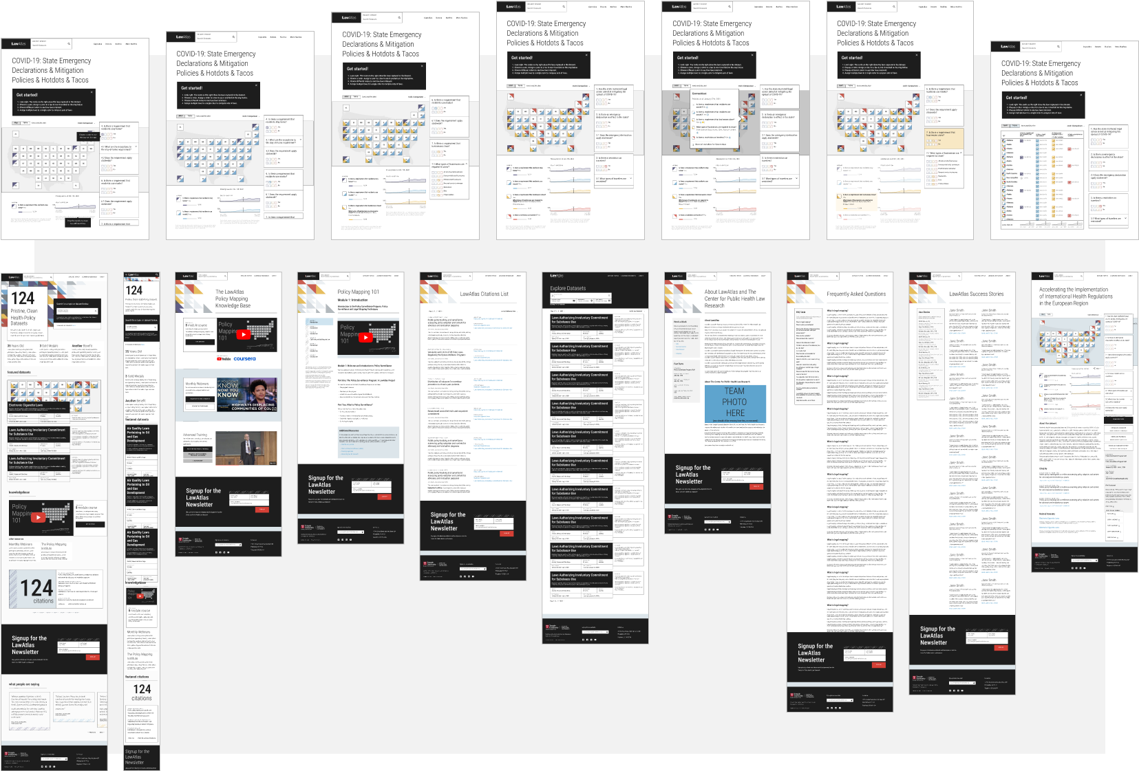
Data Visualization
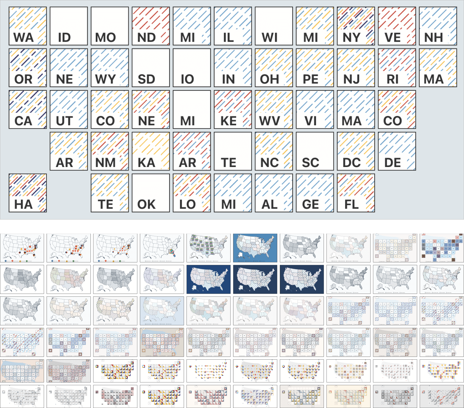
Would a choropleth work? While choropleth maps are a popular choice for similar clients, they’re limited to displaying only a single variable. To show policy groupings and co-occurrence, we’d need to show multiple variables at once.
Some research suggests as many as 6 or 7 different variables can be overlapped on a single surface, so we explored overlapping patterns to represent different (combinations of) policy attributes.
Benefits of Tile Maps: Geographic maps benefit from viewers’ spatial memory when looking to specific areas, however for this use case, the priority was visualizing an overall tally of adoption and supporting multiple variables, both of which benefit from tile maps’ fixed size per jurisdiction.
Interactivity can help manage complexity. Multi-dimensional datasets are inherently complex and quickly exhaust viewers’ cognitive capacity. The tool should offload this burden to the user’s mouse: additional context and reminders can be just a click (or hover) away.
Search and Discovery
All roads (searches) lead to Rome (data directory). Depending on users’ needs, they might favor different ways to identify datasets of interest, therefore search and filtering mechanics should support multiple paths (without introducing undue clutter or UI complexity).
Design
Solutions
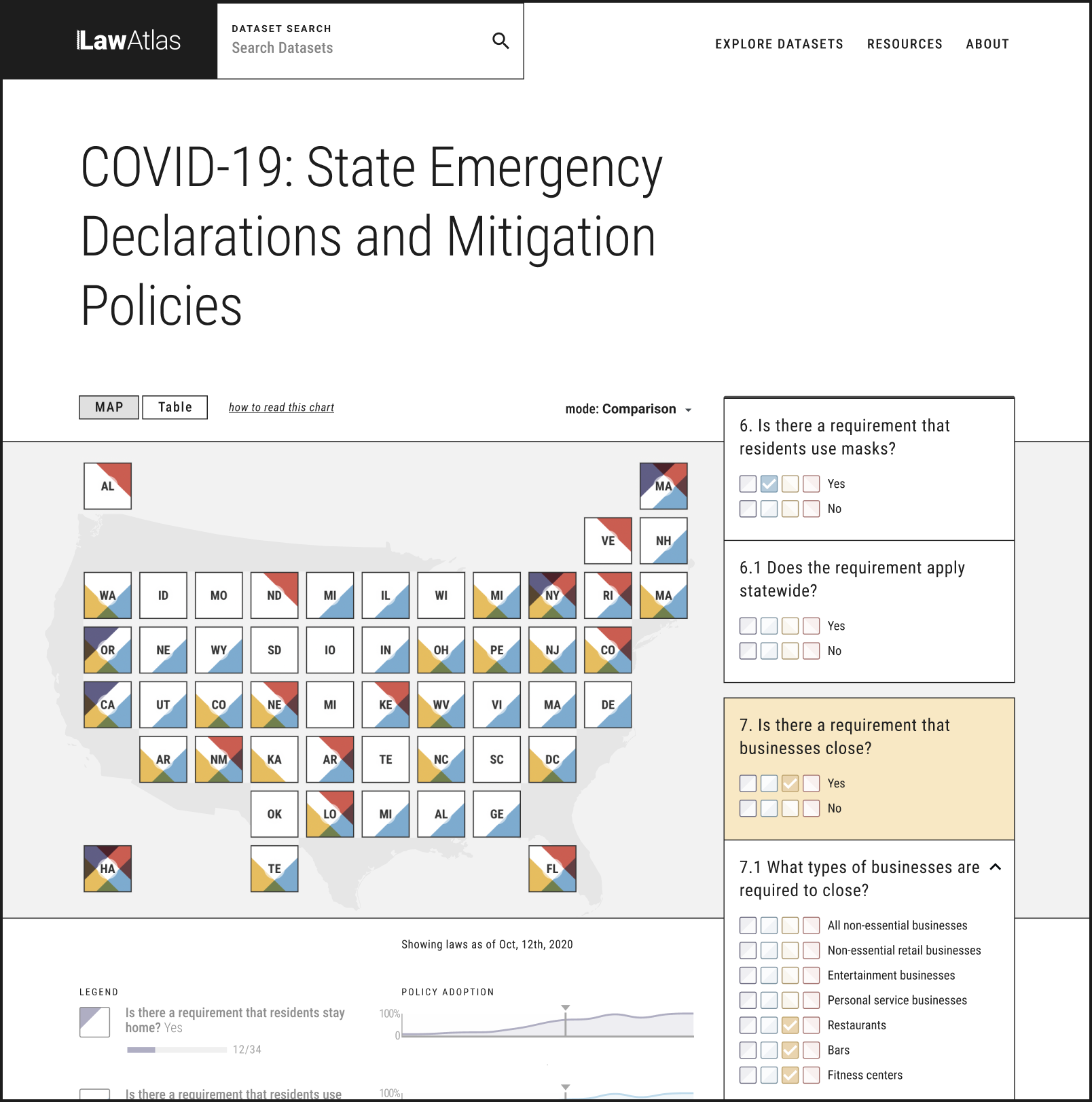
4-D Policy Tile Map Visualization. This tilemap approach makes it easy for users to see both overall adoption of a single policy and the tapestry of policy combinations across states by overlapping 4 distinct markers on each tile. The tilemap also supports the full range of geographies found in the datasets.
Interactive Dataset Explorer Tool. The Policy Map Visualization is manipulated through a 4-variable toggle for each policy attribute, where each variable corresponds to a color that appears on the corresponding tiles.
Universal Instant Search. To find datasets of interest, users can search for a specific dataset by keyword or filter datasets by topic. From the dataset directory page, users can filter by further criteria identified by the team.
Results
Live Site
The redesigned, relaunched LawAtlas explorer tool is available here.
Feedback
“This is fantastic. It is so intuitive. It took me no time at all to generate a map that can so easily be described to an audience"
“This site is truly a revolution in the way we share and communicate legal data."