Context
Prompt
How might we help a Fortune 500 pharmaceutical company educate healthcare professionals on the efficacy of a breakthrough treatment?
Background
The client recently developed a treatment for a condition that affects millions of people. In clinical trials, their treatment outperformed alternatives across a variety of dimensions: It provided more relief, to more people, faster and for a longer duration. As part of their campaign to educate healthcare providers on this new treatment, the client needed a way to visualize this clinical trial data.
Design Challenges
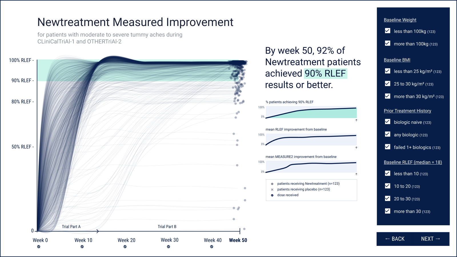
- Visual impact matching treatment impact. The standard metric for reporting treatment efficacy for this condition is the proportion of people who achieve a certain threshold of relief. This new treatment, however, is so effective that the majority of subjects achieved almost total relief, which results in a very dull graph!
- Humanizing clinical trial data. Healthcare professionals are inundated with data. This makes it easy to lose sight of the fact that, behind the data, there are real patients whose lives are impacted.
- Staying true to the science. Without exception, the visualization must strictly match the data from the trials.
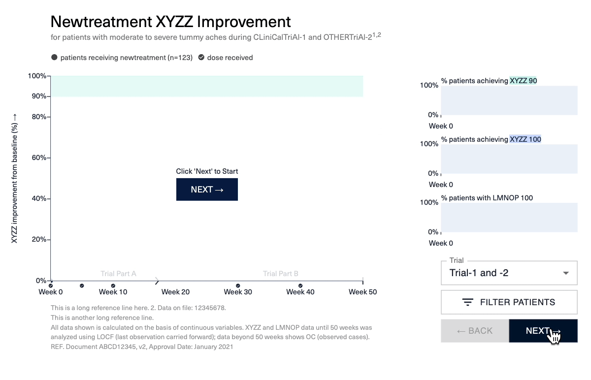
- Slicing and dicing. To show efficacy across a variety of patient criteria, the final product needed interactive filtering functionality.
Insight
Show everything. Under the right conditions, ensemble visualizations help viewers identify general trends from many, many data points. Since the trials were so successful, most of the 100s of patients had similar outcome trajectories (up and to the right). Plotting each patient’s history as its own line would help viewers 1) identify the overall trend through the ensemble effect and 2) appreciate that they’re seeing hundreds of subjects’ results. Each person’s results act as a texture that supports the overall story.
Design
Solutions
- Through research and client workshops, developed a story about what made the treatment uniquely successful (compared to alternatives) and, importantly, how the data can be quantified in a way that’s familiar to specialist physicians.
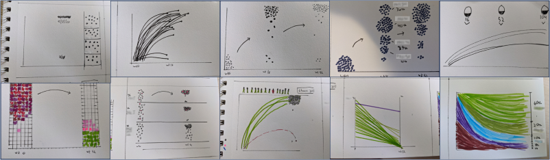
- Aligned client teams on design approach through a series of brainstorming and concepting exercises.
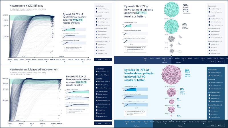
- Designed high-fidelity mockups and prototypes to show how the final visualizations would look with realistic data (this is particularly important for data-as-texture visualization approaches) and how the final product would reflect the company’s brand.
- Developed custom javascript pipeline to dynamically calculate metrics and render each patient’s individual line to an HTML canvas. This was optimized to ensure performance and support smooth animations across browsers, even on older iPads.
- Developed a custom React app, packaging the visualization into a tool that the client’s education teams could use when presenting to healthcare professionals.
- Worked with client analysts through rigorous audits to make sure the underlying data and visualizations were true to previously published research.
Results
- Successfully launched the visualization tool.
- Achieved a compelling visual story (“I thought [the visualizations] were absolutely stunning”) and stayed true to the science (approved by client’s science and medical communications teams).
“Absolutely stunning!”