Context
Client
A large, multinational market and public opinion research firm.
Prompt
How might we help non-profit and NGO analysts understand the landscape of diverse social support groups in Uganda?
Background
The client recently finished a multi-year research project, surveying different populations across nearly every district in Uganda. The client asked us to help find the stories in the data and design an interactive tool for exploration.
Goal / Challenge
Many-to-many storytelling. The tool would be used by many different groups of users, each with different interests and priorities. The data also contained many unique and interesting stories. So how do we help the right users find the right stories?

Design

Insights
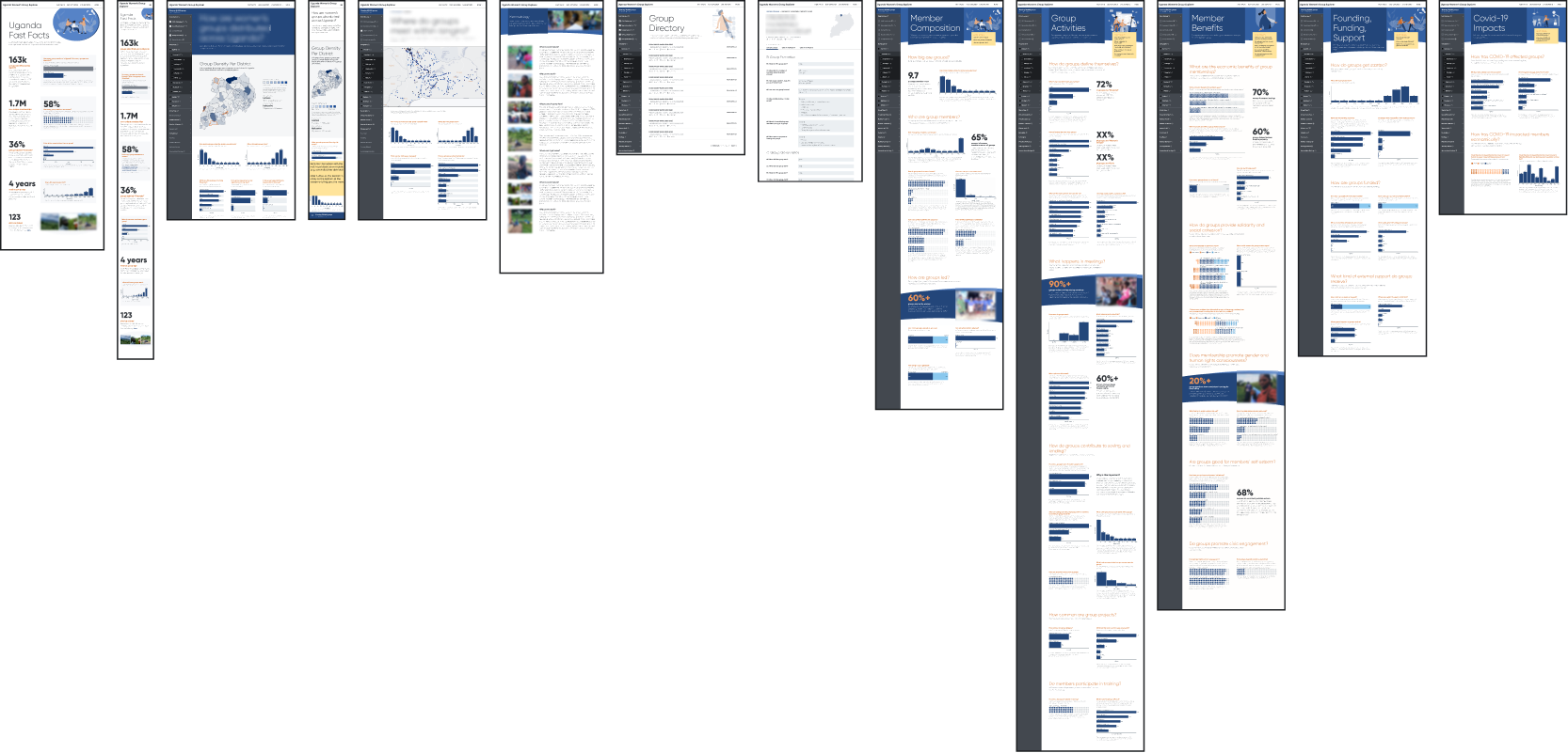
- Break the stories up into chapters. By grouping insights into a number of different themes, we can offer an information hierarchy that is easily navigable while still allowing related insights to build on each other.
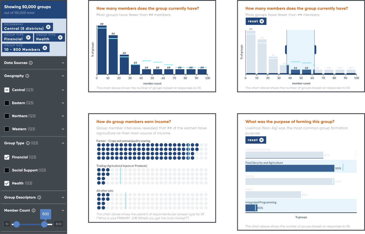
- Interactivity to functionality without expanding scope. With tools like universal filtering, the same charts and graphs can be viewed through a variety of different lenses, answering more questions with fewer charts.
- Keep charts simple. While some projects benefit from fine-tuned, custom visualizations, for this project, with this much content, the story is best told by composing many simple charts that work together as a group.
Solutions
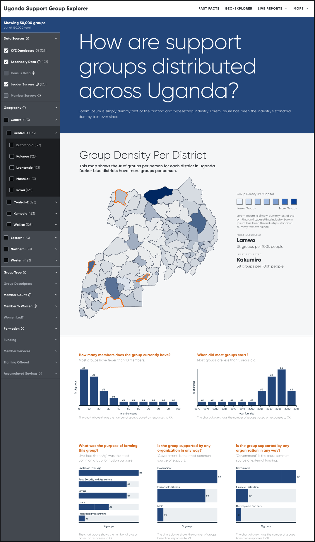
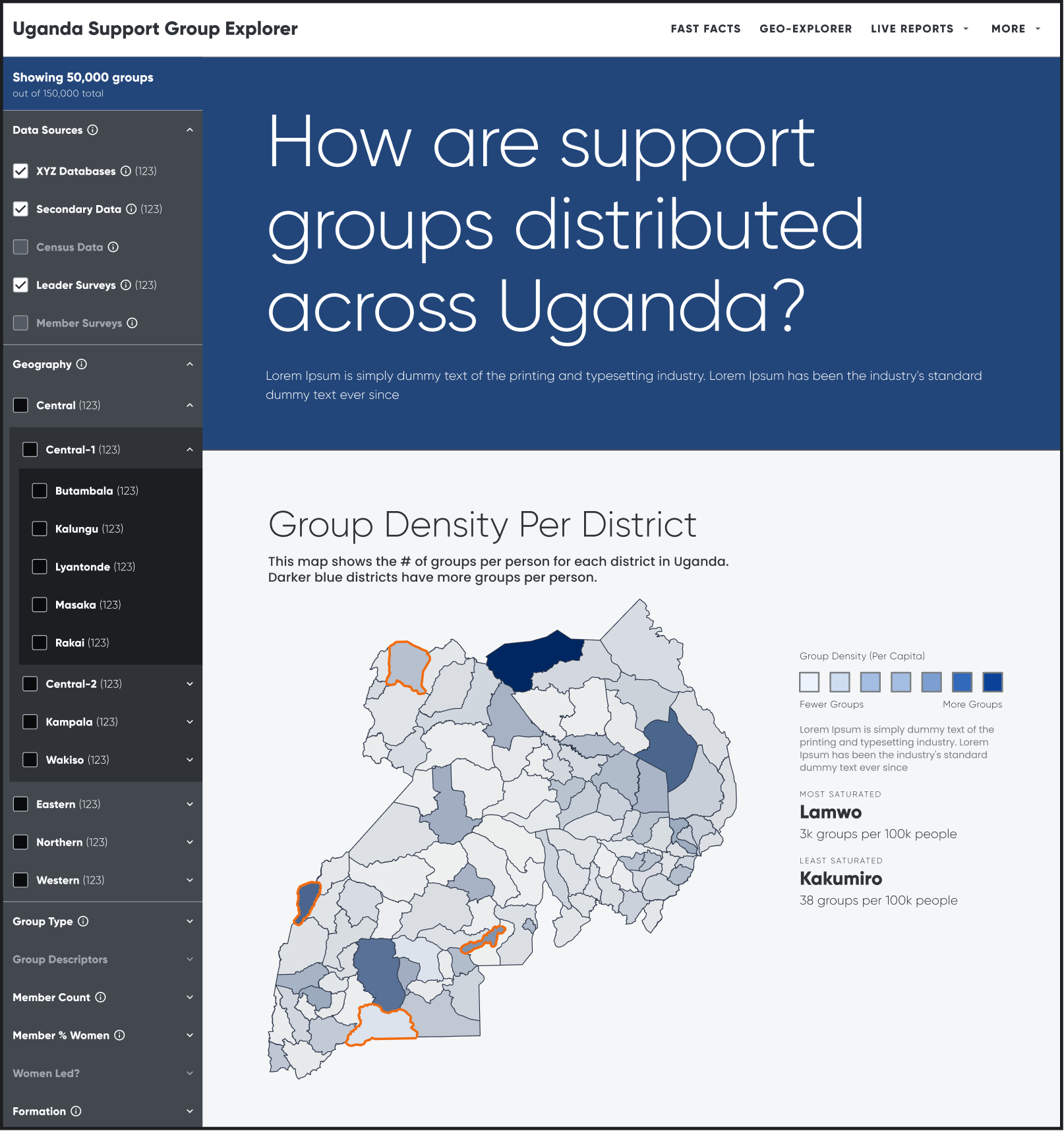
- Geographic Explorer: To understand the densities of particular groups, we designed a 2-layer geographic explorer. The first layer was a choropleth map, showing group density by district. Users could then click into certain districts to see how groups are dispersed within the region.
- Group Directory: To help analysts identify specific groups that meet their theories-of-action, groups could be sliced and diced within the group directory.
- Live Narrative Reports: To help new users (or exceptionally busy users) grasp key takeaways, a series of “live” reports could be read through linearly, or combined with filtering tools, for exploring various themes in greater depth.


