Context
Client
Worklytics is an industry leader in workplace analytics, helping organizations measure & continuously improve the way they work.
Prompt
How might we visualize workplace benchmarks, with humanity, clarity, and style?
Background
Data becomes “actionable” when it’s misaligned with our expectations. For example, knowing that employees spend 20 hours each week in meetings might be an interesting “fun fact,” but what can you do with it?
Is 20 hours good or bad? If bad, how bad? How urgently does it require your attention?
To answer this, you need to know what’s “normal.”
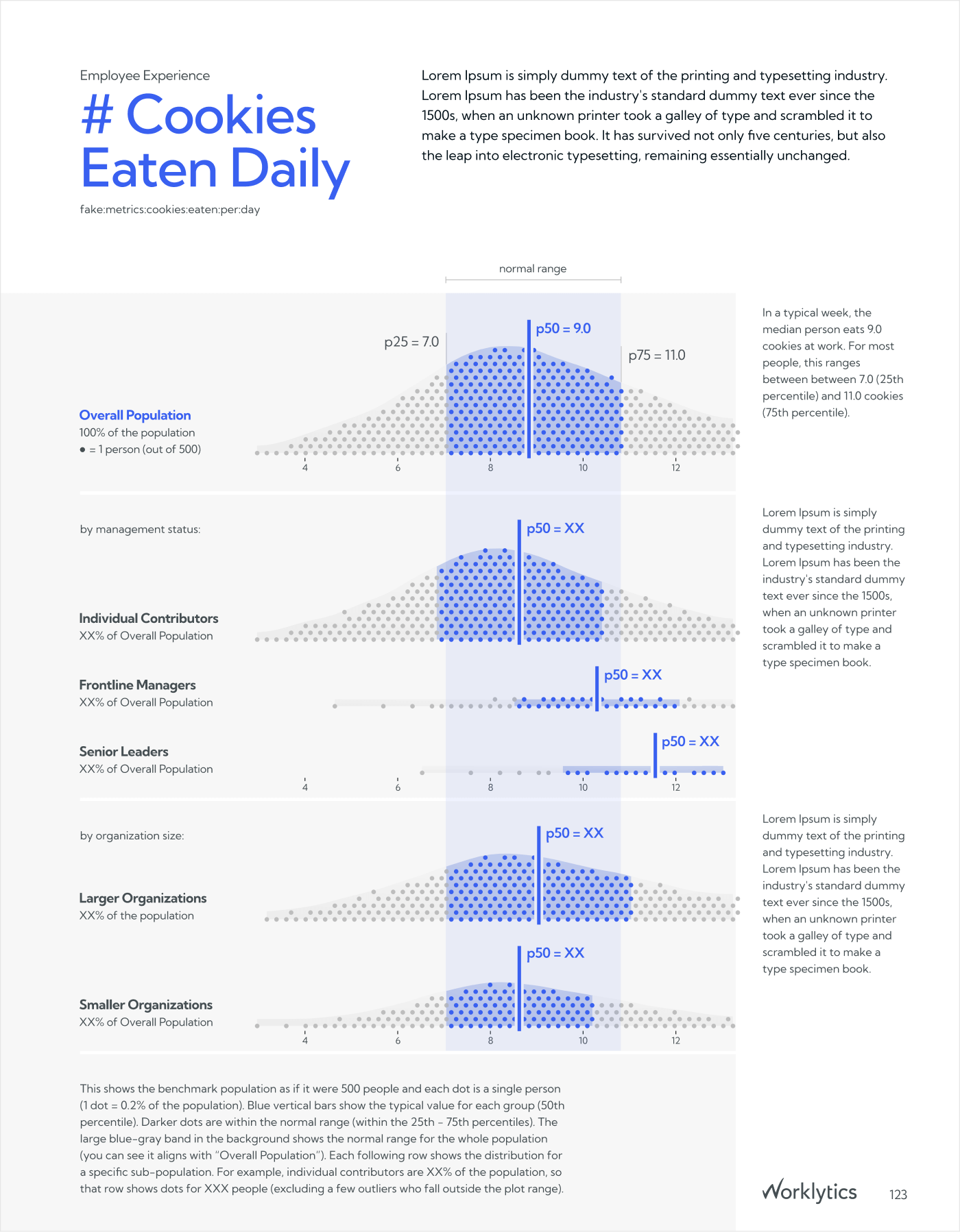
Benchmarks help you pair “20 hours per week of meeting time” with context like “compared to hundreds of thousands of similar office workers, 20 hours a week is an extreme outlier, higher than XX% of the population.” This makes it clear that 20 hours is a crazy amount of time and that your teams’ meeting habits might need some attention. This realization is the first step toward actions like improving meeting hygiene, better collaboration tooling to encourage asynchronous communication, or adopting practices like “no meeting Wednesdays.”
Worklytics’ benchmarks provide this important extra context and make up one of the world’s leading datasets on “what’s normal?” at work. The Worklytics Benchmarks Report showcases these benchmarks and educates customers on how to use them in their own analysis.
Design
Challenge #1: What does “normal” look like?
When designing the main benchmark visualization, we needed to balance clarity and approachability, while playing nicely with Worklytics’ existing visual language. Fortunately Worklytics makes this easy. They’re not shy about leaning into more expressive charts like jitter plots, which feature prominently in their app and in their reporting.
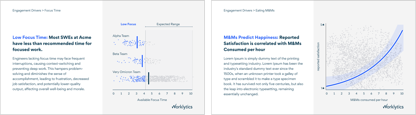
Plots like these are powerful for visualizing people analytics data because they a) have an easy, concrete visual metaphor (1 dot = 1 person), b) they promote better business decisions in a variety of scenarios since they show the full range of outcomes, and c) they can be quite compact and easy to lay out in dense reporting.
Jitter plots have an important drawback though: Because they’re compact, they tend to hide the shape of the underlying data. Since the benchmarks are detailed enough to show the shape, and the shape is an important part of the story, we wanted to show it off. It’s also a great source of visual variety, which goes a long way toward differentiating metrics in a long report.
Insights
Show more data: For the benchmarks, showing the full distributions of data is important.
While conventional business reporting favors simple-seeming charts (e.g. bar charts of averages), these overly simplistic visualizations are often misleading (Wilmer & Kerns 2022). Hiding outcome variability encourages misjudgements about the causal stories behind the data (Holder & Xiong 2022).
Related biases can also impact a variety of other business decisions, like overpaying for programs that only offer marginal improvements (Hofman 2020). More expressive charts like jitter plots or quantile dot plots avoid these issues by showing the full range of data.
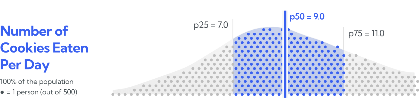
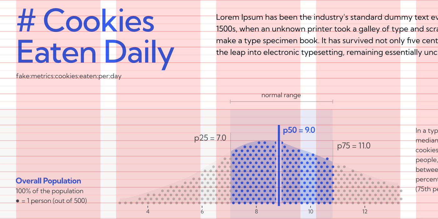
Lead with the familiar: While averages and medians are only a small part of the story, they’re still the first thing people look for. By overlaying the bright blue median bar (p50=9.0) and giving it the most visual weight, we can ensure the charts keep viewers in their comfort zones, meeting their immediate expectations and even minimizing certain types of decision bias (Kale 2020). Because the prominent median gets noticed first, the additional detail of the distribution is purely additive—adding context—without sacrificing the immediacy of a more familiar plot, like a bar chart. Detail doesn’t have to be distracting.
Benchmark ranges. The charts also highlight the interquartile range of the benchmark distributions, with blue dots and shading from the 25th to the 75th percentiles. Benchmarks aren’t goals, at least not necessarily. However, our research and others’ show that charts like these can be highly influential (Holder & Xiong 2023, Milkman et al 2021, Allcott & Mullainathan 2010): It’s human nature to shift our attitudes and behaviors to align with perceived social norms.
Presenting the benchmarks as a range of outcomes avoids being overly assertive about the importance of any particular point on the spectrum, which is a judgement best left to customers. At the same time, to the extent that organizations would like to shift toward the benchmarks, targeting a range of acceptable outcomes can be more motivating toward longer term perseverance in behavior change, relative to a goal defined as a point value (Scott 2013).
Proven approachability: Quantile Dot Plots help data-shy audiences understand variability and uncertainty. These charts are well-studied within the VIS community and reliably effective, even for helping random people at a bus stop to predict uncertain bus arrivals (Kay 2016). This works because the individual dots are concrete and (potentially) countable. This affords a simple, but powerful visual metaphor: You can read the chart by imagining each dot is a person, and they’re all lined up based on their outcome on the chart.
Good dataviz is good writing. Even with proven charts, data-literacy issues can put insights out of reach for some audiences. For this reason, it’s always good to provide detailed “how to read this chart” explainers. It’s also good to tell the same story in multiple ways, both visually and in writing. This has an added bonus of assisting memorability, as people remember soundbites from chart titles more than the charts themselves (Kong 2019).
Challenge #2: Information Overload.
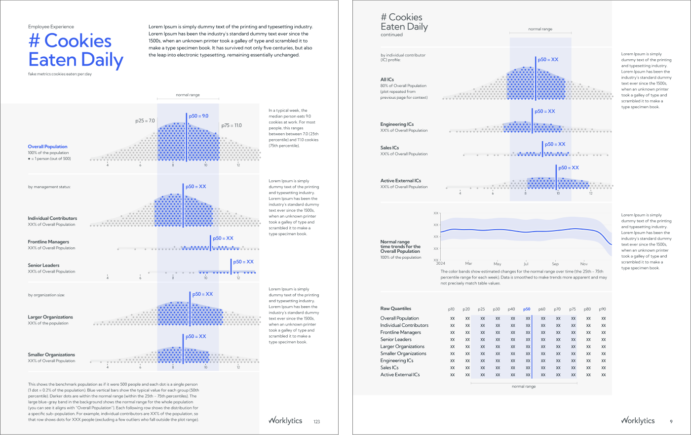
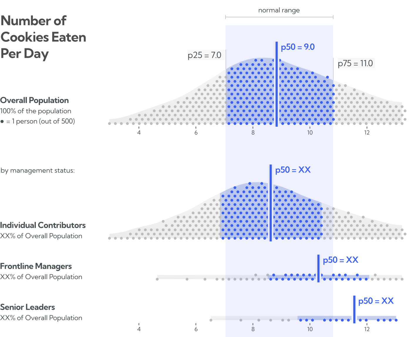
In addition to benchmarking the overall population, Worklytics also provides benchmarks for eight specific subgroups like frontline managers, software engineers, or people who work at huge corporations. While this enables customers to make more “apples to apples” comparisons, it adds quite a bit of density.
Insights
Small multiples. Aligning the plots vertically into small multiples gives viewers enough space to consider each subpopulation individually, while also making it easy to compare between rows, to see how metrics differ between groups.
Blue normal range anchor. To further facilitate between-row comparisons, we extended the normal range for the overall population all the way down the page (and onto the second page) as the soft blue band in the background. This makes it easier to compare subpopulations to the overall norm, without having to bounce your eyes up-and-down the page (Franconeri 2021). As an added bonus, it also serves as a pleasant structural element on each page, guiding your eye toward the most critical content.
Dot counts as differentiation. To reinforce the idea that each row represents a distinct subgroup of the overall population, and convey how these subgroups can differ dramatically in size, the number of dots on each row is proportionate to the size of the subgroup. For example, you can see there are only a handful of dots on the senior leaders row, because senior leaders are only a small proportion of people within a typical organization.
Strict Baseline Grid. To minimize visual noise, each chart and all text elements were carefully aligned against a consistent grid, both vertically and against a text baseline. This gave us room to pack in more information while avoiding a cluttered feeling.
Challenge #3: Where’s the action?
While the metric pages were designed to minimize clutter and overload, the scope of the report added another challenge: It’s 89 pages long and covers 35 metrics. And each metric includes eight profiles and 12 charts.
Benchmarks make data actionable, but with this much material, how do we guide viewers toward “the action?” How can we use the report to demonstrate the types of comparisons that make this data valuable?
Insights
Always be educating. Introductory material sets up the rest of the report for success. We expect that most viewers will quickly flip past this on their way to the main content, but even scrolling through they can gain a gut sense of what to expect from the report and gain some exposure to the visual language. And, as questions pop up, they’ll know exactly where to look first.
Follow the blue path. The blue band through each page represents the benchmark range for the overall population. This element does a lot of work within each page (e.g. it’s a visual anchor, as well as a reference for the charts), but it also works between pages. As viewers navigate from section to section and metric to metric, the blue band shifts positions horizontally, giving each section a unique fingerprint, while indicating transitions between metric sets and previewing their distributions.
Action in the outliers. Benchmarks are actionable because they highlight data that doesn’t match expectations. They reveal outliers in the organization, which represent the biggest opportunities either for improving stale processes (e.g. senior leaders getting first dibs on cookies) or finding exceptional teams worth emulating (e.g. the lower tail of senior leaders who eat a reasonable amount of cookies).
So the best way for analysts to use the benchmark data is looking for places where their organization and the benchmarks are misaligned, then digging deeper to figure out why. Because the overall population acts as a “benchmark of benchmarks,” we’re able to use this approach in the report by showing each groups’ normal ranges in high contrast blue, making it easy to spot parts of their curves that are misaligned with the overall population, demonstrating this as a technique that Worklytics’ customers can do in their own analysis.
Results
"Benchmarks drive real interest from and value for our customers, but they can be challenging to navigate across so many metrics and personas. That's why we're so glad to work with Eli on projects like this. He has a reliable talent for distilling that complexity into data stories that are both sophisticated and accessible, even for our customers' busy executives. He also kept us well-informed every step of the way and clearly articulated his thought process at key decision points. Our customers loved the results, we loved the process. Amazing work all around!"
The report is live here:
The Worklytics Benchmark Report, Version 2.