Context
Prompt
The World Government Summit asks: “What Just Happened? What’s improved? What’s broken through? What’s gone supernova? Charting our development across many different metrics over a 10 29 year period to highlight the successes - and the bottlenecks.”
To reduce harmful emissions, and encourage a net-zero world, it’s important to understand where these emissions come from. To that end, we thought we’d use the WGS retrospective prompt to look back at sources of Greenhouse Gas emissions.
Challenge
How might we…?
- How might we understand emissions in a way that promotes climate justice? While climate change is everyone’s problem, some countries have contributed to it disproportionately.
- While absolute magnitudes of emissions are important for prioritizing opportunities, a country’s responsibility for the current climate crisis doesn’t necessarily scale with their overall emissions.
- For example, India is one of the world’s largest emitters of Greenhouse Gases. But as the second largest country in the world, this reflects their size, not necessarily their relative responsibility.
Insights
In “Quantifying national responsibility for climate breakdown: An equality-based attribution approach for carbon dioxide emissions in excess of the planetary boundary,” Jason Hickel offers an insightful framework for determining a country’s “fair share” of greenhouse emissions.
If we can quantify how much a country should emit, we can draw comparisons to how much they actually emit.
This will allow us to explore absolute emission magnitudes, but with the needed context to avoid painting an overly harsh view of countries like India (with large populations, but low per-capita emissions).
Design

The Poster
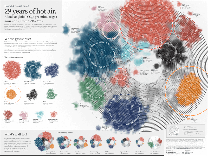
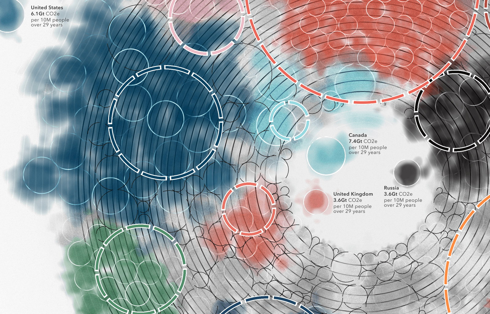
This poster explores global cumulative greenhouse gas emissions from 1990 - 2019. Emissions for each country are shown with small, white rings filled with colorful puffs of air. Each country has 1 puff per 10M people. Puff sizes show typical emissions for those 10M people, over all 29 years, such that the total area covered by all puffs represents the total emissions for the country (each pixel ~=4Gt of CO2e).
The larger, color rings represent each country’s “fair share” of emissions, based on Hickel, 2020. Comparing total “puff area” to the area of each “fair share” ring shows how much excess CO2e a country has emitted (e.g. US / EU / Canada “overshoot” their budget, while India has low emissions relative to its size).
For comparison, the 30 biggest rings in the background represent total global emissions for each of the 29 years (also scaled to 1px ~=4Gt of CO2e).
Methodology
Data and Analysis
- Data is from ClimateWatch, as cited by The World Bank which was originally referenced in WGS’ sample data.
- “Fair Share” emissions were calculated as a proportion of average population, using Jason Henkel’s framework in “Quantifying national responsibility for climate breakdown”
Technology:
- Javascript
- Three.js / GLSL
- Figma

