
Equitable Epidemiology
Can risk ratios be risky? Can proportional mortality rates disproportionately increase mortality? Can adhering to communication conventions undermine adherence?
Epidemiology conventions, which may be perfectly suitable published in The Lancet, require different considerations when produced for the public.
Please get in touch to set a date!
Equitable visualizations support healthier populations. Thoughtful data design can play an active role in correcting health misbeliefs and harmful stereotypes, as well as supporting impactful communication goals like risk perception, public support, and behavioral adherence.
On the other hand, conventional ways of visualizing group health outcomes can be actively harmful.
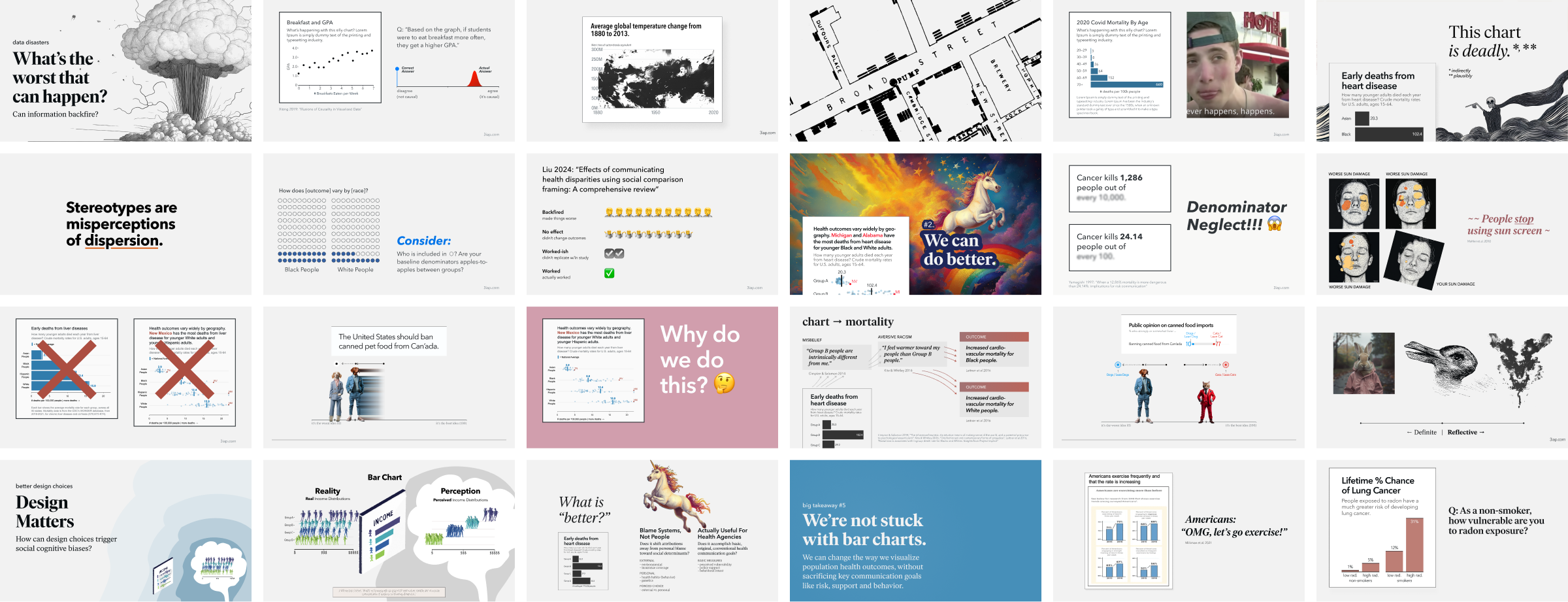
In this workshop, we’ll learn how to visualize population health to support health outcomes that are more equitable for priority populations, and more effective for the whole population in general.
After these workshops, health communicators will:
1. Understand how data visualization can impact health communication goals like perceived vulnerability, public support for health policies, behavioral intent, and attributions to social determinants of health.
2. Appreciate how popular conventions for visualizing group outcomes can reinforce harmful misbeliefs about population health, and how these misbeliefs can actually undermine health outcomes for the populations being visualized.
3. Make alternative chart choices to more effectively, equitably convey population health outcomes.

The workshops are for health communicators involved in producing public-facing visualizations of population health outcomes, in particular:
- Analysts, educators, communicators, and administrators at municipal, state, or federal health agencies
- Advocacy groups using data to promote health equity
- Data journalists covering health policy
Material can be adapted based on your groups’ needs and interests, to cover various themes. Each session requires 60-90 minutes, including a presentation of the topics, supporting example redesigns, questions and discussion, and group exercises. Workshop case studies can also be customized to handle your specific data and use cases.
Recommended rates are as follows, however pricing can be flexible to meet your organization's needs.
Large Group Talk: To motivate the topic and introduce the concepts to the wider organization:
- Single 45-minute primer talk, plus two case studies and Q&A
- $4,000 per 50 attendees
Interactive Workshops: To support group discussion and explore more targeted topics in greater depth:
- One to two deep dive sessions, including interactive group exercises and discussions
- $159 per participant per session, for 10–25 participants
Please get in touch to schedule a date.
- Email hi+workshops@3iap.com
- Book a time on 3iap's Calendly
- Or use the form below to send a message
Quick contact form
Add your information below and we'll get back to you right away.
