
Visual Villainy
You’ve heard “how charts lie.” Maybe you’ve fibbed with statistics. Perhaps you’ve even dabbled with truncated y-axes. But this talk will encourage you to be even more ambitious with your evil data deeds.
Instead of just misleading audiences, why not unravel the social fabric of society? Or sabotage an election? Or spread misinformation?
To do this, we’ll explore an evil toolkit of design techniques that are scientifically proven to promote the three P’s of evil dataviz: Plagues, Prejudice, and Polarization.
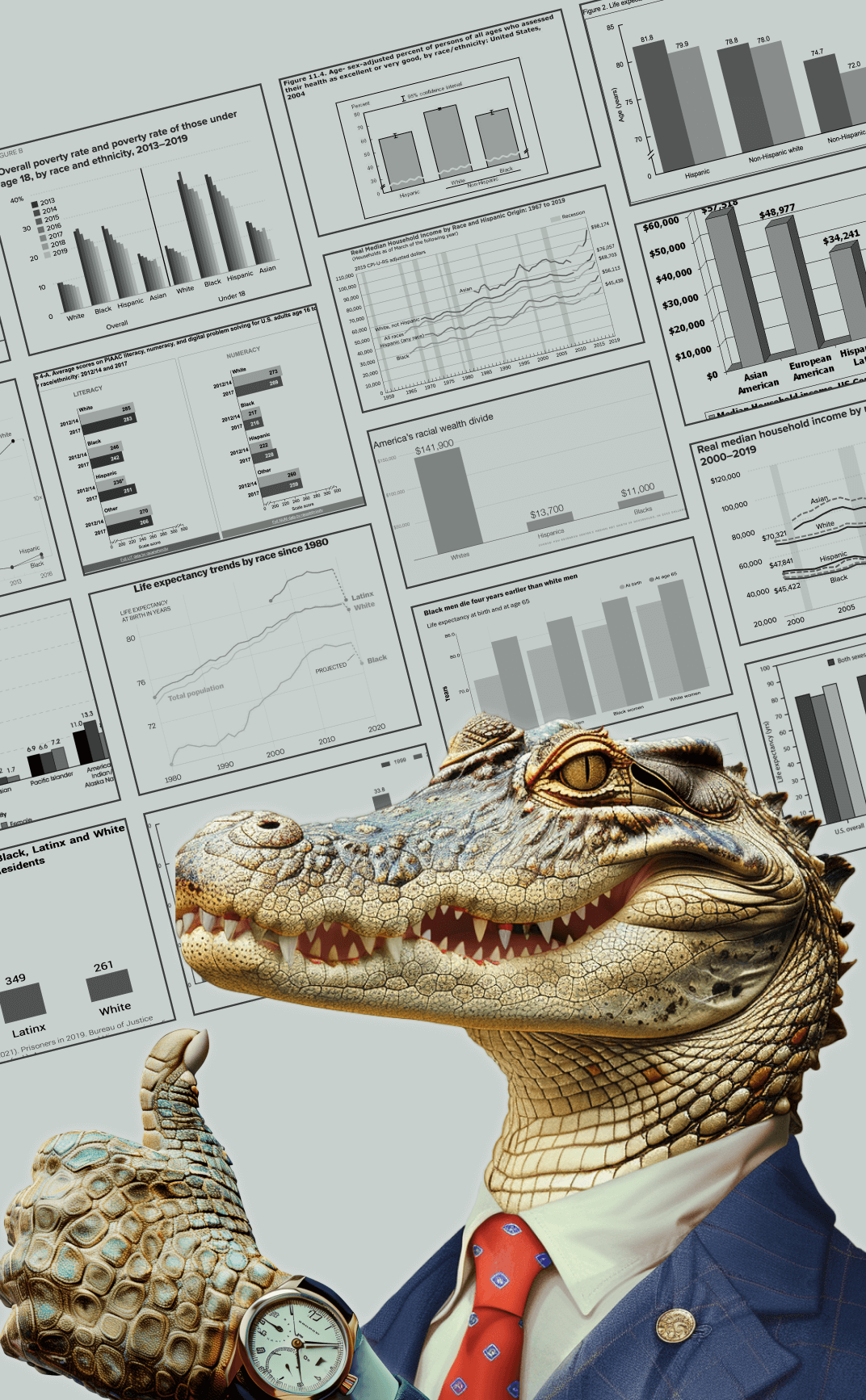
Let’s say you’ve been hired by evil alligators to create evil dataviz. Your design goal is to unleash havoc and general mayhem. How might we use dataviz to sow division, spread pandemics, and convince your fellow citizens that climate-change-induced sea level rise is in their best interest?
Your goals may not be so nefarious, but your charts might be. Trusted institutions like the EPA, CDC, and Census Department don’t intend for their data to cause mayhem, but this is often the effect.

This humorous keynote is adapted from Eli Holder and Gabrielle Merite's Outlier 2024 keynote address. It promotes positively influential dataviz through a bit of silly reverse psychology.
In this workshop, we’ll learn ways to make better non-evil dataviz by exploring some of the many odd ways data visualization can be accidentally evil. We’ll review recent dataviz research projects related to the social impact of data visualization, data advocacy and data journalism.
By highlighting ways to make evil charts, we hope to give social-impact oriented data communicators a more intuitive sense of the ways that data advocacy can backfire and some alternative approaches for creating more positively disruptive charts.


After this workshop, attendees will learn:
Motivation. Understanding the latest research on the downstream consequences of social misbeliefs, and how they’re promoted by popular, conventional wisdom in data visualization design.
Awareness. Using the ABSURD framework to identify six critical sources of information backfire and how they manifest in public facing dataviz.
- Always Be Neutral
- Blame People Not Systems
- Stir Dissent With Stereotypes
- Undermine Social Norms
- Repeat, Repeat, Repeat
- Doomsday
New visualization techniques. Learn alternative visualization approaches for social impact, by tracing chart examples from “good” to “evil.”

This talk is intended for general audiences interested in data visualization and social impact.
This is a 45 minute keynote talk, intended to engage large audiences and provoke conversation. It can be followed up with questions and discussions or breakout sessions.
Talk case studies can also be customized for your specific data and subject matter.
Please get in touch to schedule and discuss.
- Email hi+workshops@3iap.com
- Book a time on 3iap's Calendly
- Or use the form below to send a message
Quick contact form
Add your information below and we'll get back to you right away.
