Introduction
What are data visualization applications?
There are 3 types of dataviz applications:
1. Data storytelling apps
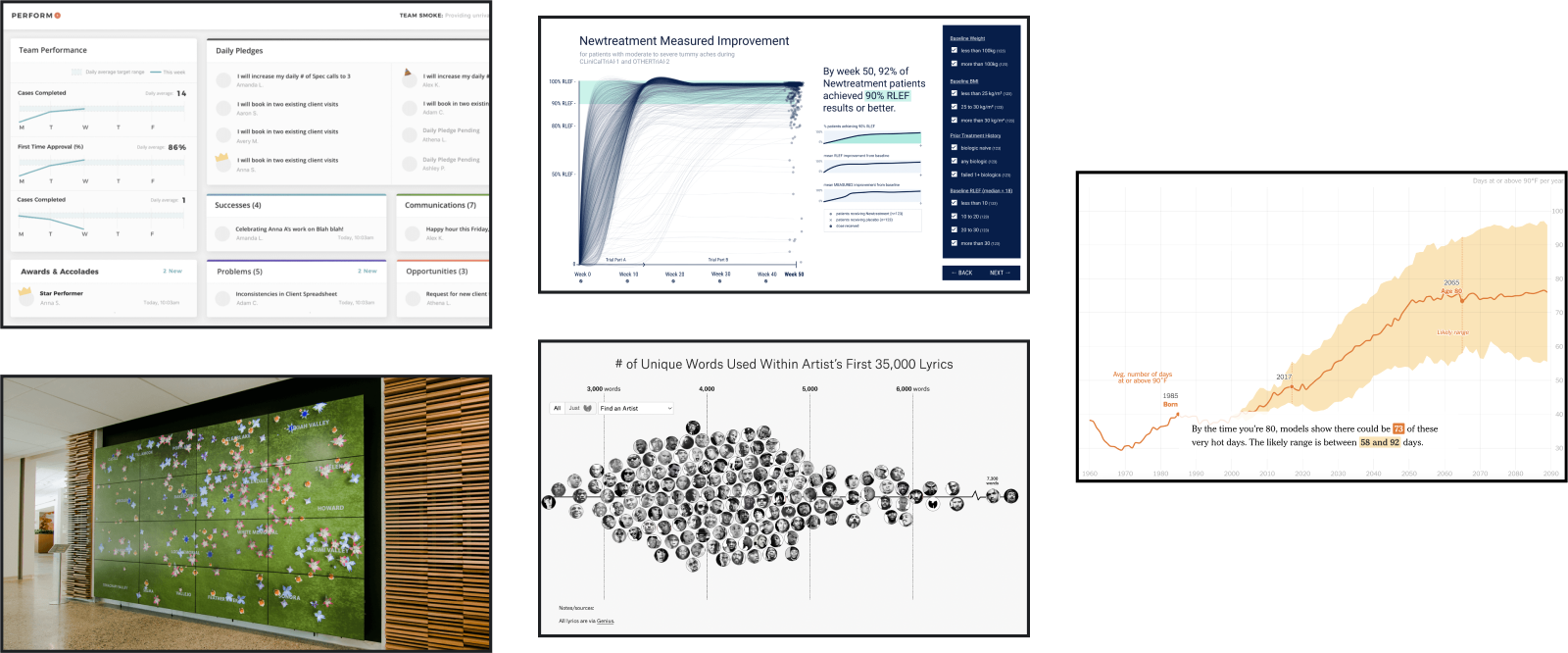
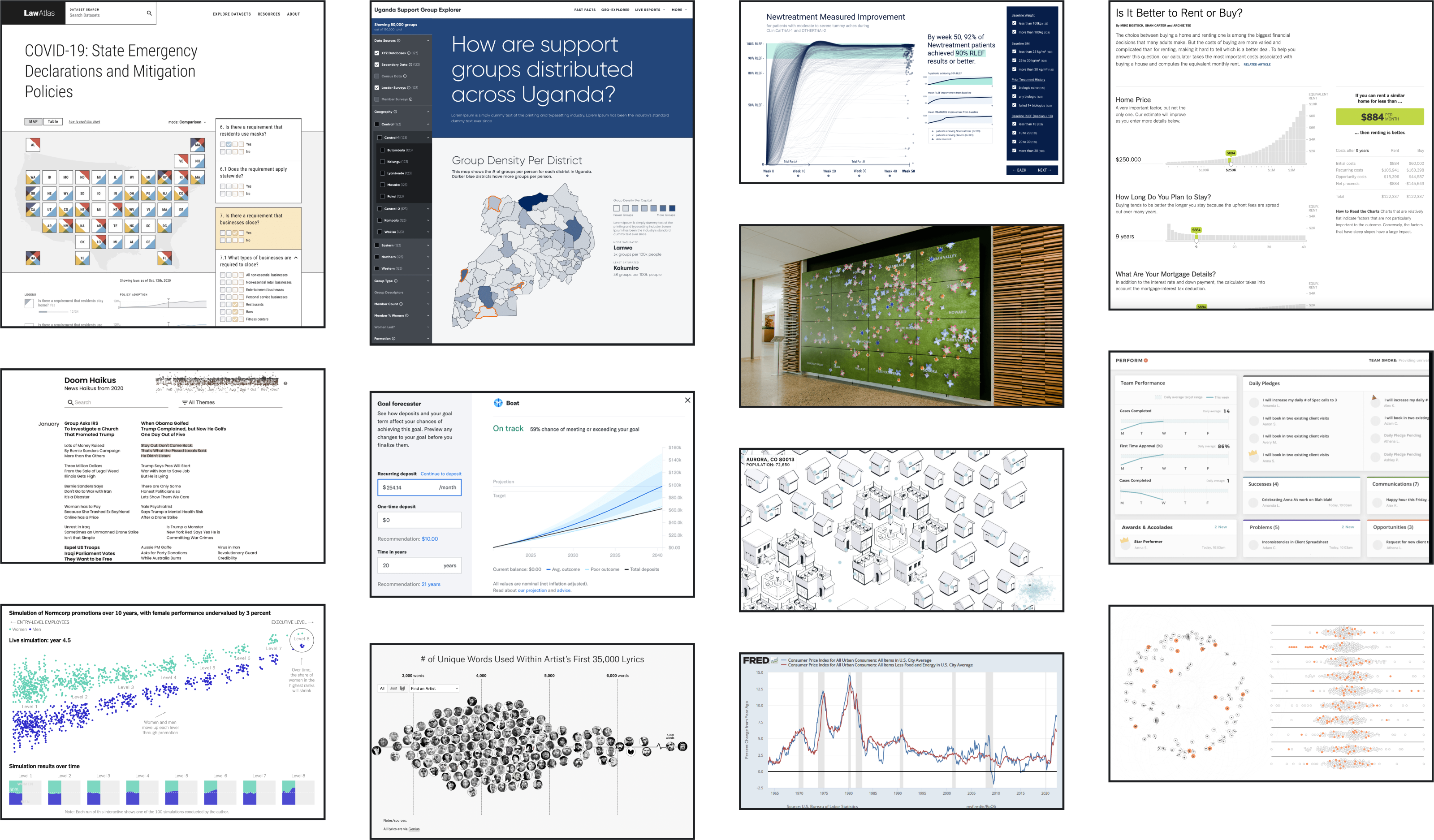
Storytelling dataviz apps, typically focused on a narrative, aimed at educating and raising awareness around the most important findings or insights in a dataset. These often come in the form of web-based, linear scrollytelling experiences, such as the projects featured on The Pudding. These can also be interactive, for example see 3iap’s recent work visualizing clinical trial data, which includes narrative elements and interactive filtering.
2. Data exploration tools
Data exploration apps focus on flexibility, helping audiences use dataset(s) to answer a potentially infinite, long-tail of questions. This turns dense data into an resource that non-savvy consumers can use for general reference, or very advanced users can use for complex analysis. These are typically web-based and let users slice, dice and visualize data in a variety of ways. The St Louis Federal Reserve’s FRED tool is the quintessential example of a data exploration tool. 3iap’s recent work visualizing health policy datasets includes both dataset search and discovery, as well as custom visualizations.
3. Simulators and calculators
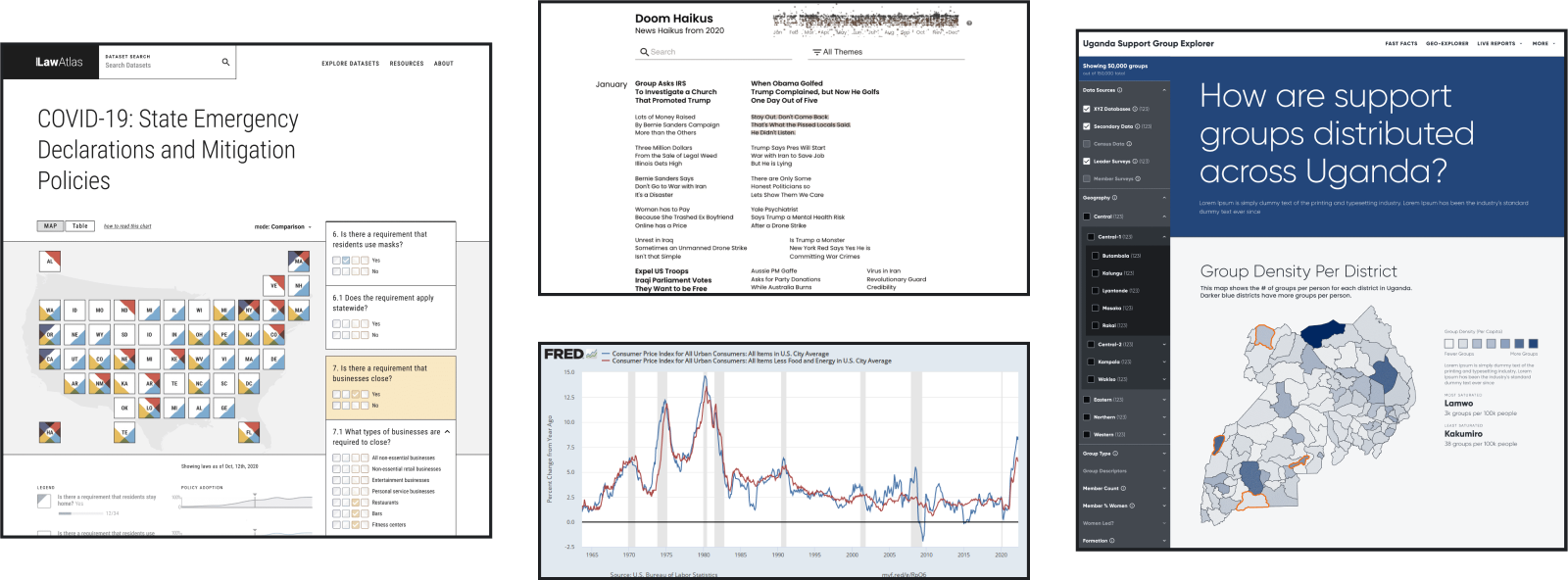
Calculators and simulators help audiences “experience” datasets or complex models. This approach is particularly valuable when helping users make analytically difficult decisions, such as Betterment’s calculator for retirement planning or The New York Times’ famous mortgage calculator. This can also help everyday readers visualize complex social phenomenon, such as Jessica Nordell’s gender discrimination in the workplace simulator, Shirly Wu and Stephen Osserman’s People of the Pandemic, The Washington Post’s animated Covid Simulations, or Eli’s Social Polarization Simulator.
What tools and technology are used to build data visualization apps?
- Web Applications / Javascript: Custom dataviz apps are most frequently built for the web, with tools like D3, React, Svelte, or Three.js.
- Mobile Android / iOS Apps: In product visualizations, especially those targeted at creating consumer feedback loops, will be built directly into the products’ apps.
- Native Code / Unreal / Unity: For museum or corporate office installations, data visualization — and occasionally data art — can be built using common web stacks, but often use lower-level technology like C++ or game engines like Unreal or Unity.
How much do dataviz apps cost to design and build?
Learn about the cost to develop data visualization apps here.