Introduction
Table of Contents:
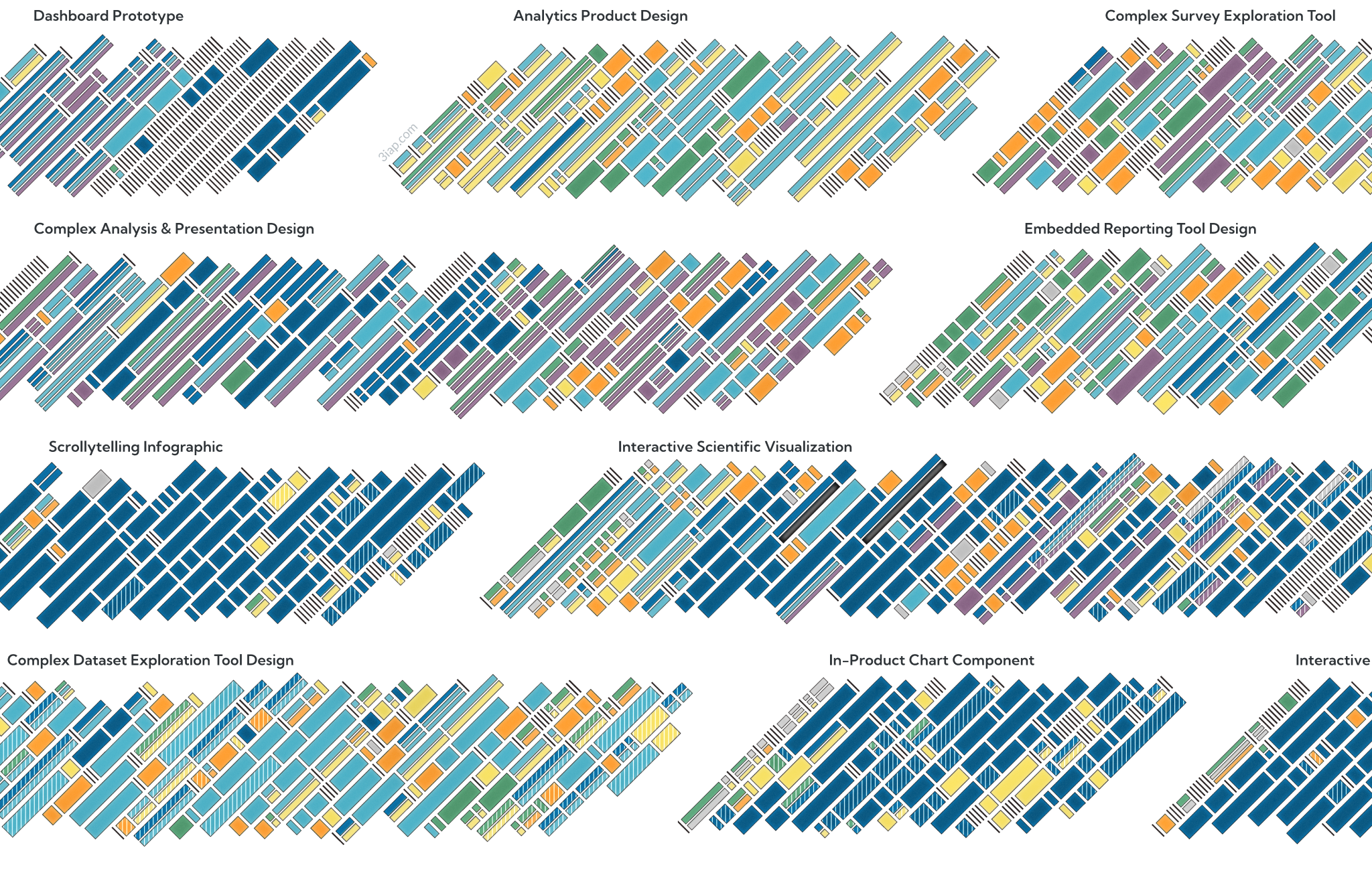
What services do data visualization consultants typically offer?
Data Storytelling. Data-backed insights can influence everything from purchasing decisions to public policy. Expert data designers help transform these findings into an approachable, memorable narrative that’s visually appealing enough to break through the noise in our newsfeeds and inboxes, to reach, engage and educate busy and distracted audiences.
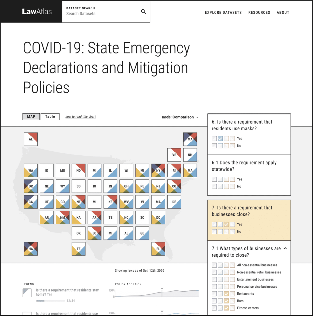
Custom Visualization Tools. Unique datasets answer unique questions. For example, large, opendata datasets can inform a wide variety of research and analysis, but the way the data will be used is difficult to predict ahead of time. Experienced data visualization developers can design and build interactive data exploration tools and custom applications, purpose-built to support common questions for a dataset, while also supporting open-ended insight discovery.
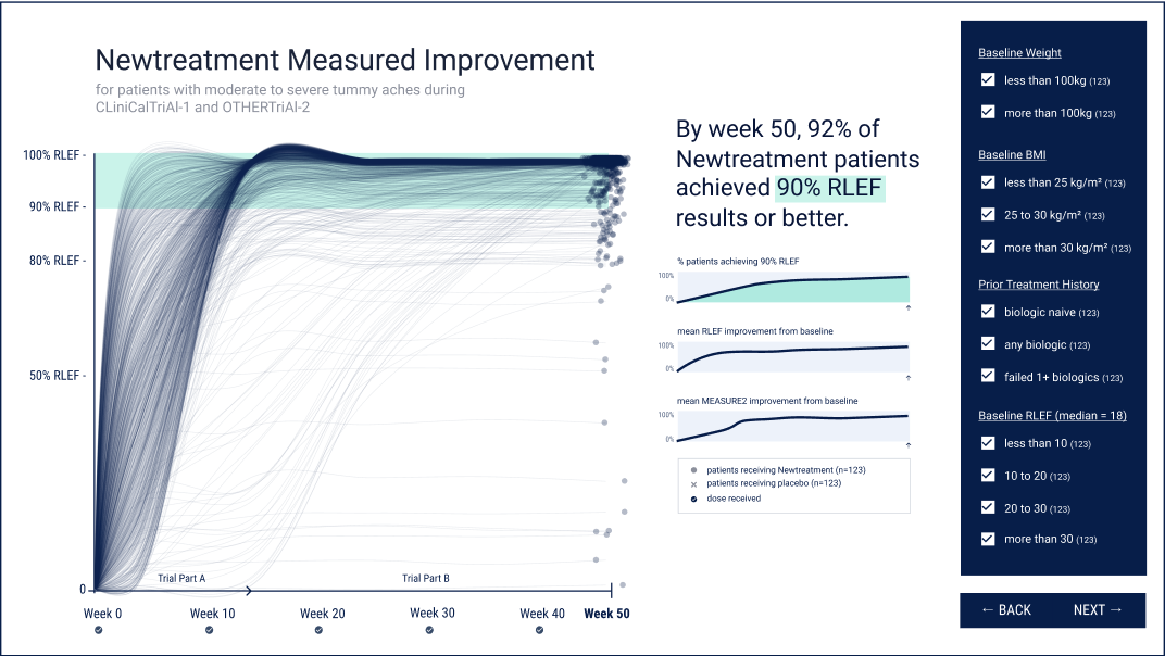
Data Product Design. All software products revolve around data, whether it’s an iPhone app targeted at consumers, or a b2b SaaS platform. Embedded analytics and well-designed feedback loops can create a win-win for software startups: Not only can they help users get more value out of services and motivate them to achieve their most important outcomes, they can also drive key metrics for the apps themselves like retention, conversion, and LTV.
Approachable Analytics. For Business Intelligence tools (like Looker, Tableau, PowerBI, etc) to support decision making, they need to be designed in a way that’s understandable and accessible to employees, even those who aren’t data-savvy.
Dashboard Consulting. Good dashboards inform, great dashboards align. Effective dashboards rest on a foundation of well-designed metrics and KPIs around which the entire organization can rally. Executing this requires expertise at the intersection of management consulting and data visualization design.
Training. Even in professional settings, data-literacy rates can be surprisingly low. To develop a data-driven culture, it’s crucial for internal researchers, analysts, and data-scientists to learn the most effective, accessible data visualization techniques. Training can help data professionals present their findings in a way that even executives can understand.
What are the benefits of effective data visualization?
- Awareness, reach and engagement for complex topics (data storytelling).
- Supporting new discoveries (interactive data exploration tools).
- Smarter, faster decision-making (visual analytics).
- Improving business performance and organizational alignment (OKRs or KPI dashboards).
- Encourage targeted behavioral outcomes (visual feedback loops).
How to hire the right data visualization consultant?
Non-profit, NGO, Marketer, or Academic Researchers with profound insights to share.
- Data Storytelling
- Custom Visualization Tools
Software Startup, SaaS company, or App, with underutilized app data to unlock.
- Data Product Design
- Custom Visualization Tools
Business Leaders, creating a work culture that’s metrics-driven, data-informed.
- Approachable Analytics
- Dashboard Consulting
- Training