Introduction
Bar charts are a bad idea when visualizing social outcomes like public health, student test scores, or economic inequality. Reducing entire populations of people down to a single average tends to be misleading; you might even argue it’s “deadly!”
Instead, when visualizing people, we should aim for more expressive charts that show the full range of outcomes, like jitter plots, histograms, or quantile dots. Seeing variation helps audiences understand the systemic forces that affect people at a population level.
When I talk about this in workshops, I see lots of nodding heads and knowing looks, but there’s almost always the same pushback:
“This is great, but I don’t know R or Python.”
A fair point! Tools like Excel and Google Sheets don’t make this easy. Even the more modern viz tools like Datawrapper require a bit of wrangling to show something like ranges.
What can we do instead?
The most recent wave of AI models are surprisingly adept at generating charts. With the right prompting, they can punch out workable javascript, using D3 or vegalite to render a dataset into a remarkably pleasant chart.
In this post we’ll walk through a series of prompts to demonstrate how to visualize inequality with jitter plots, step-by-step, using Google Gemini and regular language.
We’ll use county-level income inequality in North Carolina as our example. This helps demonstrate that, at a population level, how much you earn is less about how smart you are or how hard you work, it’s more about where you live.
Step 1: Pulling the Data
First, we need data. The US Census Bureau’s American Community Survey (ACS) is a great resource for this. We can even ask the model to generate the exact URL to get the data from the Census API.
Prompt:
Could you give me an API request for ACS data for 2023 in north carolina at the county level for median household income, county population size, and number of households?
Gemini returns a well-formatted API request URL:
https://api.census.gov/data/2023/acs/acs5?get=NAME,B19013_001E,B01003_001E,B25003_001E&for=county:*&in=state:37
You can try it yourself here.
It returns a bunch of JSON rows that look like this:
[["NAME","B19013_001E","B01003_001E","B25003_001E","state","county"],
["Alamance County, North Carolina","64445","174286","68441","37","001"],
["Alexander County, North Carolina","65268","36440","13895","37","003"],
...
["Yancey County, North Carolina","54961","18676","8188","37","199"]]
Step 2: A First Rough Chart
Now, let’s get an initial visualization. We can give the API URL directly to Gemini and ask it to build a basic chart.
Prompt:
Create an HTML page with a D3 chart.
The chart should show horizontal jitter plot (also called a strip plot). The dot values should be based on Median Household Income. The dots should be light gray and have 0.8 opacity and have blending set to multiply.
The x domain (horizontal scale) should range from [lowest value floored to nearest 10000, highest value ceilinged to nearest 10000]
The x axis should include a horizontal line and 3 ticks for the start, middle, and end of the domain. The axis line and tick marks should all be the same dark gray color. The start tick label should be left aligned and the end tick label should be right aligned, so the whole label stays on screen.
Everything should be framed inside the same box and left aligned. The height of the jitter plot row should be no more than 120px. The xaxis should be just below the plot with minimal spacing.
The box should be 800px wide and 450px tall. It’s okay if it hangs off the screen.
Using this data… https://api.census.gov/data/2023/acs/acs5?get=NAME,B19013_001E,B01003_001E&for=county:*&in=state:37
The result:

It’s a bit rough, but a great starting point.
- Chart types have ambiguous names, so providing a couple ways to identify the chart might help the model understand your intent (e.g. both “jitter plot” and “strip plot”)
- You might not always need to specify an x-axis domain, but sometimes it needs some help.
- Being specific on things like styling and layout should help get more predictable results.
- Specifying exact dimensions (800x450px) can be helpful when you’re plugging charts into a report or slide deck.
Step 3: Titles and Text
Good dataviz is good writing. Specific chart titles are one of the best ways to make sure charts communicate clear takeaways for wide audiences. In fact, research shows titles are often more memorable than the visual itself (Kong et al 2019).
Let’s add a clear title and a dynamic subtitle that automatically highlights the range of outcomes.
Prompt additions:
The chart title should be: “In North Carolina, median household income varies widely by geography.”
Subtitle should be: “[county with highest income] has the highest income in NC ([highest income value]), while [county with lowest income] has the lowest ([lowest income value]).”
The axis title should be Median Household Income.
Underneath the x-axis should be explainer text that says
“How to read this chart: Each dot is 1 county in NC. Dots are positioned horizontally based on the county’s
median household income. Dots are randomly positioned vertically within the row for visual separation.”
Make sure to respect the line breaks.
Everything should be framed inside the same box and left aligned. The order should be the title, then the subtitle, then a line break, then the plot, then the x axis, then the explainer text.
The result:

Getting better!
- Note how it handles the brackets like [county with highest income] and [highest income value] and writes the code behind the scenes to fill in the correct values.
Step 4: A Reference Line
While we want people to take in the whole distribution, reference lines provide a familiar anchor for audiences who might be skittish about less conventional charts. It bridges the gap between a conventional bar chart and a jitter plot, making the new format more approachable.
Prompt additions:
In the middle of the row should be a black vertical tick line that shows the average value for all data points in that row. The line should be solid and 4px thick, Above the tick line should be the actual average value.
There should be a legend that shows the following elements on the same row. They should be separated by 8 spaces worth of horizontal spacing.
* a matching gray circle icon with text “1 dot = 1 county”
* a matching vertical black line icon with text “state average”. The “black line icon” needs to be vertical to visually match the vertical tick used to signify the average.
The order should be the title, then the subtitle, then the legend, then a line break, then the plot, then the x axis, then the explainer text.
The result:

This is meant as a simple demo, but in “real life” you might consider other options for the reference lines like the statewide average, instead of the average of averages currently shown.
Step 5: Layout Cleanups
The chart is coming together, but as you saw above, it’s still a bit of a mess. Sometimes it requires more handholding on details like layouts or writing.
Here, we’ll give more specific guidance to create a cleaner, more professional look.
Prompt additions:
In the subtitle, the county names should just include the county name, not “north carolina” (e.g. “Wake County” not “Wake County, North Carolina”). In the subtitle use “NC” not “North Carolina”
There should be 48px of padding on all sides of the chart. The vertical spacing between the title and subtitle should match the vertical spacing between the subtitle and the legend. The vertical spacing between the legend and the plot should be 48px. The xaxis should be just below the plot, with 24px of spacing between the dots and the axis. The axis title should be below the axis, with 12px of spacing between the axis and the axis title.
The subtitle, legend text, value label, axis ticks, and axis title should all have font-size = 14px.
The explainer text should be font-size=12px.
The result:

This still has some annoying spacing issues, but it’s pretty close for a robot that can’t actually see the chart…
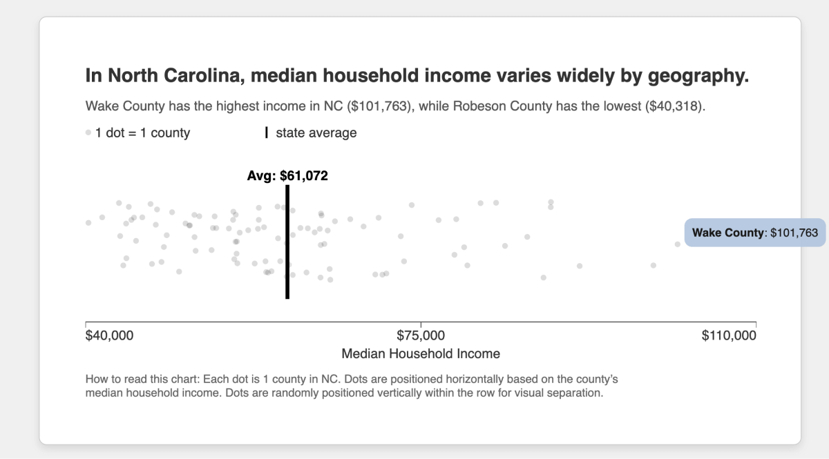
Step 6: Adding Mouseovers for Interactivity
Because this chart is just a web page, we can also make it interactive.
Adding tooltips that appear on hover allows viewers to explore individual data points to get a better sense of which counties make up the extremes.
Prompt additions:
When you mouseover the dots, it should show a tooltip like "[county name]: $[household income value]"
The result:
What’s particularly handy, Gemini’s canvases come with share links, so you can share the whole thing:
Step 7: Download Button
To make the chart portable, let’s add an “Export to SVG” button. This lets you download a high-quality vector graphic that can drop into PowerPoint, Keynote, Figma, or whatever you’re working with.
Prompt additions:
All CSS styles should be included inline in style attributes. Do not split the CSS into a style sheet or reference styles through classes. This includes the dot styles, the axes, font families for all text elements set to “sans-serif”. The title, subtitle, legend, and explainer text should be included as SVG, not HTML.
Add a button underneath the box that says “Export to SVG.” This button should download the chart as an SVG file.
The result:
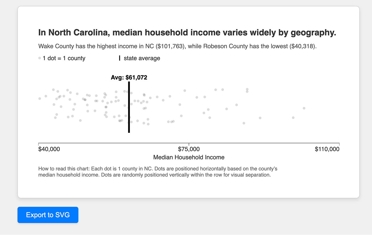
And there it is! This button was actually quite a time saver for making this post.
Step 8: Split by region
Okay so we’ve gotten to a fairly nice, polished chart. But just like in real life, sometimes you have to see something to realize it’s not exactly what you want.
The previous chart shows county variability, but it doesn’t tell us much about the counties themselves.
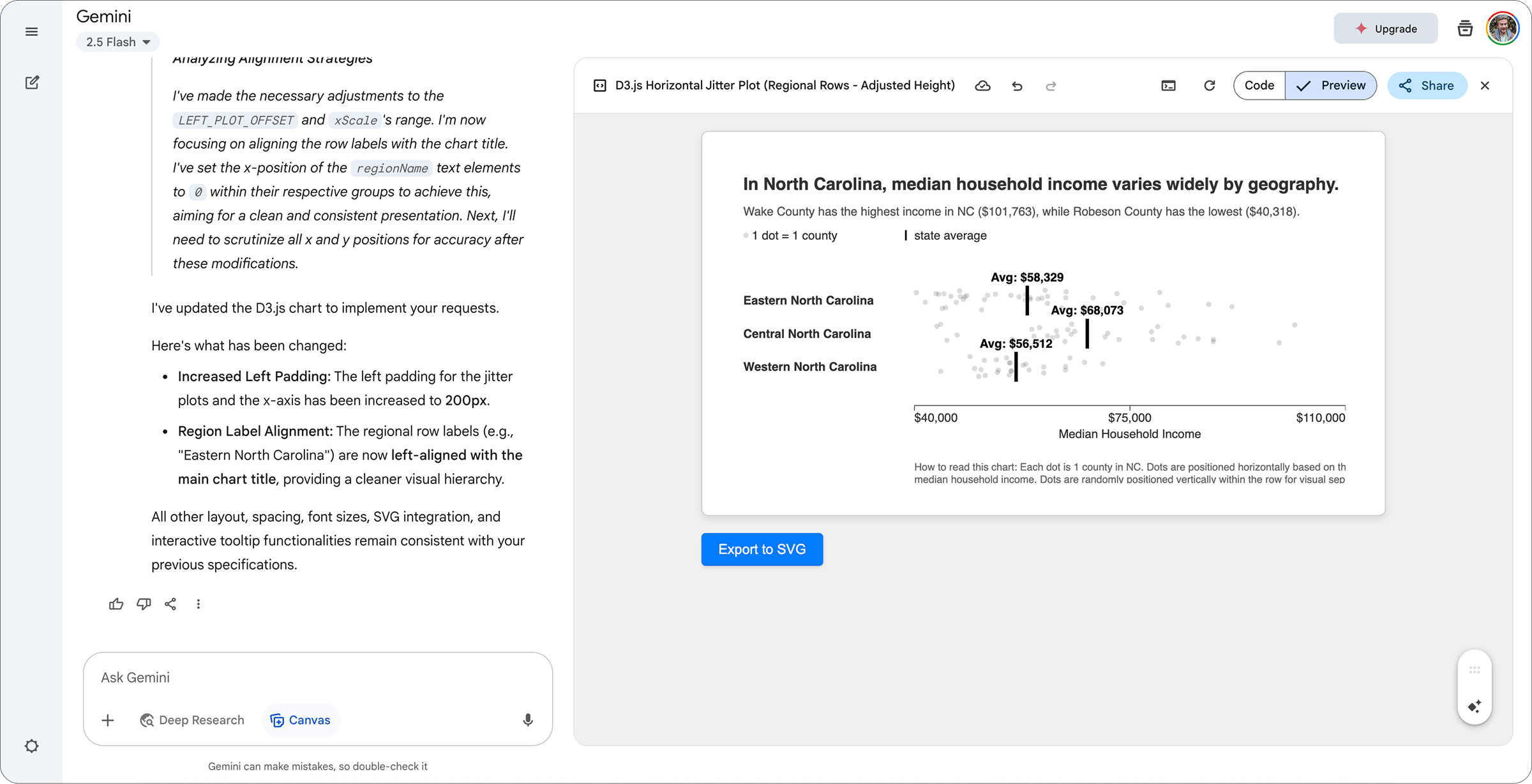
Let’s add another dimension. We’ll divide up the dots into regions, so we can compare Eastern, Central, and Western North Carolina.
This will require region labels which aren’t in the original Census data. With a bit of googling I found the following table from North Carolina’s state government, mapping county names to regions. Conveniently, it also has an API which gives results like this…
{"total_count": 100, "results": [
    {"county": "Perquimans", "region_name": "Eastern North Carolina"},
    {"county": "Chowan", "region_name": "Eastern North Carolina"},
    {"county": "Halifax", "region_name": "Eastern North Carolina"},
    ...
    {"county": "Mitchell", "region_name": "Western North Carolina"},
    {"county": "Haywood", "region_name": "Western North Carolina"},
    {"county": "Cherokee", "region_name": "Western North Carolina"}
]}
Now we’ll see if the model can not only add more rows to the chart, but also join together two datasets to make this happen.
Prompt additions:
Can you use the following data to divide the jitter plot into rows based on the county’s region, using the following data? e.g. so there’d be one row with Eastern North Carolina where all the dots are counties in Eastern NC
Note in the census data counties will be labeled “XXX county” but in the API it will just be listed as “XXX”
Can you make each jitter row 33% the height, so everything fits? And add left padding to the jitter plots and the x axis so that the labels on the left don’t overlap with the plots? Needs probably 200px The row labels and explainer text should be aligned to the left, so they’re left aligned with the chart title.
The result:

Done!
Now we can see there’s variability within the state, but there are also differences between the regions.
We can also see that Western North Carolina, near the mountains, is generally lower income, while higher income is more concentrated in Central North Carolina, which makes sense, since this includes the state’s major cities like Raleigh, Durham, and Charlotte.
There’s certainly more we can do with this chart, for example hinting at county populations or exploring how factors like income relate to education or segregation. But for just a few minutes of prompting, this is a great start for descriptive reporting on income levels in NC.
You no longer need to R or Python to move beyond the bar chart. With a bit of prodding, more equitable, effective, expressive charts (like the jitter plots) can be “vibe coded” with generative AI models like Gemini, Claude and ChatGPT.
Next steps:
- Check your results closely! AI models require a close eye to verify their output.
- If you or your team want to learn more about equitable data design, please check out 3iap’s workshops like The Equitable Dataviz Primer or Equitable Epidemiology.
- Any questions, comments, or feedback? Feel free to email hi@3iap.com.