
Introduction
After almost every Equity Dataviz workshop, the first response from participants is inevitably something like: “Great! We’re sold on equitable chart design… but how do we do this in Excel? Or Google Sheets? Or R? Or Python?” This post answers that question for spreadsheets like Excel or Google Sheets.
Why use Jitter Plots to visualize social inequality?
Visualizing differences in outcomes between social groups (e.g. race, gender, age, income, etc) is an important part of analyzing social inequity and holding policy-makers accountable for the decisions that drive these disparities.
3iap’s peer-reviewed research shows that, when visualizing social outcomes, certain types of visualizations can increase harmful stereotypes about the people being visualized.
Some visualizations (e.g. bar charts, dot plots) make it seem like differences between groups are much larger than they really are. This triggers unconscious social biases that can lead to unfairly blaming the outcome differences on the people themselves.
On the other hand, charts like jitter-plots or range-plots make it clear that there are also wide outcome-differences within groups. This makes it difficult to stereotype a particular group because viewers can see that, even though there are differences between groups, a person’s group identity only explains a small part of the differences.
In this post, we’ll look at how to visualize between- and within-group-differences using Jitter Plots.
Example dataset
To make this realistic, we’ll look at differences in PrEP coverage between different regions in the United States, using a publicly available dataset from AIDSVu. For context PrEP stands for Pre-Exposure Prophylaxis. It’s a prescription that drastically reduces people’s chances of getting HIV. The United States has a national goal of covering 50% of at-risk populations by 2030. They’re making progress, but for a number of reasons, progress in southern states has been slow.
Walkthrough
First we’ll prepare the data.
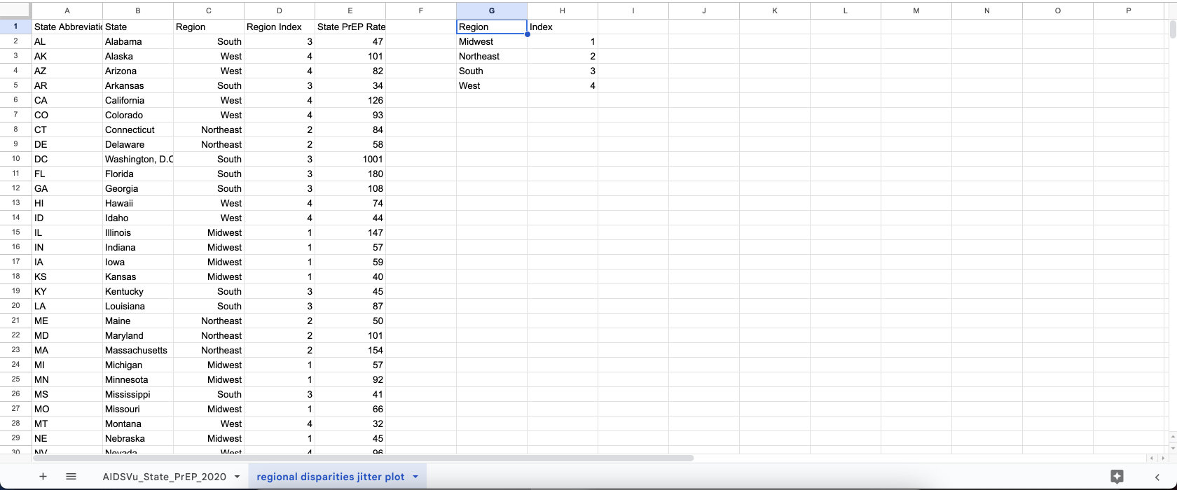
- We’ve copied the columns for
State Abbreviation,StateandState PrEP Ratefrom the raw data - We’ve assigned each state to a
Region(seeC:C) - On the right we’ve given each region an index that we’ll use later to assign regions to rows in the plot. We use a vlookup in column
D:Dto give each row an index value:=VLOOKUP(C2,$H$2:$I$5,2,FALSE). This looks up the index from the table on the right.
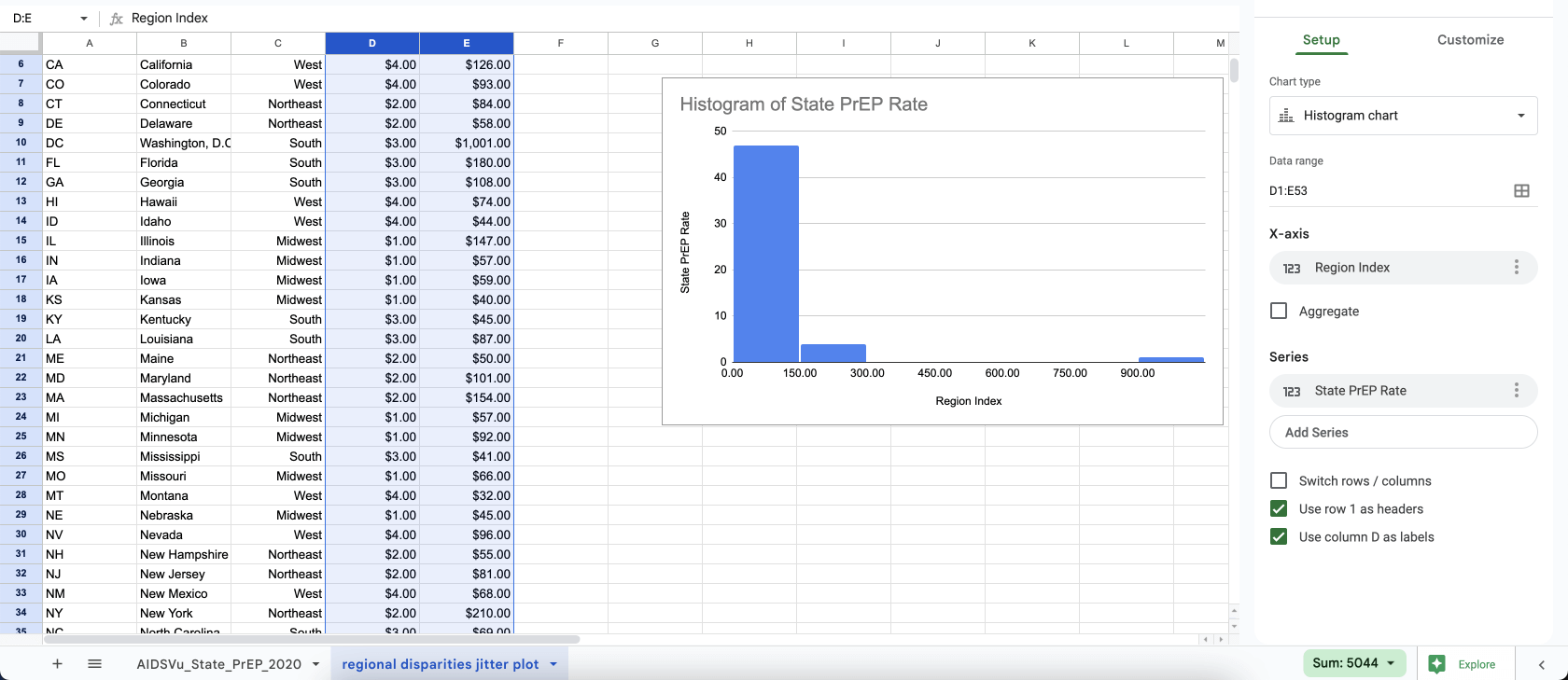
Next we’ll add a chart.
- Select columns
D:E - In the top menu, choose
Insert > Chart - You’ll see Google Sheets defaults to some sort of histogram
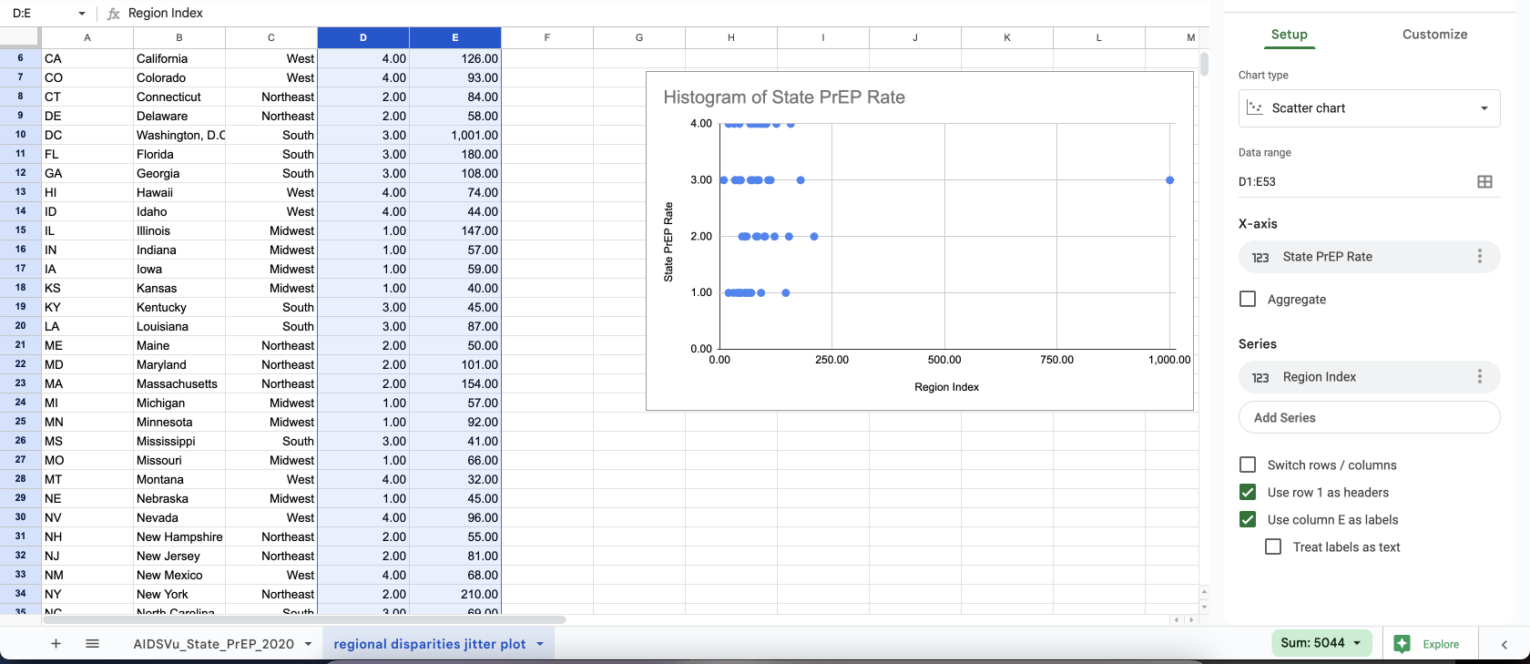
Then we’ll update the chart settings on the right.
- Change
Chart typetoScatter chart - Change
X-axistoState PrEP Rate - Change the first
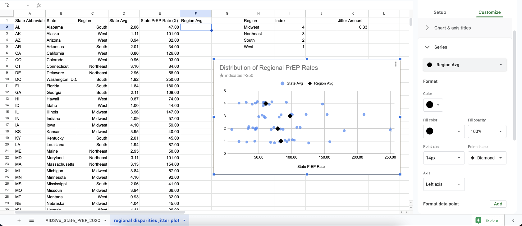
SeriestoRegion Index - You can see we’ve got the start of a jitter plot, with each dot representing an individual state’s “PrEP rate”
- We have a fairly extreme outlier though. This is Washington D.C.
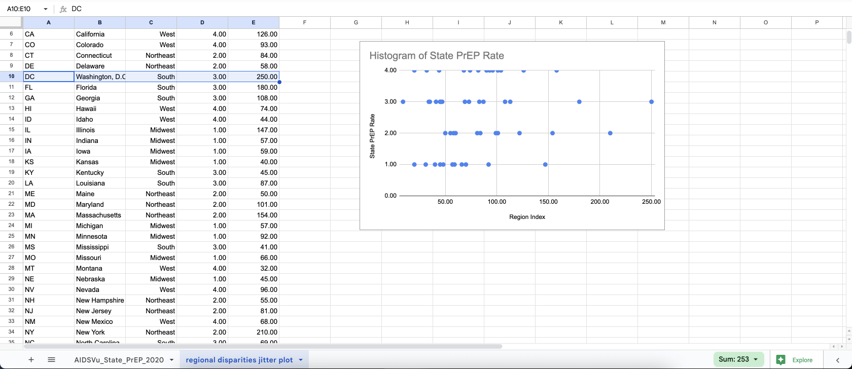
To handle the Washington D.C. outlier:
- We don’t want to clip the data point entirely but we also don’t want every other point to be so tightly packed you can’t see it.
- We’ll “clamp” the value and say the max value is 250, then we’ll clarify what’s happening with annotations.
- You can see this shrinks the x-axis and makes the other states’ values easier to see.
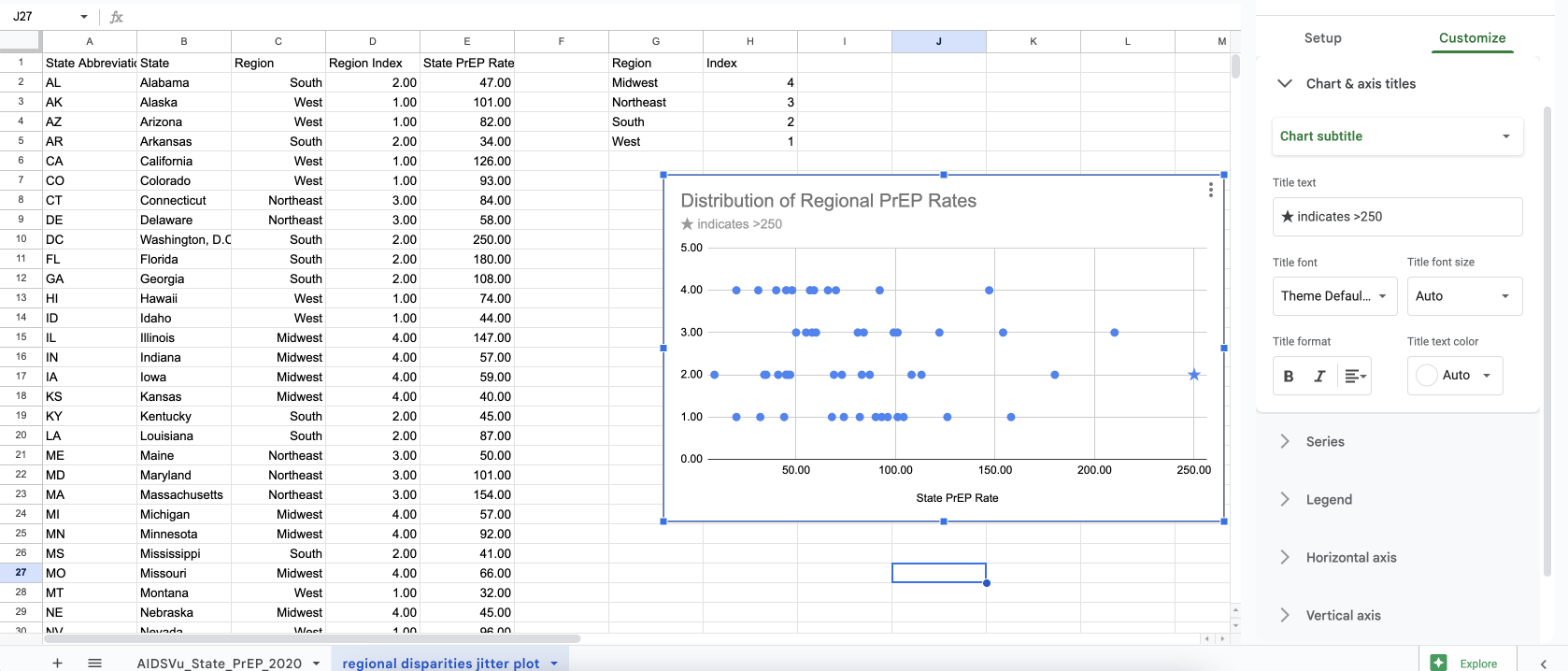
We want to make our treatment of the Washington D.C. outlier transparent:
- We’ll change the shape of the marker to a star, to differentiate it from the other points (double click on the Washington D.C. point to edit the appearance of that single point)
- We’ll also add a text annotation in the subtitle.
- Note: We’ve also reversed the ordering of the region indexes so that the rows are in alphabetical order.
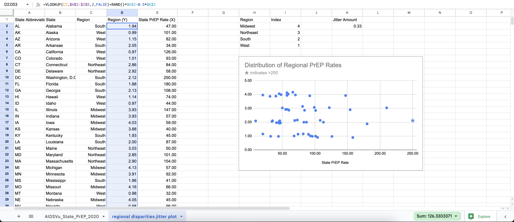
How do we make the dots jitter?
- This isn’t a big deal for this dataset, since it’s only ~50 total dots. But for larger datasets jittering helps make the underlying distribution more apparent.
- First, we’ll add a constant to
K2to control the amount of vertical jitter on each line - Then we’ll modify our formula for column
D, changing the formula to=VLOOKUP(C2,$H$2:$I$5,2,FALSE)+RAND()*$K$2-0.5*$K$2- Remember
=VLOOKUP(C2,$H$2:$I$5,2,FALSE)is how we look up the row index from the table on the right - We’ve added
+RAND()*$K$2-0.5*$K$2which generates a random number from 0—1, then multiplies that number by our jitter amount constantK2. We subtract half ofK2to center it on the line.
- Remember
- Finally we drag the formula down column
Dto apply it to each row - You can see the dots on each row are now vertically jittered.

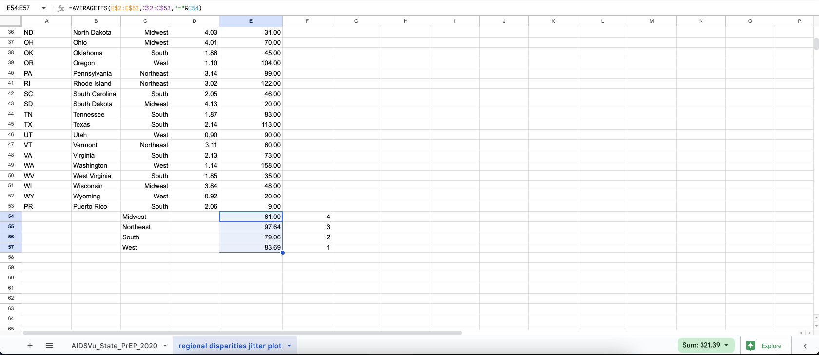
With jitter plots, people generally still expect to see what the “typical” value is for the dots (either an average or ideally a median). To show this with Google Sheets we’ll have to get a bit clever.
Our plan here is to append the average values as part of the overall dataset shown on the scatter plot, but we’ll differentiate the average values by putting them in another “series”
- First we claim column
Fto contain data for another series that we can use in the chart - Then we scroll down to the bottom
- In column
Cwe put the 4 region names - In column
Fwe do a similar vlookup as we used in columnD, to look up the row index for the region, i.e. settingF54to:=VLOOKUP(C54,$H$2:$I$5,2,FALSE). Then we drag that down for the 4 rows. - In column
E, we useaverageifsto get the averge value for each region, i.e. settingE54to:=AVERAGEIFS(E$2:E$53,C$2:C$53,"="&C54) - Now we’ve got the data in place to show the averages. Next we’ll update the chart…
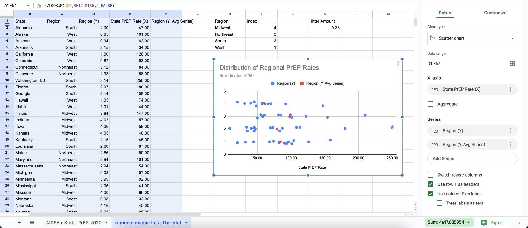
To show the averages on the chart:
- We open the chart settings on the right
- We add another
Series: This is columnFRegion (Y, Avg Series)` - You can see the average values show up as red dots.
- You can see this has all the parts we need, but we need to do some cleanup to make it clearer.
To make this a bit clearer, let’s rename our columns (again!):
- We’ll change column
Dto “State Avg”, since each blue dot represents an individual state’s average value. - We’ll change column
Fto “Region Avg”, since the average markers represent the average of averages for all states in the region.
To differentiate the average markers further:
- We’ll go into the
Customize > Seriesand change the shape of the marker to someting different than the circle. Outside of Google Sheets these should be big vertical lines, but we’ll settle for diamond shapes.
You can see it’s taking shape, but the row numbers are super confusing.
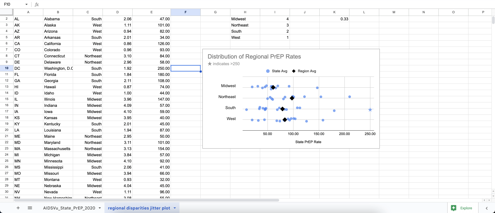
The most important part of any dataviz is the way we label it. So let’s replace the confusing row numbers with the actual region names.
- Unforutnately Google doesn’t make this easy. There’s no clear way to use text as a y-value for their scatter charts.
- Instead, we’ll just fake it by inserting a drawing. In the top menu, choose
Insert > Drawing. In the drawing you’ll create a text box and type the name of each region on each line, then save and close the drawing. - To make room for our new drawing, double click on the y-axis, then change the font color to white. Then select the plot area of the chart and drag the left side over, to create a margin on the left.
- Finally drag the drawing text over the chart. This is certainly not a glamorous solution to getting readable labels on the chart, but worthwhile given how much clearer it makes the story.
Next steps:
Hopefully this helps you show outcome variance when visualizing social outcome disparities (or any kind of group outcome differences).
- A demo version of this spreadsheet is available here. Please feel free to copy and use as a template.
- There may certainly be easier ways to accomplish the above. If you’ve got other good spreadsheet hacks, please send us a note at hi@3isapattern.com.
- You can also use Google’s Gemini AI tool to generate similar charts: How to visualize social outcome disparities with jitter plots and Google Gemini
- If you or your teams are interested in learning about more equitable dataviz in general, please check out 3iap’s Equity Dataviz workshop, where we’ll cover our latest research on the topic, unpack the underlying psychology of data-driven stereotyping, and cover alternative ways to visualize social outcome disparities (without making them worse).