How to create Jitter Plots in Microsoft Excel to visualize social outcome disparities

After almost every Equity Dataviz workshop, participants inevitably say something like: “Great! We’re sold on equitable charts. Jitter plots seem fun! But how do we do this in Excel? Or Google Sheets? Or R? Or Python?” This post answers that question for spreadsheets like Excel or Microsoft Excel.
Why use Jitter Plots to visualize social inequality?
Visualizing outcomes for different social groups (e.g. race, gender, age, income, etc) is a common first step in analyzing social inequity and holding policy-makers accountable for the decisions behind these disparities.
3iap’s peer-reviewed research shows that, when visualizing social outcomes, certain types of visualizations can increase harmful stereotypes about the people being visualized.
Some visualizations (e.g. bar charts, dot plots) make it seem like differences between groups are much larger than they really are. This triggers unconscious social biases that can lead to unfairly blaming the outcome differences on the people themselves.
On the other hand, charts like jitter-plots or range-plots make it clear that there are also wide outcome-differences within groups. This makes it difficult to stereotype a particular group because viewers can see that, even though there are differences between groups, a person’s group identity only explains a small part of the differences.
In this post, we’ll look at how to visualize between- and within-group-differences using Jitter Plots.
Example dataset
To make this realistic, we’ll look at differences in new HIV diagnoses between different regions in the United States, using a publicly available dataset from AIDSVu. The United States has a national goal of reducing HIV incidence by 75% before 2030. They’re making progress, but for a number of reasons, progress in southern states has been slow.
Walkthrough
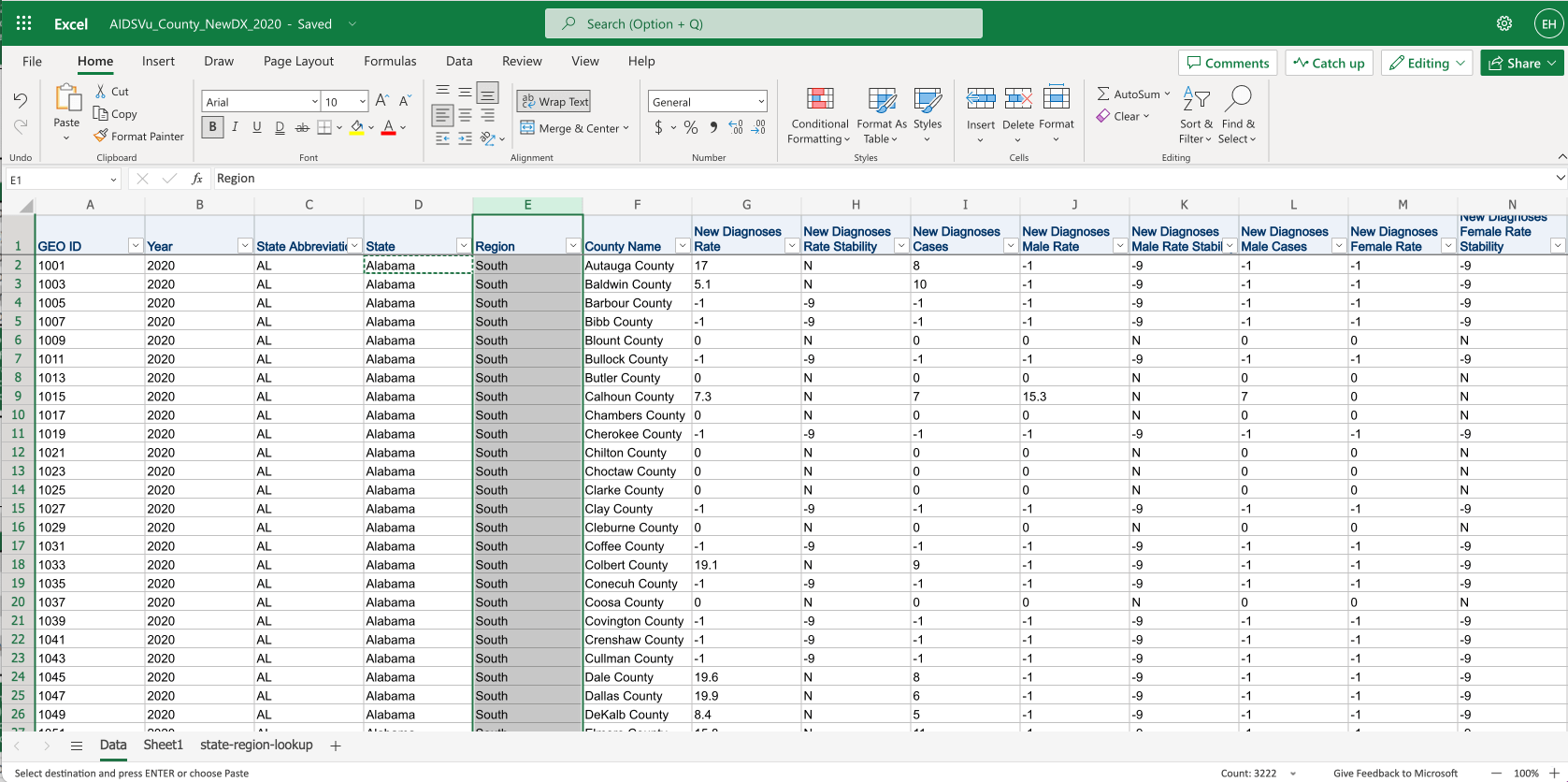
First we’ll prepare the data. Above is the original spreadsheet from AidsVu, but I’ve added a column Region (see E:E) using a vlookup from the state-region-lookup sheet.
Next we’ll choose just the columns we want and filter the data using this formula: CHOOSECOLS(FILTER(CHOOSECOLS(Data!C:H,3,2,4,5,6), Data!H:H="Y"),1,2,3,4)
- With
CHOOSECOLS(Data!C:H,3,2,4,5,6), we’ve selected the columns forRegion,State,County,New Diagnoses Rate, andCHOOSECOLS(Data!C:H,3,2,4,5,6) - With the filter
Data!H:H="Y", we’re choosing only rows that are listed as rate-stable. AIDSVu discusses rate-stability in their methodology documentation.
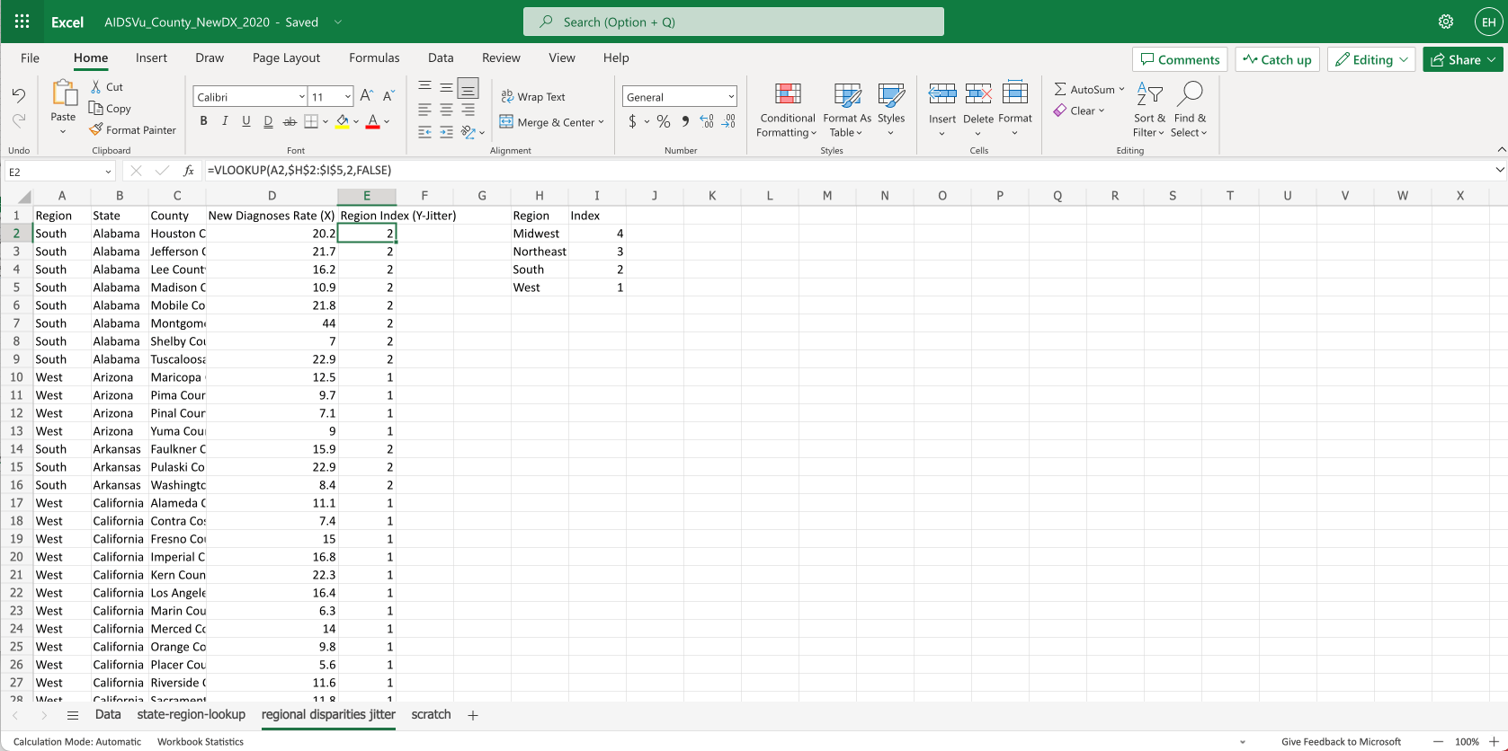
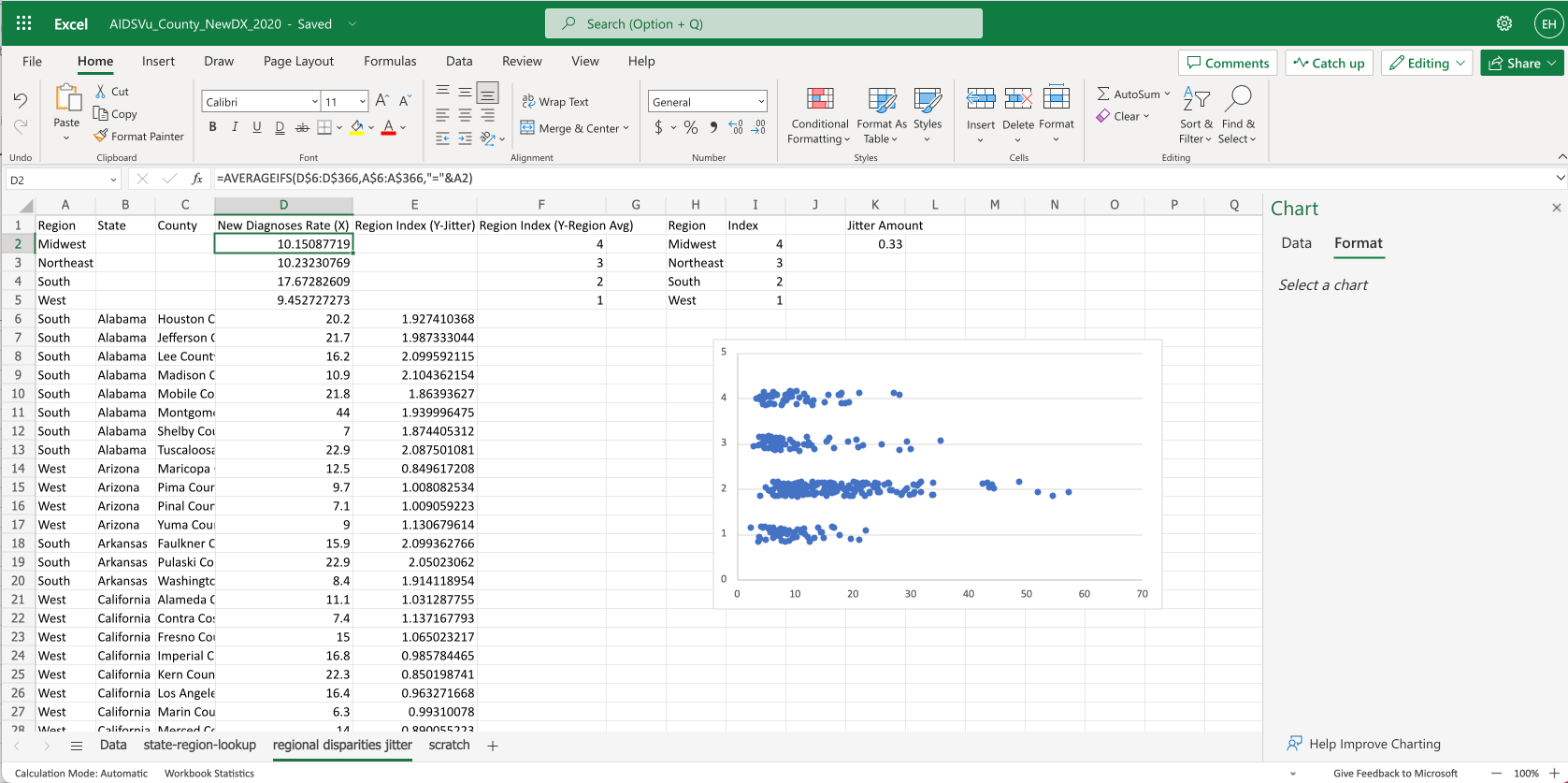
Since Excel won’t let us use text values in a scatter plot, we create a column that represents each region as a value from 1-4.
We use a vlookup in column E:E to give each row an index value: =VLOOKUP(A2,$H$2:$I$5,2,FALSE).
This looks up the region’s index from the table on the right.
We’ve also renamed the columns to clarify which columns drive which axes, for when we create the chart.
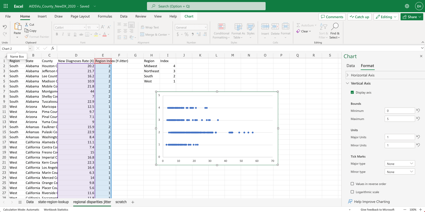
Next we’ll add a chart.
- Select columns
D:E - In the top menu, choose
Insert > Scatter - You’ll see Excel lays out a rough scatter plot
- To tidy things up, we’ll delete the chart title and x-axis title. We’ll also adjust the formatting for the Vertical Axis, setting the Bounds to 0-5 and the units to 1.
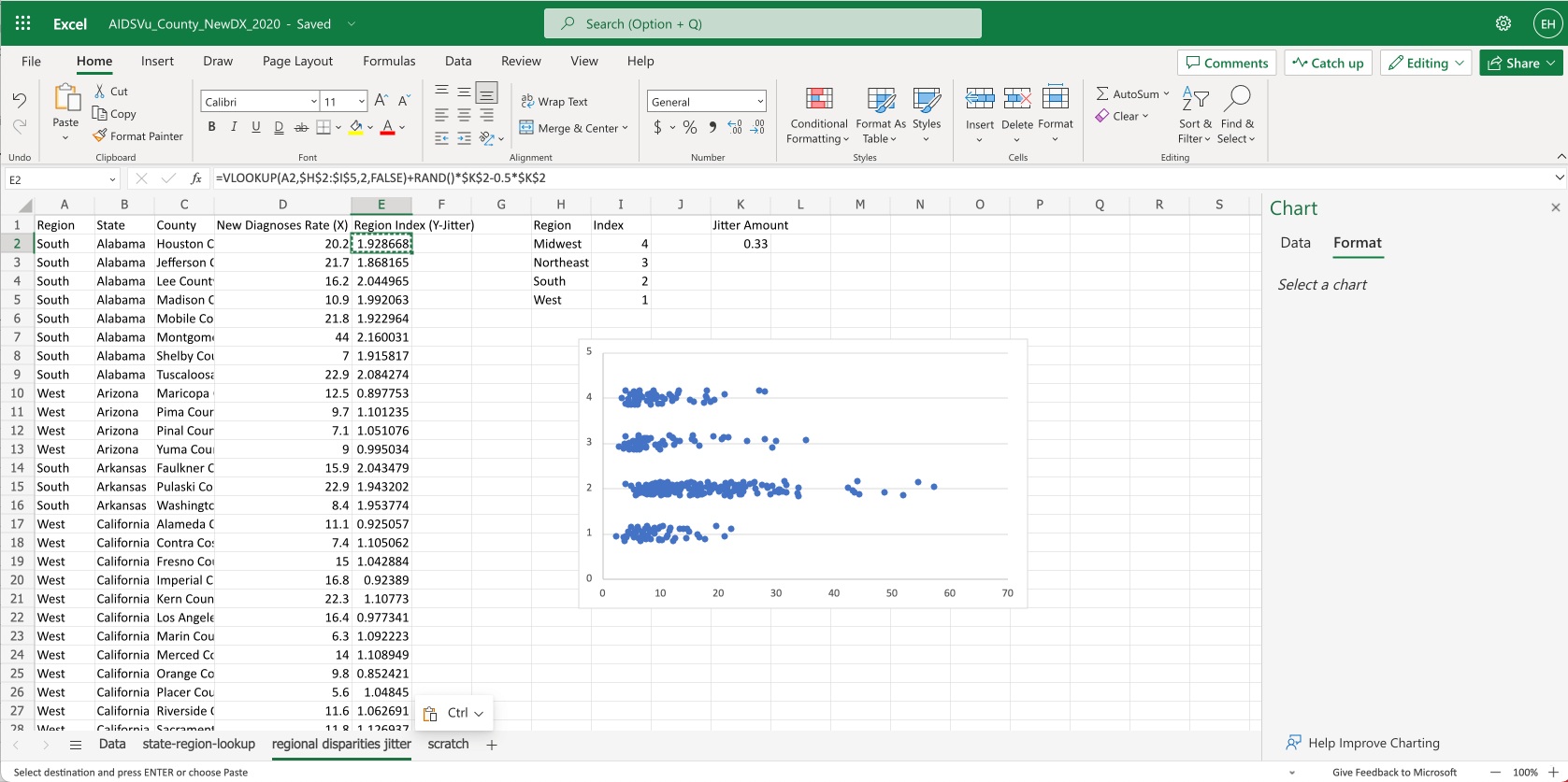
How do we make the dots jitter?
- Jittering helps make the underlying distribution more apparent.
- First, we’ll add a constant to
K2to control the amount of vertical jitter on each line - Then we’ll modify our formula for column
E, changing the formula to=VLOOKUP(A2,$H$2:$I$5,2,FALSE)+RAND()*$K$2-0.5*$K$2- Remember
=VLOOKUP(A2,$H$2:$I$5,2,FALSE)is how we look up the row index from the table on the right - We’ve added
+RAND()*$K$2-0.5*$K$2which generates a random number from 0—1, then multiplies that number by our jitter amount constantK2. We subtract half ofK2to center it on the line.
- Remember
- Finally we drag the formula down column
Eto apply it to each row - You can see the dots on each row are now vertically jittered.
With jitter plots, people generally still expect to see what the “typical” value is for the dots (either an average or ideally a median). To show this using Excel we’ll have to get a bit clever.
Our plan here is to prepend the average values as part of the overall dataset shown on the scatter plot, but we’ll differentiate the average values by putting them in another “series”
- First we claim column
Fto contain data for the average series that we can use in the chart - Then we’ll move the whole dataset down 4 rows
- In column
Awe put the 4 region names - In column
Fwe do a similar vlookup as we used in columnE, to look up the row index for the region, i.e. settingF2to:=VLOOKUP(A2,$H$2:$I$5,2,FALSE). Then we drag that down for the 4 rows. - In column
D, we useaverageifsto get the averge value for each region, i.e. settingD2to:=AVERAGEIFS(D$6:D$366,A$6:A$366,"="&A2) - Now we’ve got the data in place to show the averages. Next we’ll update the chart…
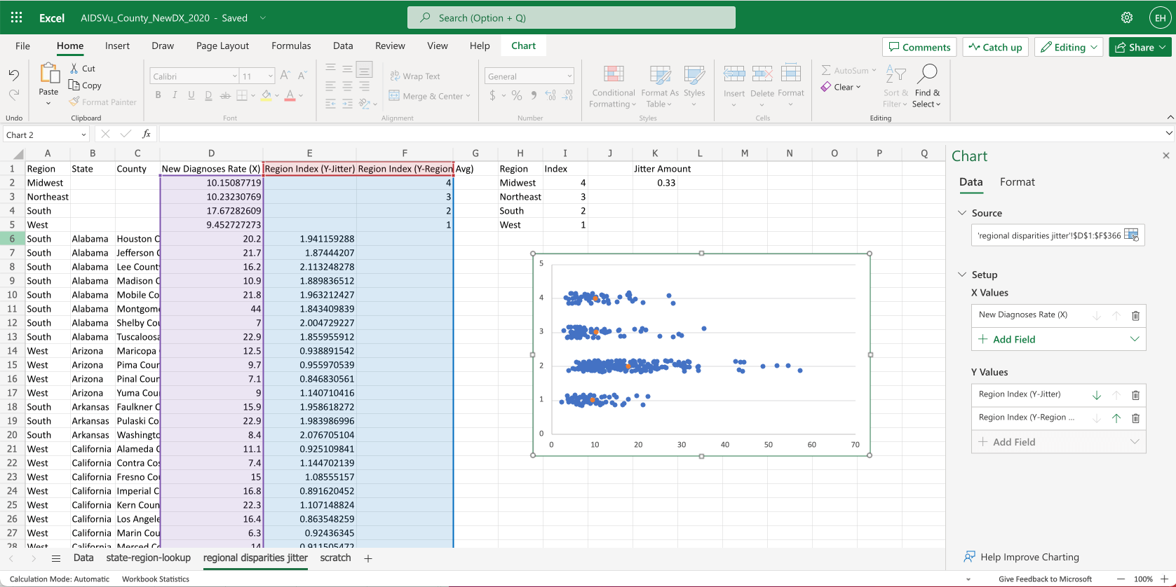
To show the averages on the chart:
- We open the chart settings
- We change the source by highlighting from
D1down toF366 - Then adjust the Y Values if excel doesn’t do this automatically
- You can see the average values show up as orange dots.
- You can see this has all the parts we need, but we need to do some cleanup to make it clearer.
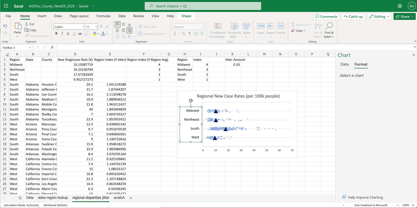
The most important part of any dataviz is the way we label it. So let’s add the region names.
To add labels to the rows, we just insert a textbox using Insert > Text Box.
Then adjust the size of the chart so the rows line up with the text.
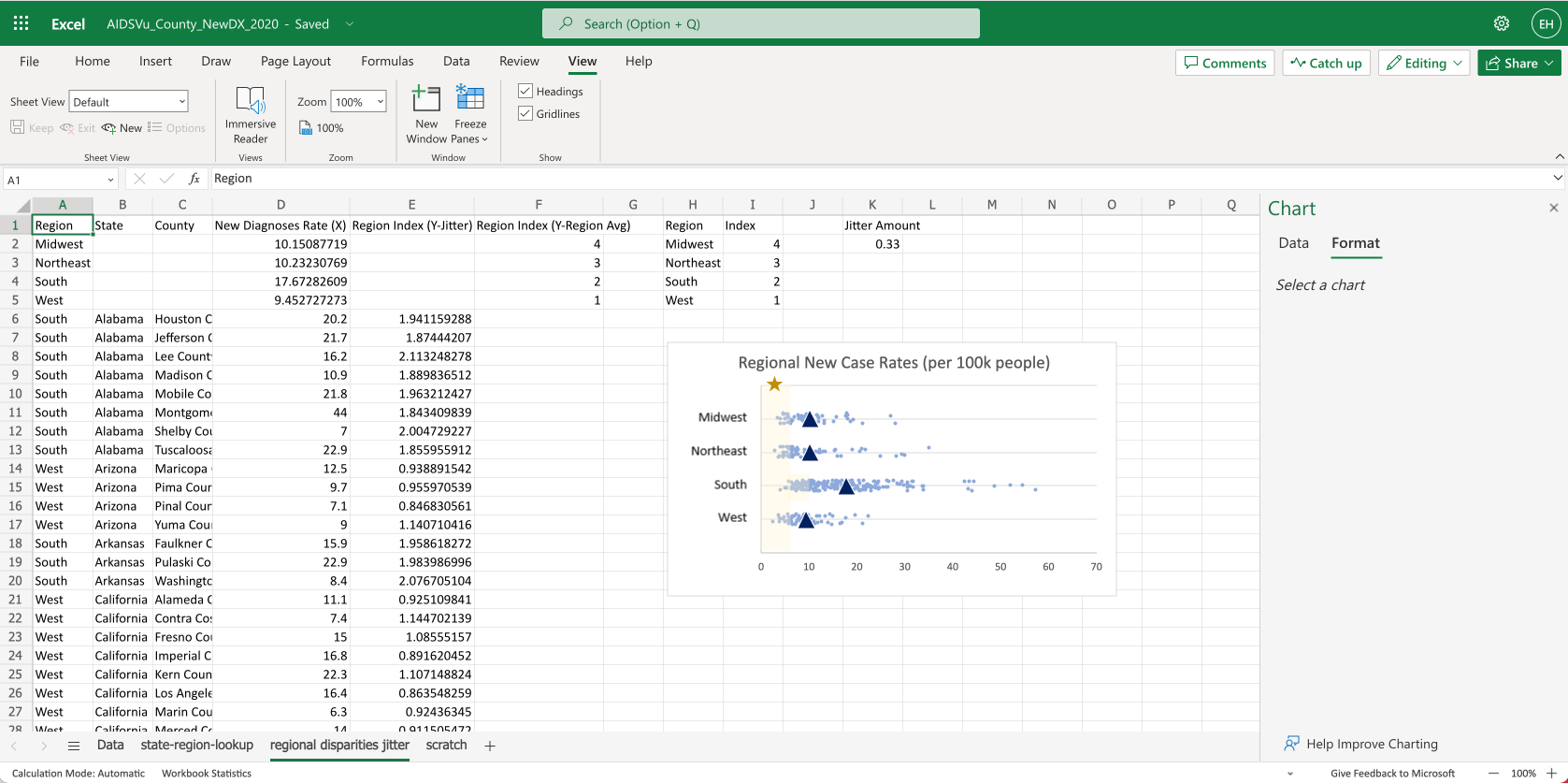
For extra credit we can use shapes to overlay a goal range and a small star icon, indicating the U.S. goal to reduce HIV incidence by 75%.
Next steps:
Hopefully this helps you show outcome variance when visualizing social outcome disparities (or any kind of group outcome differences).
- A demo version of this spreadsheet is available here. Please feel free to copy and use as a template.
- There may certainly be easier ways to accomplish the above. If you’ve got other good spreadsheet hacks, please send us a note at hi@3isapattern.com.
- You can also use Google’s Gemini AI tool to generate similar charts: How to visualize social outcome disparities with jitter plots and Google Gemini
- If you or your teams are interested in learning about more equitable dataviz in general, please check out 3iap’s Equity Dataviz workshop, where we’ll cover our latest research on the topic, unpack the underlying psychology of data-driven stereotyping, and cover alternative ways to visualize social outcome disparities (without making them worse).