Introduction
This article was co-authored by Eli and Pieta Blakely. It’s also posted on Pieta’s site here.
Numbers don’t lie, but they’re under no obligation to tell the truth. There are also no guarantees that audiences will look at our data and reach the conclusions we might expect. With data visualization, like all other forms of communication, it’s important to recognize the difference between what the data says and what audiences actually hear.
Nowhere is this distinction more meaningful than visualizing racial inequality.
When data represents groups of people it’s inescapably interpreted through the audience’s prior knowledge, assumptions, biases and stereotypes about the groups being visualized. This makes visualizing social data unique from, say, visualizing rocket trajectories, stock prices, widget sales, or turtle migrations.
Social biases are especially important to consider when visualizing data concerning people from minoritized communities. Generally the people consuming these visualizations won’t be members of the groups being visualized, they’ll be members of majority groups for whom the visualized groups are psychologically distant “others.” (e.g. In the US, white people are the majority, so even though a visualization may feature asian, black, hispanic or indigenous groups, it will primarily be viewed by white people.)
Interpreting information about “other” groups can have some surprising consequences. For example, in a study published earlier this year, Skinner-Dorkenoo et al. found that the more white people in the US are aware of racial disparities in Covid-19 outcomes, the less empathy they showed for Covid sufferers and the less willing they were to support safety precautions. That is, the more people believed that problems only affect others, the less willing they were to solve them. In this case, highlighting racial disparities in Covid-19 outcomes actually made them worse.
As equity-minded data workers, the burden falls to us to present this data in ways that help audiences look past their biases. Raising awareness of social disparities is a worthy goal, but we have to do it in ways that avoid the negative side effects.
The Power of Context
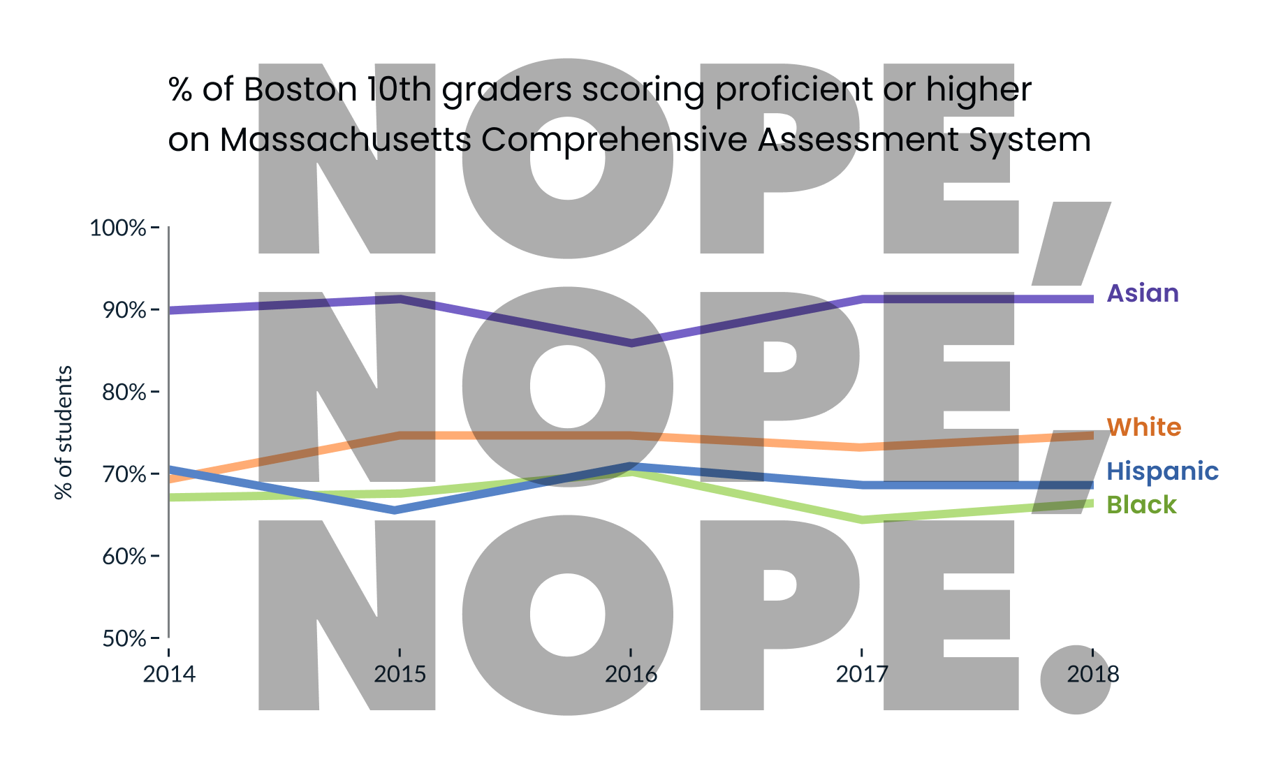
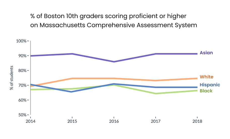
For anti-racist dataviz, our most effective tool is context. The way that data is framed can make a very real impact on how it’s interpreted. For example, this case study from the New York Times shows two different framings of the same economic data and how, depending on where the author starts the X-Axis, it can tell 2 very different — but both accurate — stories about the subject.
As Pieta previously highlighted, dataviz in spaces that address race / ethnicity are sensitive to “deficit framing.” That is, when it’s presented in a way that over-emphasizes differences between groups (while hiding the diversity of outcomes within groups), it promotes deficit thinking (see below) and can reinforce stereotypes about the (often minoritized) groups in focus.
In a follow up study, Eli and Cindy Xiong (of UMass’ HCI-VIS Lab) confirmed Pieta’s arguments, showing that even “neutral” data visualizations of outcome disparities can lead to deficit thinking (and therefore stereotyping) and that the way visualizations are designed can significantly impact these harmful tendencies.
What is deficit thinking in the context of dataviz? Why is it a problem?
The chart above might seem innocuous. It’s not necessarily wrong or inaccurate. It’s not intentionally misleading. But when people read charts like these, many of them will reach harmful, false conclusions (e.g. “Black and hispanic people did worse on tests because they don’t value education.”).
Why? The chart above has an implicit deficit frame. By emphasizing direct comparisons between minoritized and dominant groups, the chart encourages viewers to consider the groups with the worst outcomes (often marginalized groups) as deficient, relative to the groups with the best outcomes (often majority groups).
“How could someone conclude that from a simple chart?”
People interpret data through the lens of their pre-existing beliefs and biases. Deficit-framed charts exacerbate 2 troublesome social-cognitive biases that underpin our tendencies to stereotype: 1) outgroup homogeneity is the tendency to overestimate the similarity of people from other social groups and 2) attribution biases (like the “fundamental attribution error”) are the tendencies to attribute others’ successes (or failures) to personal qualities, even when the outcomes are obviously outside of their control.
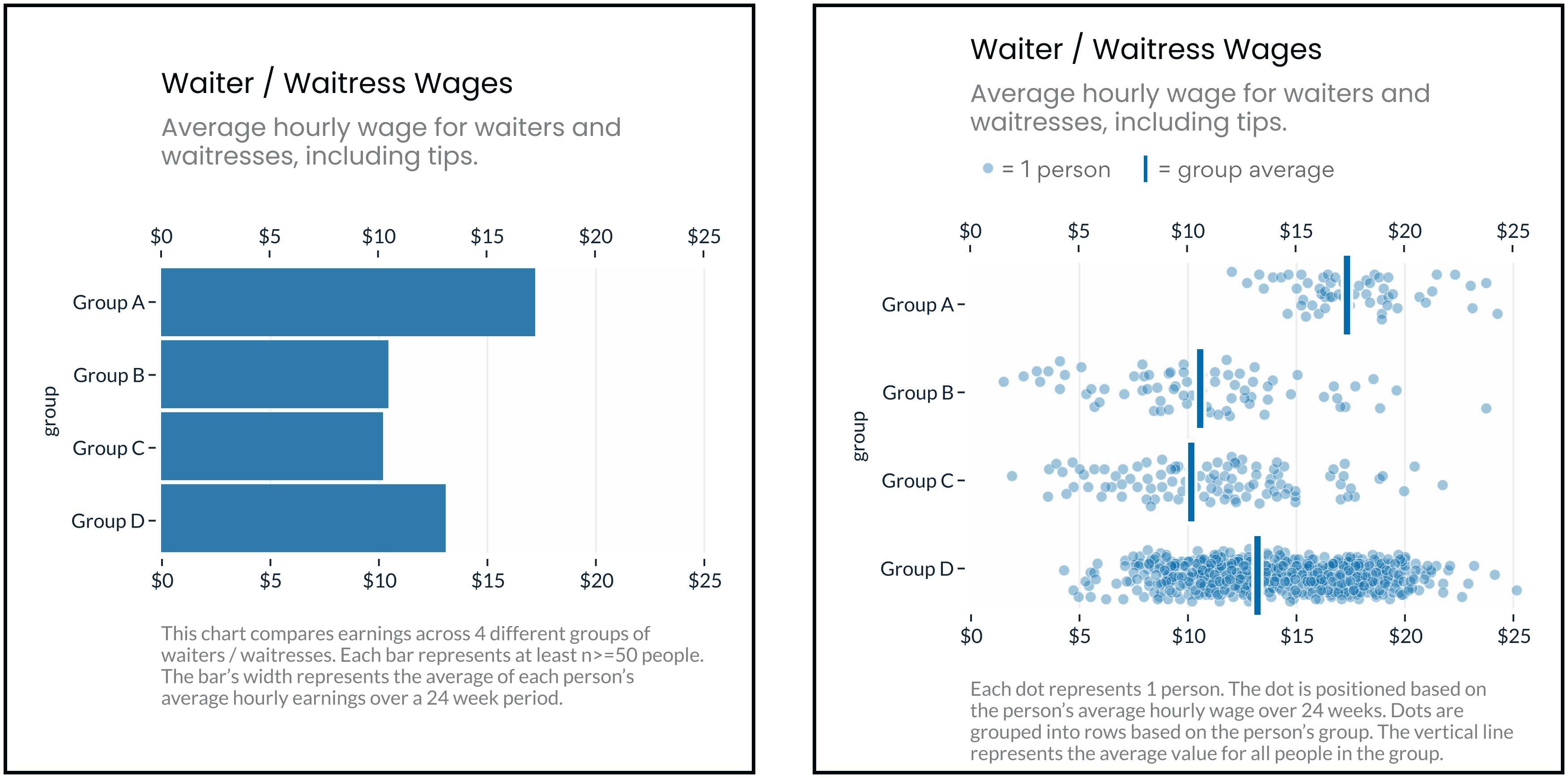
Consider the two charts above, each showing the same data. The bar chart exaggerates group homogeneity because it gives no indication of the outcome variation within the groups. It only shows the outcome differences between the groups. This creates the false impression that all Asian people earn higher wages than all White, Hispanic and Black people, when in reality there’s considerable overlap (as you can see in the Jitter plot). Research shows that when people underestimate the variation of outcomes within a category, they overestimate the impact of the category on the outcome. That is, they’re more likely to falsely conclude “being Black causes lower wages.”
Attribution biases can mislead audiences further: When considering the correlation between a certain race and their income, people can falsely conclude it’s caused by personal characteristics (e.g. “Black people don’t value education, therefore they get lower test scores,” a false stereotype) instead of environmental reasons (“being Black in an environment of systemic oppression leads to lower test scores”). Even though we know the latter is true, the former false stereotype is constantly repeated and reinforced - this requires diligence on our part, to reassert the latter truth, explicitly and frequently.
The Risks of Deficit Thinking
These biased, faulty readings highlight two central harms of deficit thinking: 1) “victim blaming” and 2) distraction.
Davis & Museus offer 2 examples of “victim blaming:” “For example, conversations about students who are at risk imply that they are likely to fail, and discourse around grit suggests that students’ individual deficiency (i.e., lack of grit) is responsible for the challenges that they experience in education.”
This tendency to blame perpetuates harmful stereotypes, creating a vicious cycle that can actually further entrench the disparities in question. According to social psychologist Charles Stangor “stereotypes become self-fulfilling prophecies, such that our expectations about the group members make the stereotypes come true.”
These lowered expectations can be detrimental in a number of ways. As an example, Stangor points to studies showing that teachers’ expectations for their students can significantly influence students’ academic performance. This may also explain the well-known “gifted gap” where gifted programs are disproportionately made up of white, wealthy children. Lowered expectations also affect the person being stereotyped. For example, in studies on stereotype threat, researchers have shown repeatedly that priming subjects with stereotypes (or even reminders of their own race) can impact scores on standardized tests.
Deficit thinking and blaming tendencies also potentially create a distraction effect. Again, Davis & Museus describe this well:
“The emphasis on individual and cultural deficiencies perpetuates assumptions that our system should seek a quick fix to remedy disparate experiences and outcomes rather than focus on addressing core systems of oppression and systemic inequities that permeate social and educational institutions. In doing so, deficit thinking prevents policy makers, educators, and communities from focusing on the actual root causes of the challenges that people of color, low-income populations, and other minoritized groups face.”
This makes sense. Since personal attributions (victim blaming) are a cognitively easier explanation, and people stop digging deeper once they’ve found an explanation that fits, victim blaming can obscure external causes, leaving more complex, systemic problems unaddressed.
Charts like the above may add a different kind of distraction: Since they present each group as a monolith, they also erase the diverse strengths and needs for each group, and therefore encourage inappropriate one-size-fits-all solutions. A focus on race itself as a cause prevents more nuanced, deeper thinking about how to help individual members of the group reach their full potential.
Conclusions
As presenters of data, we have a responsibility to present it in ways that encourage readers to extract useful information. There are years and years of negative racist stereotypes in literature and news. If we don’t think carefully about doing better, our charts and graphics can be read through those harmful lenses - perpetuating the problem instead of solving it. As data handlers and presenters, we have a responsibility to make careful and thoughtful decisions about how to present our data to support deep thinking and positive results.
About the authors:
- Pieta Blakely is an expert evaluator, who has helped countless mission-based organizations measure and maximize their impact. Her nonprofit program evaluation practice, Blakely Consulting, helps clients build organizational cultures that thrive on joyful accountability and doing important work well.
- Eli Holder is a data visualization designer and the founder of 3iap (3 is a pattern). 3iap, a data, design, and analytics consulting firm, specializes in psychologically effective data visualization, product design, and custom data product development.