Context
Client
A leading startup in the workplace analytics space. Client gives “people analytics” teams visibility into their firms by quantifying traditionally hard-to-measure organizational dynamics (e.g., collaboration, communication, employee experience, etc).
Prompt
How can we communicate a mountain of insights in a way that’s easy for executives to digest and take action on?
Background
As Covid-19 emptied out offices, every organization made a hurried transition toward working remote. For many firms, particularly the very large companies that partnered with the client, there was already a struggle to understand and optimize their organizations. Without line-of-sight between managers and employees, the struggle became even more acute and many turned to workplace analytics. This created significant demand for the client’s data and insights, particularly their “Remote Analysis” reports.
Challenges
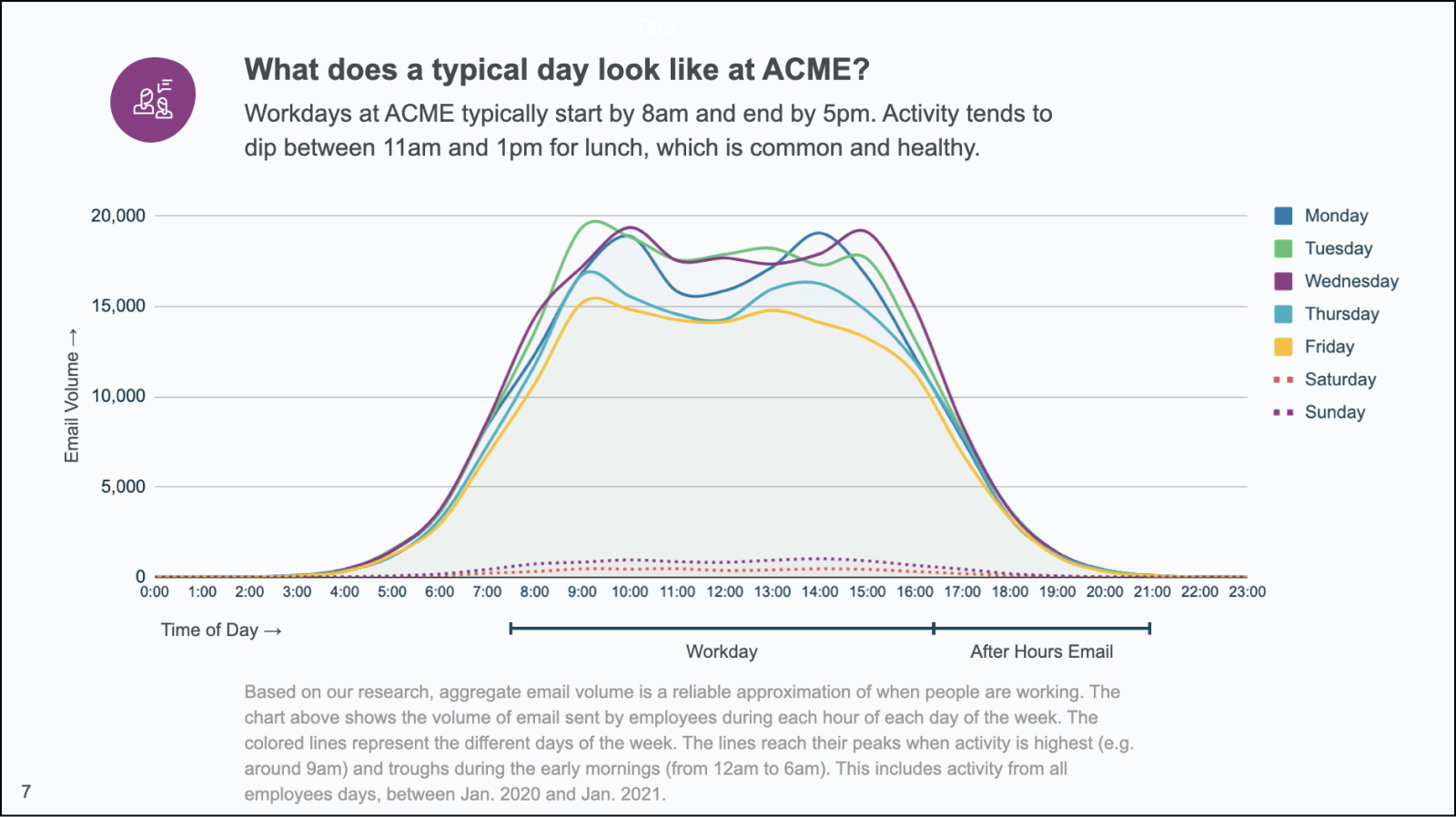
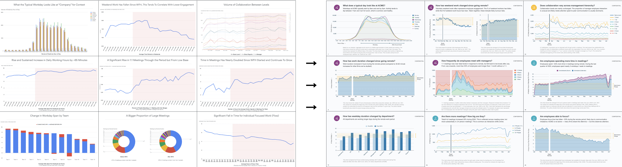
- Low-level data can’t stand alone. Client’s reports relied heavily on the presenter’s narration. However, for their insights to be impactful beyond the initial presentation, the data needed to also be easily understood by other stakeholders outside the room.
- “Hand crafted” reports don’t scale. Reports would often take several days of manual wrangling between Data Studio, Google Sheets and Powerpoint.
Design
Insight
With purpose-designed data visualization, the client’s reports could more easily reach executive teams beyond the initial presentation, supporting more informed decision-making throughout their organizations. By automating the busywork, we could free up time for more value-add analysis.
Services
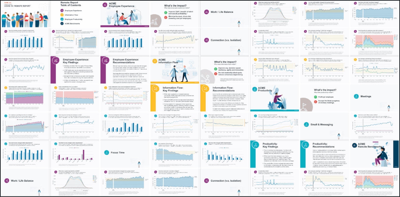
- Redesigned charts, graphs and slides for improved understandability and engagement (matching client’s brand and visual language). Developed story and structure for deck, making it easier for readers to navigate and understand all 50+ slides as a whole.
- Worked with leadership team to translate their context, experience and overall insights into the deck’s commentary, annotations and benchmarks, making analysis more standalone, approachable and self-serve.
- Automated and templatized labor-intensive report-creation process.
- Designed Google Data Studio dashboard templates to support ongoing, end-user monitoring of underlying workforce dynamics.
Results
- Client’s clients report that executive teams make faster, more confident workforce decisions.
- Reduced busywork to generate presentation decks from days to minutes.