Introduction
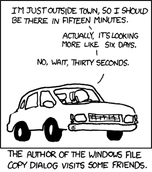
It’s hard to do hard things. Continuing to do hard things is even harder.
American culture glorifies persistence. When we hire, we hire for “grit.” We lionize the leaders who saw us through our longest, most difficult times (e.g. MLK, Washington, Churchill, FDR, Moses, Frodo). Resiliency inspiration saturates social media (e.g. Einstein: “It’s not that I’m so smart, it’s just that I stay with problems longer.”). And we all remember Mitch McConnel’s compliment to Elizabeth Warren’s tenacity: “Nevertheless, she persisted!”
But what if persistence isn’t some innate super power?
As we’ll see, our stick-to-it-iveness depends on our expectations. And our expectations depend on our available information. This makes expectation-setting a powerful use case for information design.
So let’s explore the psychology of information and expectations, then look to some effective examples of visualizing expectations in the wild.
Informational Grit
Consider Jeff Bezos’s anecdote in his letter to Amazon shareholders (src):
“A close friend recently decided to learn to do a perfect free-standing handstand… She then practiced for a while but wasn’t getting the results she wanted. So, she hired a handstand coach… In the very first lesson, the coach gave her some wonderful advice. “Most people,” he said, “think that if they work hard, they should be able to master a handstand in about two weeks. The reality is that it takes about six months of daily practice. If you think you should be able to do it in two weeks, you’re just going to end up quitting.” Unrealistic beliefs on scope - often hidden and undiscussed - kill high standards. To achieve high standards yourself or as part of a team, you need to form and proactively communicate realistic beliefs about how hard something is going to be.”
One of the perks of being a billionaire is friends who can afford handstand coaches, because these coaches are full of surprisingly practical wisdom. There’s quite a bit of evidence supporting this wisdom:
- In 2002, Oettingen & Mayer showed that healthy expectations can also improve our chances for success in 1) job hunting, 2) dating, 3) test-taking and 4) recovering from hip-replacement surgery (src).
- In 2010, Swift & Callahan showed the power of expectation setting for encouraging clients to remain in psychotherapy (src). By telling new clients, up front “this process usually takes 13–18 sessions” they improved client retention significantly, boosting therapy sessions by 80% (from 5.9 to 9.9 sessions).
- In 2019, Chu & friends spent 130 hours interviewing patients about their experiences waiting to see a doctor (src). Their #1 suggestion: “Proactively informing patients of delays.” Setting expectations about delays improves “willingness to wait” by reducing uncertainty and increasing tolerance.
- Earlier this year (2020), Briscese & friends explored how expectations impact willingness to comply with Covid-19 stay-at-home orders (src). They asked 2,697 participants what they’d do if quarantine orders continued for X more weeks / months. When X was “much longer than expected,” noncompliance intentions more than doubled.
What makes expectation setting powerful?
Reducing Uncertainty. There’s an intrinsic reason for valuing clear expectations: Uncertainty hurts. Actually, in some cases (src), uncertainty is worse than physical pain! Some researchers suggest that anxiety itself is just our body responding to uncertainty (src, src). Others suggest that the reason we seek any information is reducing this uncertainty-driven anxiety (src, src).
Agency. Weather apps have earned a spot on all of our home screens (and the #2 use case of Alexa / Google Home, src) because, before we walk outside, we want to know if it’s hot or cold and what’s falling out of the sky. There’s obviously nothing we can do to change the weather, but the information gives us some agency in how we prepare for it (e.g. flip-flops or snowshoes?).
Preempting Trouble. When doing a hard thing, there will always be bad days. Every diet will have a few unintended cheat days. Quitting smoking often means multiple “last cigarettes.” Every Poké Trainer will lose a few battles on the road to Poké Mastery. These slip-ups are only a problem when they spiral into self doubt. Preempting helps us avoid downward spirals by normalizing the inevitable setbacks and putting them in context of the larger journey, helping us preserve our sense of efficacy.
Information Design Examples
Our willingness to endure depends on realistic expectations about the road ahead. This might explain why expectation setting is so prominent in information design.
Countdown Clocks
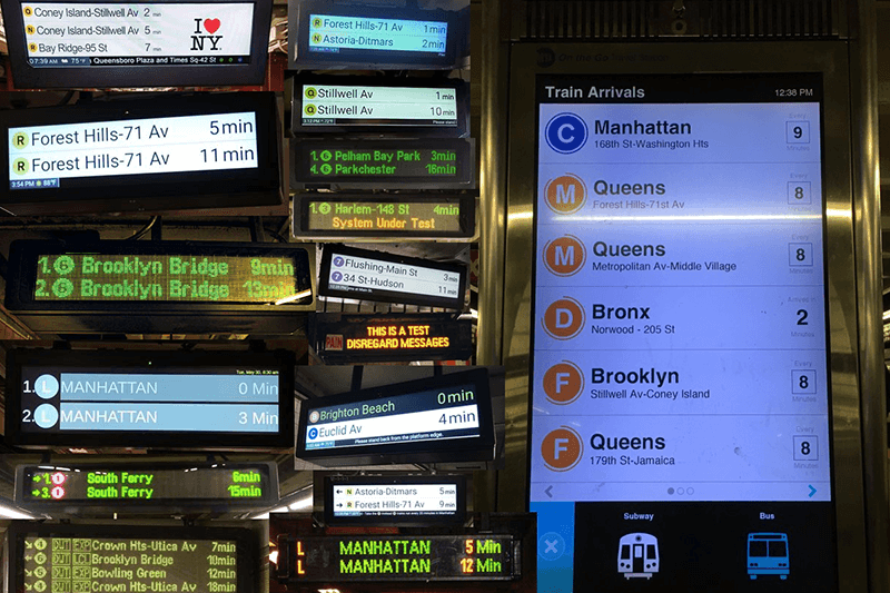
If you’ve ridden the subway in NYC in the past 10 years, you’ve likely run into what the MTA calls a “Countdown Clock.” When you’re waiting on the platform, you can look up at these big displays to see an ETA for the next train’s arrival. The MTA loves these, so they spent 11 years installing them in all 471 subway stations.
What’s so great about countdown clocks? They imbue patience in subway riders. According to Zou & Sha, this leads to very positive outcomes (src):
- Countdown clocks reduce riders’ perceived wait time
- They improve rider satisfaction rates (& perception of the MTA)
- And, they actually improved weekly ridership (1783 riders per station)
Weight Loss
Losing weight in a healthy way is a long term journey, but every day can feel like a struggle. For people trying to lose weight, it’s very easy to lose sight of the goal and let a few instances of stress-eating slip into a downward spiral (see: the “what the hell” effect).
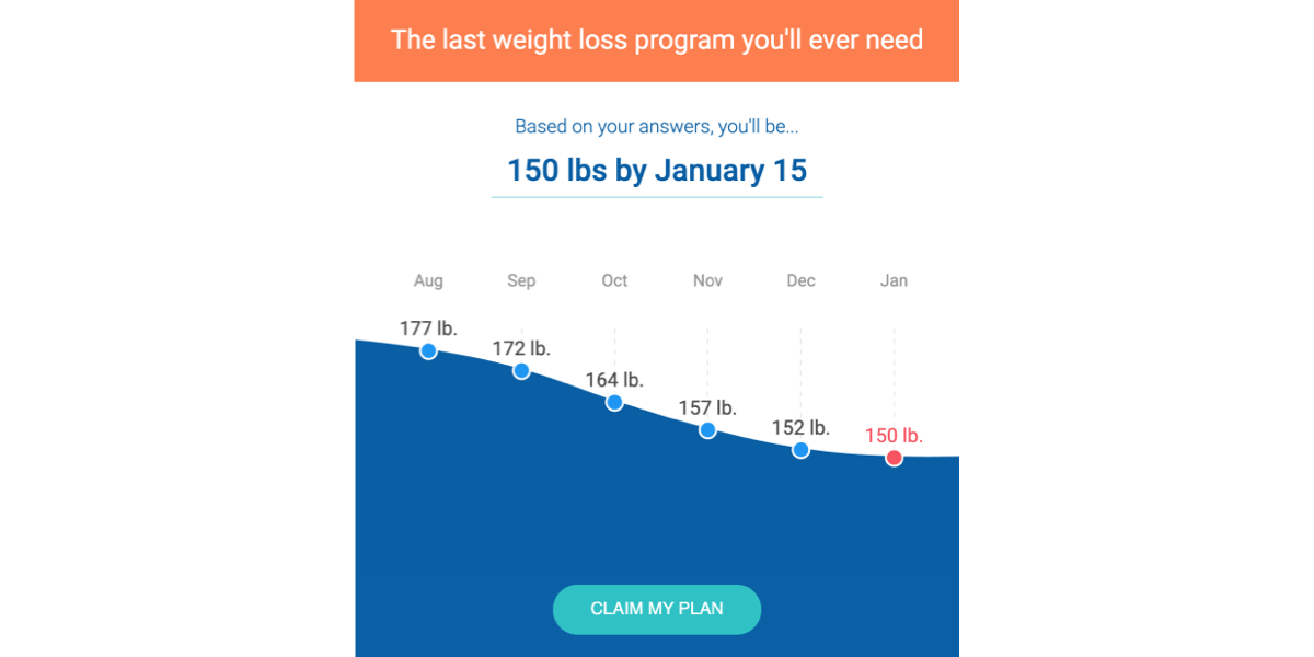
When I worked at Noom in 2014, we confirmed this in our own user research, indicating how easy it was for users to feel lost. Retaining users in Noom’s program meant helping them visualize how their struggles today would pay off tomorrow.
Noom’s weight graphs help users visualize not just their past and current weigh-ins, but also their projected weight in the future. Both the in-app weight graph and the onboarding visualization (above) show the user’s current weight, projected forward, decreasing roughly ~2lbs / week until the day they hit their target weight. Not only does this set realistic expectations about weight loss as a long term commitment, it gives users something to look forward to. From personal experience, I can tell you that Noom users are very attached to this feature.
Route-Planning
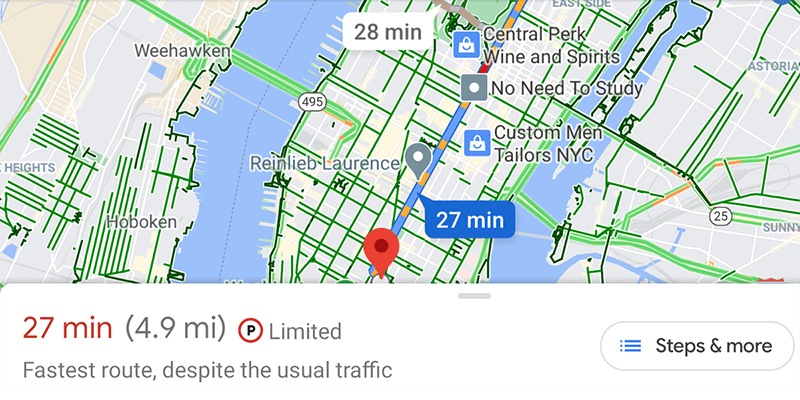
Google Maps has 2 goals when showing you routes: 1) helping you get to your destination (safely, quickly, etc) and 2) encouraging you to continue using Google Maps.
The product’s predicted ETAs set expectations about travel time. The traffic density indicators preempt trouble ahead. Both of these make the road ahead more bearable for users. They also inform the user’s decision about alternative routes / travel methods, improving agency.
Toward Goal #2, the product devotes a fair amount of UI to CYA (“cover your ass”) expectation setting. Route-planning is difficult, particularly so because the user’s travel experience is out of the app’s control; at rush hour, even a perfect algorithm may only have bad options to offer. In those situations, letting users know that even the “fastest route” will still have traffic (and exactly when / where to expect it) preempts these unexpected gotchas. As an added bonus, it’s also a clever way to say “Don’t blame us when you’re stuck in traffic, blame the cars in front of you!”
Estimated Reading Time
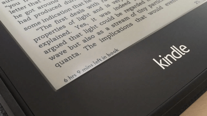
According to Arienne Holland, estimated read times first appeared on longreads.com around 2010 (src). Since then, Amazon and Kindle have also adopted this pattern. These services have a shared interest in encouraging users to read more and Holland offers some anecdotal evidence that the indicator is effective (i.e. for improving time-on-site and reducing bounce rates).
In her listicle defending listicles (src), New Yorker’s Maria Konnikova argues that lists appeal to readers because they set clear expectations about reading time, helping us decide where to devote our attention.
“Within the context of a Web page or Facebook stream, with their many choices, a list is the easy pick, in part because it promises a definite ending: we think we know what we’re in for, and the certainty is both alluring and reassuring. The more we know about something - including precisely how much time it will consume - the greater the chance we will commit to it.
Konnikova cites 2 studies suggesting that this effect is due to reducing cognitive effort in decision making (src) and reducing uncertainty (src).
Finally, in his “Ode” to Kindle’s read time estimates, Dan Safer describes its value in terms of agency, specifically how it helps him manage his time (src):
“Do I want to finish this chapter before bed? Oh, it’ll only take me 2 more minutes, so sure.”

Progress Bars
There is a crazy amount of research on the UX impact of progress bars. It turns out that progress bars can be quite effective… sometimes (src).
The Nielsen Norman Group recommends progress bars (or “percent done indicators”) for UX wait times longer than 10 seconds (src). According to Nielsen, these help “users develop an expectation for how fast the action is being processed.”
Progress bars “convey important information about (approximately) how long the wait time is. This information gives users control (that is, they can decide whether to wait or not); it decreases uncertainty about the length of the process and may reduce the perceived wait time.”
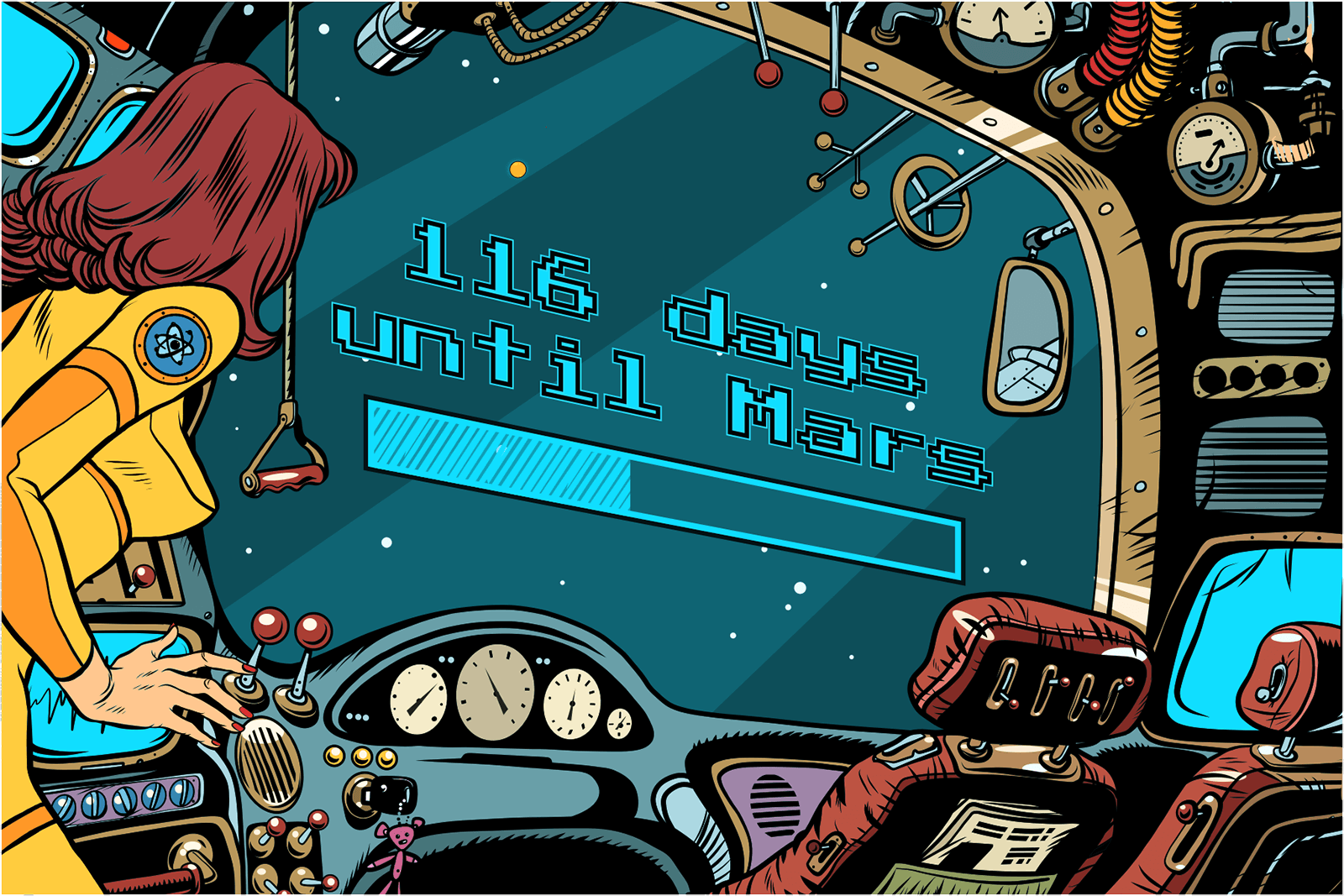
As waiting indicators, progress bars are powerful because of the expectations they set. They have an end state and they show you the distance until you reach that end state. Knowing that distance decreases uncertainty and increases agency.
There are, of course, other progress indicators like spinners or “throbbers,” that don’t show an end state, they just indicate that progress is happening. Some research suggests these can actually triple a user’s willingness to wait for a page to load, from 13 seconds to 38 seconds (src).
However, according to Cao & friends’ (src), “indeterminate” progress indicators (e.g. spinners) aren’t as effective in reducing perception of wait time. In their experiment they asked participants to wait up to 12 seconds for various media to load. When they asked “What is the maximum delay you have experienced during the test?” people in the spinner group said ~11 seconds, while people in the progress bar group said just 6 seconds.
In another study, Hohenstein & friends tested 3 different loading screens to see which designs had the biggest effect on perceived wait time: 1) a passive animation (e.g. a spinner), 2) an interactive animation (e.g. a mini-game) and 3) a progress bar (src). Consistent with Cao & friends, progress bars outperformed passive animations. But the mini-game was the best performer by far. It seems expectation-setting is powerful, but nothing beats distraction!
(One important note: Progress bars are not a silver bullet. For example, when attached to lengthy surveys they can actually increase respondents’ drop-off rates. In this context, they’re only effective when users perceive their progress as initially fast, then slower towards the end (src). And this seems to be driven more by the goal gradient effect, rather than expectation setting.)
Financial Calculators
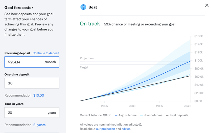
Betterment’s “Goal Forecaster” helps set realistic expectations about personal finances. Presenting the projected savings in a fan-chart helps inoculate users against inevitable economic bumps in any financial journey, while still conveying the benefits of investing over the long term.
Simulators like these help users connect the cause and effect of their actions now (auto-deposit) with likely future outcomes (goal). Making these relationships concrete helps people grasp complex concepts like exponential growth and motivates them to save more (src, src).
You can learn more about Betterment’s motivations for this feature here: Motivational Visualizations.
Anti-Pattern: Gantt Charts
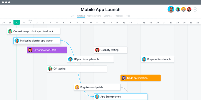
Detailed project plans inspire a sense of false confidence (src). Kahneman and Tversky coined the term “planning fallacy” 41 years ago (src), Fred Brooks told us definitively “The Waterfall Model Is Wrong” in 1995 (src) and even the Pentagon has recently adopted an “agile” approach for the $428B, F-35 fighter jet (src).
And yet the Gantt Chart lives on! Their continued existence, I think, speaks more to our desire for expectations rather than Gantt charts’ ability to deliver.
The problem begins at the Gantt chart’s fundamental unit: Each block represents a chunk of work, with a discrete start and end time. Since it’s so rare that actual work matches a predicted duration, these blocks mask important uncertainty. This problem compounds as the blocks stack to the right, by presenting an entire project’s completion date as a single point in time rather than a gradient of possible dates.
Instead of reducing uncertainty, Gantt charts only mask it. Combined with the planning fallacy, this leads to overly optimistic, but very precise estimates. It sets expectations that are sure to be violated.
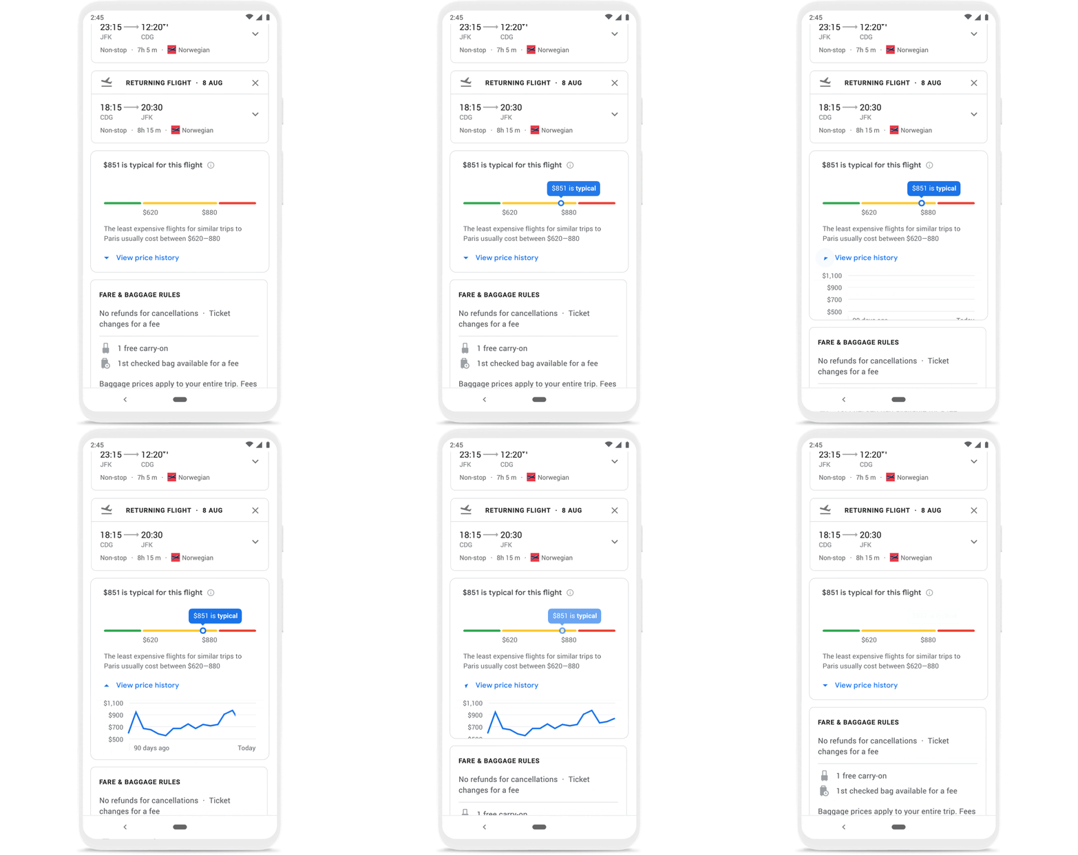
Google Flights - Price Prediction
Expectation setting isn’t just about enduring long journeys. Google Flights uses expectation setting to make your plane-ticket search as short as possible.
According to Google’s Vyacheslav Polonski (src), users face overbearing uncertainty when booking flights, particularly around pricing. “Buying a plane ticket is nothing like buying a cappuccino,” he says. This pricing anxiety meant users would “wait for as long as possible before booking… This process could take anywhere from a couple of days to several months.”
This is no bueno for the user. It’s also bad for Google. Waiting can easily turn into never booking or booking with a different service.
Google Flight’s price predictor solves this hesitation by setting realistic expectations about price changes in the future. When users feel confident the price won’t change in their favor, they’re more likely to book now.
Since ML models themselves can be unpredictable, the Google Flights team also put considerable effort into setting expectations about the model itself. Polonski cites Google’s Explainability & Trust PAIR Guidelines (and extensive user testing) as helpful tools for this.
According to Polonski, the results were positive: “This feature performed really well in usability tests… When people saw the price history graph and expressed satisfaction in what they were seeing, we knew we were on the right track.”
Google also (briefly) offered a price guarantee, signaling further confidence in their approach and, perhaps, that their solution to the hesitation problem was worth at least as much money as they’d lose to bad predictions.
Takeaways:
- Consider expectation-setting as an important use case for information design because clear expectations give people the confidence to persevere.
- Expectation-setting works by reducing uncertainty, increasing our sense of agency and preempting the inevitable setbacks of any long journey.
- When possible, don’t just offer audiences data from the past. Instead, paint a path forward. By helping people visualize their future, you can: Improve patience (and satisfaction) while waiting for doctors, trains, traffic and slow websites; Encourage long-term retention in weight-loss programs and mental health treatment; Grant confidence to move forward with small decisions, like what to read, and big decisions, like booking airline tickets and investing for the long term.

