Collaboration with Lace Padilla, examining equitable data design techniques for population mortality charts, published in 2024 IEEE Visualization and Visual Analytics (VIS)
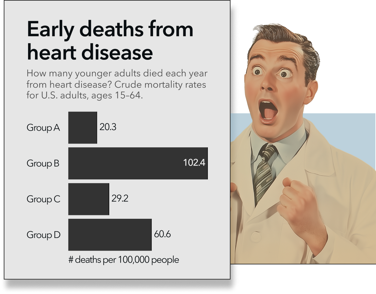
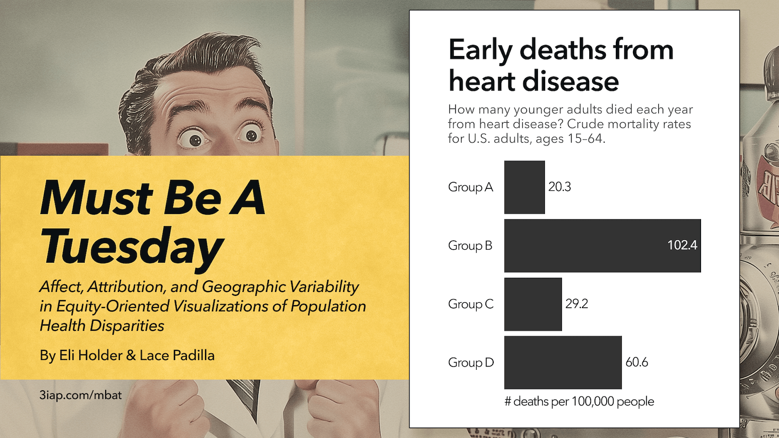
This study examines the impacts of public health communications visualizing risk disparities between racial and other social groups. It compares the effects of traditional bar charts to an alternative design emphasizing geographic variability with differing annotations and jitter plots. Whereas both visualization designs increased perceived vulnerability, behavioral intent, and policy support, the geo-emphasized charts were significantly more effective in reducing personal attribution biases. The findings also reveal emotionally taxing experiences for chart viewers from marginalized communities. This work suggests a need for strategic reevaluation of visual communication tools in public health to enhance understanding and engagement without reinforcing stereotypes or emotional distress.
Dispersion Vs Disparity: How Hiding Variability Can Encourage Stereotyping When Visualizing Social Outcomes
Collaboration with Cindy Xiong Bearfield, exploring the impact of variability on attribution and stereotypes.
Polarizing Political Polls: How Visual
Collaboration with Cindy Xiong Bearfield, exploring how social normative influences are triggered by charts