Must Be A Tuesday: Affect, Attribution, and Geographic Variability in Equity-Oriented Visualizations of Population Health Disparities
Collaboration with Lace Padilla, examining equitable data design techniques for population mortality charts.
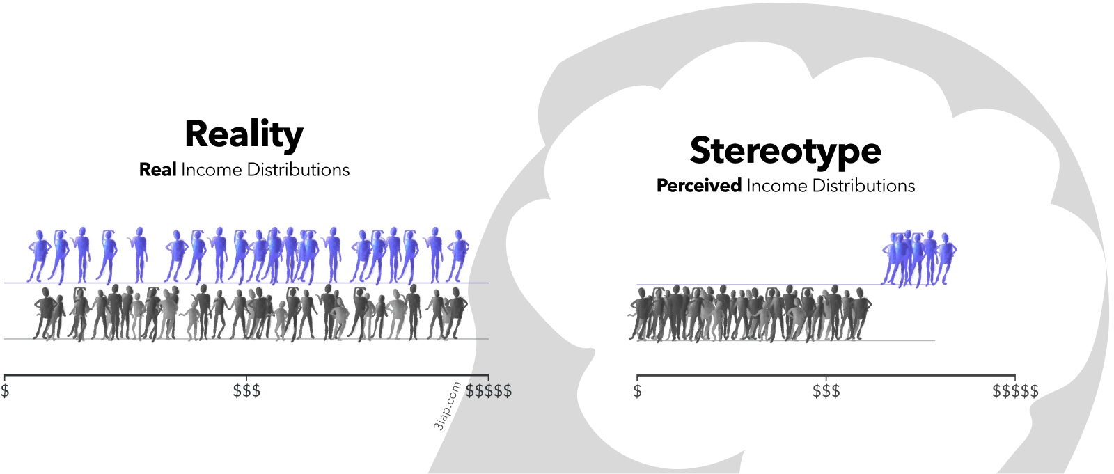
Dispersion vs Disparity: Hiding Variability Can Encourage Stereotyping When Visualizing Social Outcomes
Collaboration with Cindy Xiong Bearfield, exploring the impact of variability on attribution and stereotypes.
Polarizing Political Polls: How Visual
Collaboration with Cindy Xiong Bearfield, exploring how social normative influences are triggered by charts.
When people think of “good dataviz” they think of John Snow’s maps, because good dataviz is supposed to be intellectual and enlightening. It works by guiding us toward smarter, more rational decisions. But there are other ways that data can influence us, and a surprising amount of it relates to social psychology.
Public dataviz (e.g. dashboards published by institutions like health or education agencies) can also be influential, but not always in the ways we expect. Conventional ways of visualizing social outcome disparities are an example where conventional data visualization approaches can backfire.
Visualizing people as monoliths makes them seem monolithic.
When visualizing social outcomes, highlighting within-group outcome variability can reduce misattribution and stereotyping. This implies that it's possible to design charts that are less toxic, and still effective for their original communication goals. It also implies that data designers have a choice, and a responsibility, in how they visualize social outcome disparities.
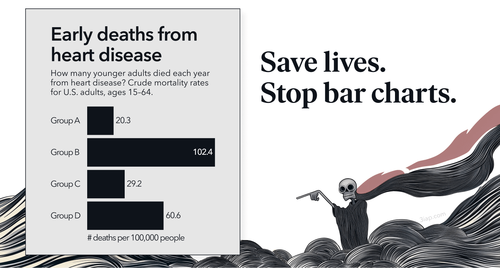
Conventional charts may feel familiar, but there’s no intrinsic advantage to them. In our "Must Be A Tuesday" study, we found that conventional bar charts and the alternative geo-emphasis charts were both effective for influencing health risk perception, behavioral intent, and policy support. This demonstrates the possibility that health institutions can change the way we visualize social outcomes, without sacrificing our original communication goals.
They blame people, not systems.
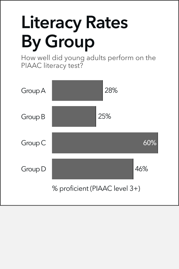
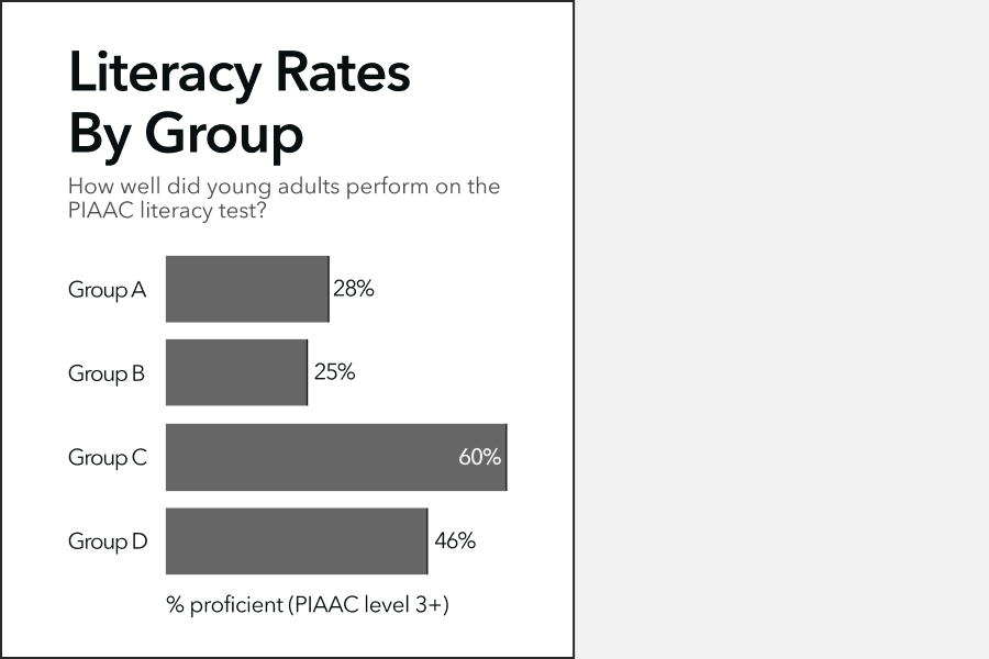
Social cognitive biases can interfere with viewers' perceptions of dataviz. For example, deficit-framed achievement charts may be accurate and easy to read, while still biasing viewers' causal explanations toward blaming the groups being visualized, instead of structural factors.
Biases in Attribution
What Is Deficit Thinking? An Analysis of Conceptualizations of Deficit Thinking and Implications for Scholarly Research
Dispersion vs Disparity: Hiding Variability Can Encourage Stereotyping When Visualizing Social Outcomes
Teachers’ Sensemaking of Data and Implications for Equity
Must Be a Tuesday: Affect, Attribution, and Geographic Variability in Equity-Oriented Visualizations of Population Health Disparities