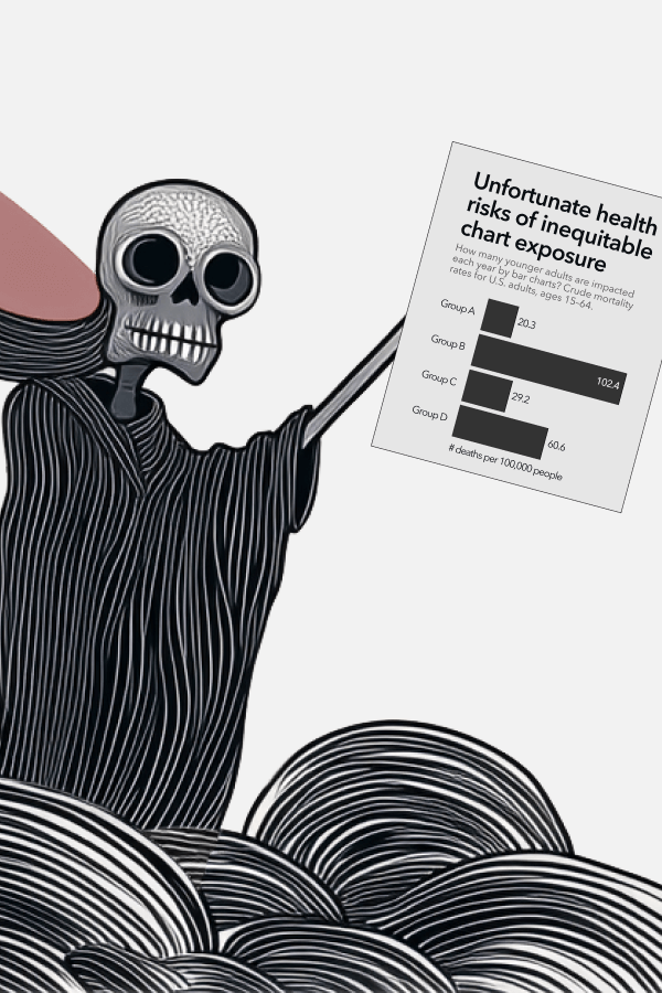
Deathly Dataviz Talk for R Ladies Rome
Thank you for the opportunity to share “Deathly Dataviz: How Public Health Dashboards Can Backfire, and What We Can Do Instead.” Notes and materials are below for reference.
Collaboration with Lace Padilla, examining equitable data design techniques for population mortality charts, published in 2024 IEEE Visualization and Visual Analytics (VIS)
This study examines the impacts of public health communications visualizing risk disparities between racial and other social groups. It compares the effects of traditional bar charts to an alternative design emphasizing geographic variability with differing annotations and jitter plots. Whereas both visualization designs increased perceived vulnerability, behavioral intent, and policy support, the geo-emphasized charts were significantly more effective in reducing personal attribution biases. The findings also reveal emotionally taxing experiences for chart viewers from marginalized communities. This work suggests a need for strategic reevaluation of visual communication tools in public health to enhance understanding and engagement without reinforcing stereotypes or emotional distress.
Dispersion vs Disparity: Hiding Variability Can Encourage Stereotyping When Visualizing Social Outcomes
Collaboration with Cindy Xiong Bearfield, exploring the impact of variability on attribution and stereotypes.
Polarizing Political Polls: How Visual
Collaboration with Cindy Xiong Bearfield, exploring how social normative influences are triggered by charts.

When people think of “good dataviz” they think of John Snow’s maps, because good dataviz is supposed to be intellectual and enlightening. It works by guiding us toward smarter, more rational decisions. But there are other ways that data can influence us, and a surprising amount of it relates to social psychology.
Public dataviz (e.g. dashboards published by big institutions like government health agencies) can also be influential, but not always in the ways we expect. Conventional ways of visualizing social outcome disparities are an example where conventional data visualization approaches can backfire.
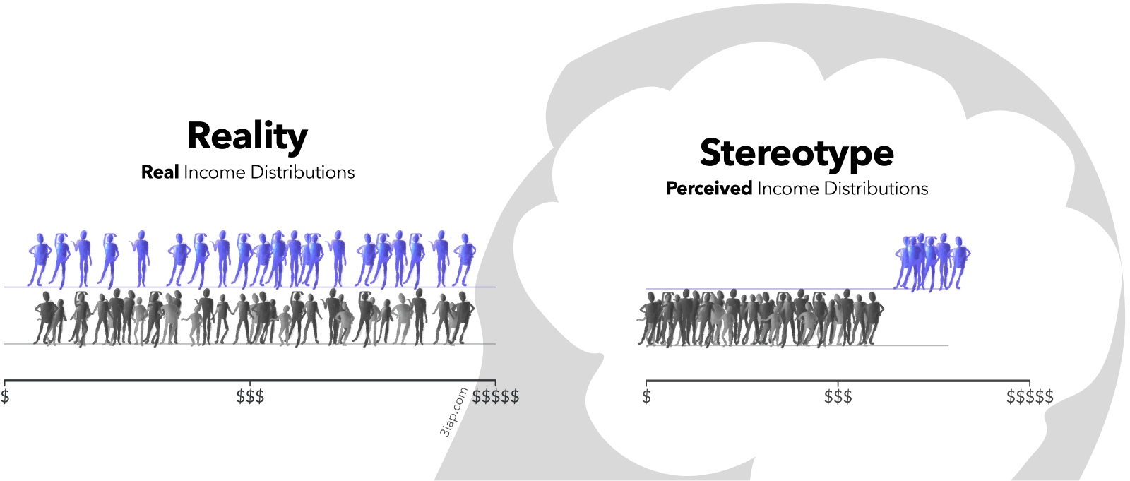
Visualizing people as monoliths makes them seem monolithic.
When visualizing social outcomes, highlighting within-group outcome variability can reduce misattribution and stereotyping. This implies that it's possible to design charts that are less toxic, and still effective for their original communication goals. It also implies that data designers have a choice, and a responsibility, in how they visualize social outcome disparities.
They undermine health outcomes for everyone. Conventional health disparity charts that promote harmful stereotypes pose downstream risks such as increased cardiovascular mortality and reduced support for programs like Medicaid.
Positively influential public dataviz starts with clear, complete communication goals. Data communication strategy should explicitly cover both equity and efficacy.
Identify and apply the equitable data design principles targeted toward equity communication goals. These can be used as inspiration while developing a chart, and as a checklist for evaluating the work.
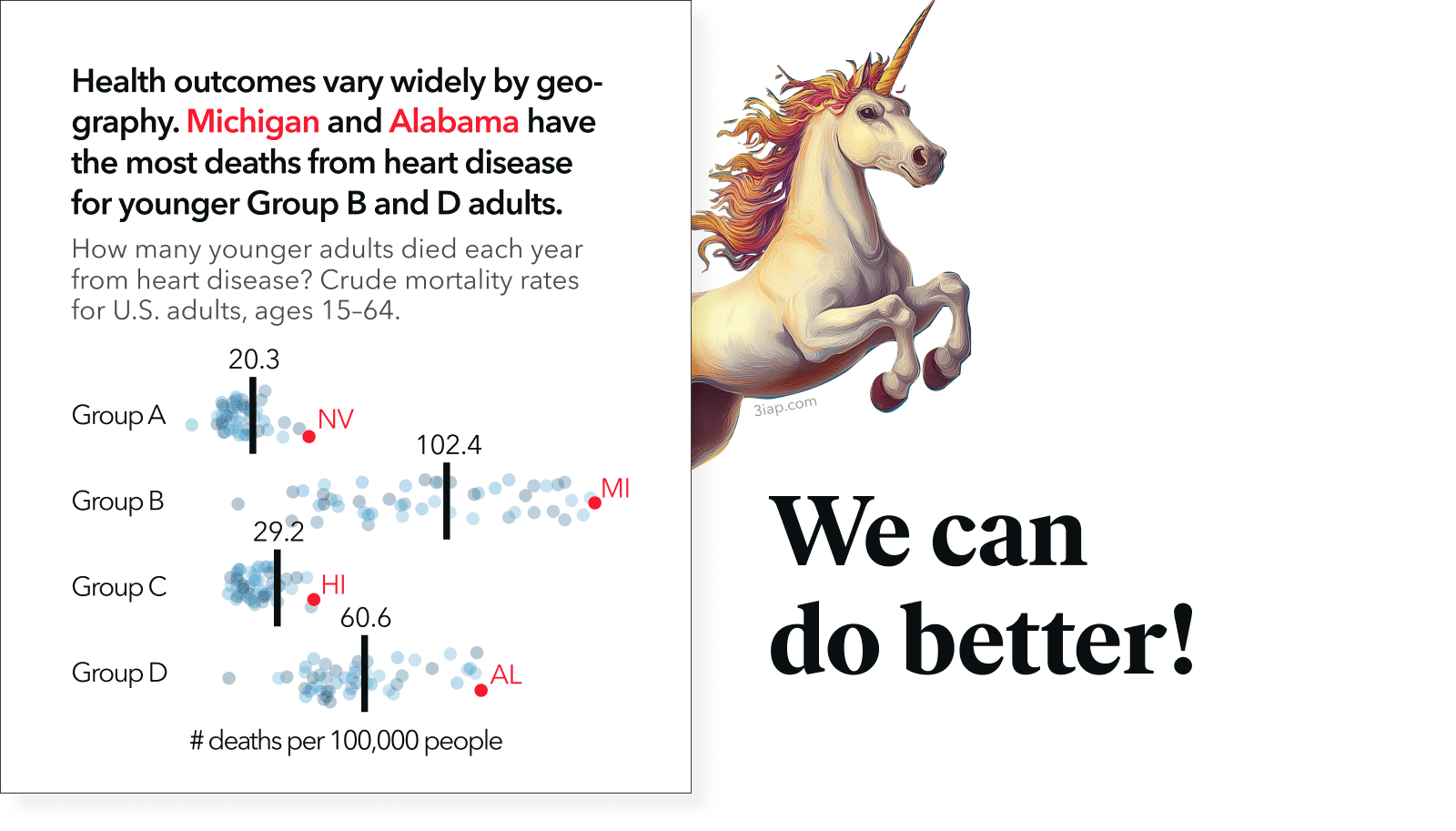
The geo-emphasis chart in the "Must Be A Tuesday" study was designed with the following principles in mind:
- Blame Systems, Not People
- Highlight Within-Group Variability (and Between-Group Commonality)
- Defiantly Definite
- Visceral Value Judgements
Since dataviz is contextual and task-dependent, the best way to understand a design and be confident that it works is to test it out.
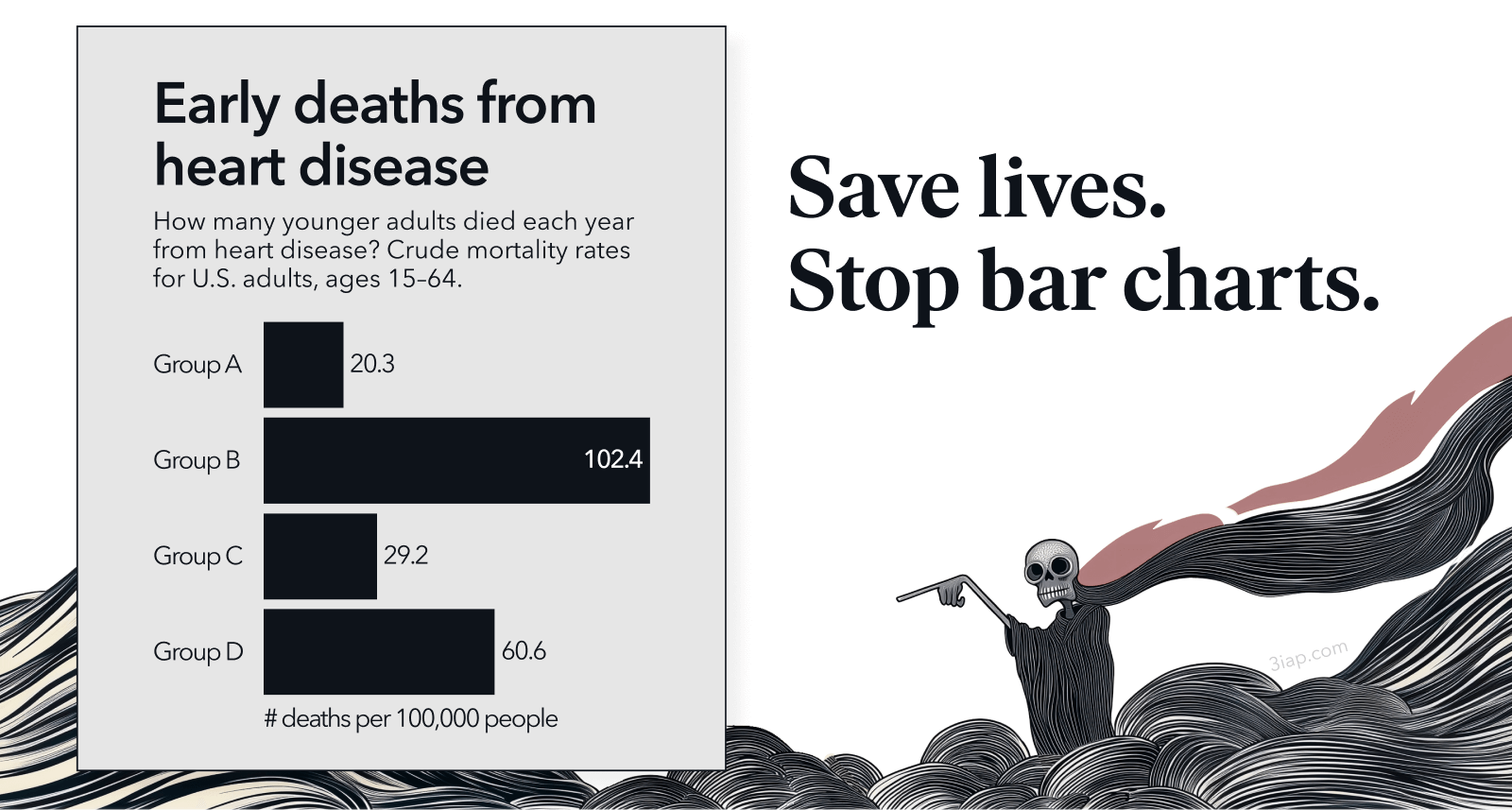
Conventional charts may feel familiar, but there’s no intrinsic advantage to them. In our "Must Be A Tuesday" study, we found that conventional bar charts and the alternative geo-emphasis charts were both effective for influencing health risk perception, behavioral intent, and policy support. This demonstrates the possibility that health institutions can change the way we visualize social outcomes, without sacrificing our original communication goals.
Data design choices, such as like assertive titles and showing variability, can play an active role in correcting health misbeliefs and harmful stereotypes.... or they can make them worse. Since these misbeliefs are associated health outcomes, it suggests making more equitable design choices when visualizing public health may indirectly benefit the public's health.


They blame people, not systems.
Social cognitive biases can interfere with viewers' perceptions of dataviz. For example, health disparity charts may be accurate and easy to read, while still biasing viewers' causal explanations toward blaming the groups being visualized, instead of external factors like social determinants of health.
Biases in Attribution
What Is Deficit Thinking? An Analysis of Conceptualizations of Deficit Thinking and Implications for Scholarly Research
Must Be a Tuesday: Affect, Attribution, and Geographic Variability in Equity-Oriented Visualizations of Population Health Disparities
Dispersion vs Disparity: Hiding Variability Can Encourage Stereotyping When Visualizing Social Outcomes
Conventional health disparity charts that promote misattributions for social outcome disparities pose downstream risks such as undermining political urgency for change and reinforcing disparities in treatment within the healhtcare system.
The U.S. Playbook to Address Social Determinants of Health
The Age of Responsibility: On the Role of Choice, Luck and Personal Responsibility in Contemporary Politics and Philosophy
Health in the United States: Are Appeals to Choice and Personal Responsibility Making Americans Sick?
What Is Deficit Thinking? An Analysis of Conceptualizations of Deficit Thinking and Implications for Scholarly Research
Must Be a Tuesday: Affect, Attribution, and Geographic Variability in Equity-Oriented Visualizations of Population Health Disparities
Abandon 'Race.' Focus on Racism.
Who Deserves Health Care? The Effects of Causal Attributions and Group Cues on Public Attitudes About Responsibility for Health Care Costs
Racial bias in pain assessment and treatment recommendations, and false beliefs about biological differences between blacks and whites