Context
Prompt
How might we illustrate examples of “motivational dataviz” in a way that’s entertaining and works for print?
Background
Nightingale Magazine is the Data Visualization Society’s beautifully crafted print publication, covering new ideas and compelling work in the data visualization community. They asked us to contribute an article and illustrations about the non-informational, motivational impacts that data visualizations can have on viewers.
Challenge
Designing for print is a unique, refreshing challenge. To work in this medium, each visualization needed to work as a standalone artifact and be relatively constrained in size and color. They also needed to be approachable and quick to consume to catch readers’ attention as they flip through the magazine.
Key Insights
Big, Absurd Ideas
Keep it light. While each visualization illustrates a unique psychological mechanism, each one of which could fill a textbook chapter on data psychology, most readers would be new to the overall concept of affective visualization. So it was more important to keep things light and memorable (and maybe a bit silly) than attempt to capture each concept in realistic detail. Instead we used “stylized” charts showing the application of these mechanics based on different absurd scenarios.
Productive Absurdity. Absurdity can be a useful communication tactic for winning over skeptics and increasing memorability (Arias-Bolzmann et al, 2013). Given that dataviz is traditionally valued for its rational, sense-making benefits, but the article instead focuses on non-cognitive impacts that readers may be unfamiliar with, a more disarming approach should make these new concepts more palatable.
Design
Viz #1
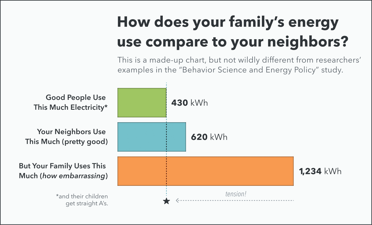
A silly reproduction of Sacramento Municipal Utility District’s electricity usage letter (via Allcott & Mullainathan 2010). The horizontal bar chart shows a customer’s consumption compared to their peers. Charts that compare a person’s outcomes to social norms are effective through a social-psychology process called “social normative conformity,” which is a fancy way of saying “peer pressure.” You can learn more about the power of social-normative influence in dataviz here.
Viz #2
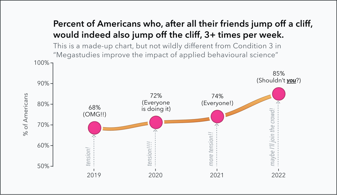
An absurd reproduction of Robert Cialdini’s social norms intervention for 24-Hour Fitness customers (via Milkman et al 2021). Charts like this also rely on social-normative influences.
Viz #3

A silly reproduction of Matthaei et al’s Ambulatory Glucose Profile, showing a distribution of blood glucose levels compared to a target range over a 24 hour period (via Matthaei 2014). Charts like these are effective because of the psychology of feedback. The benchmark range makes this particularly effective through the psychology of goal setting.
Viz #4
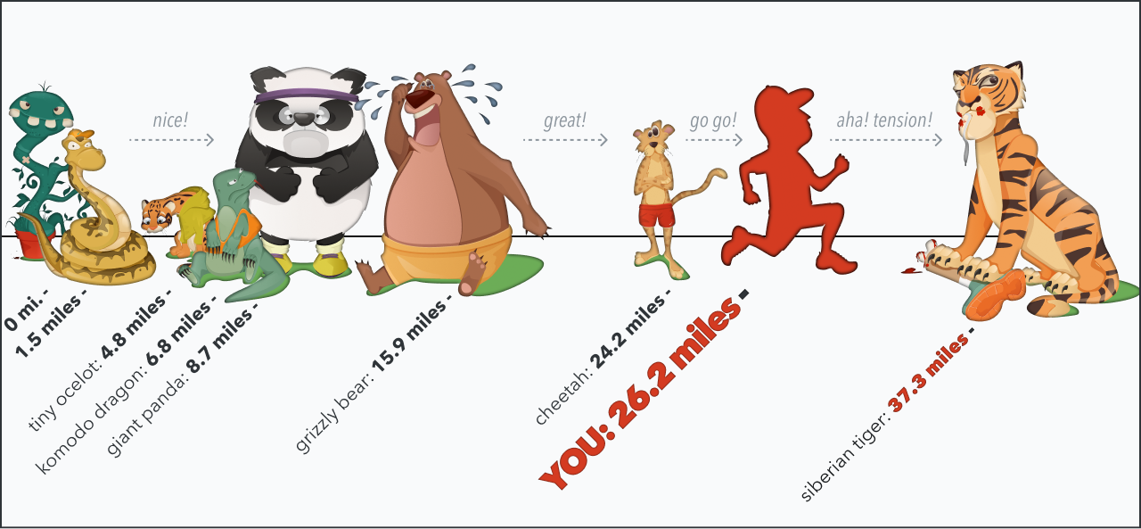
This lineup of creatures was from a popular notch.me visualization (designed in collaboration with the amazing illustrator Andra Popovici), aimed at long-distance runners. The critters were ordered by the longest-documented distances that each animal actually travels in the wild. When users crossed a milestone, they “outran” the animal. For example, after running 10 miles, a user would see, “at 10 miles, you outran a GIANT PANDA (8.7 miles),” with an illustration of a grumpy, defeated panda bear.
Then to motivate the next milestone, users were informed of their untimely demise: “Unfortunately, 10 isn’t far enough. Grizzly Bears can last 15.9 miles… And this one ate you,” with an adorably bloody, highly-satiated grizzly bear.
Milestones like this are effective by breaking big goals down into more proximate, achievable goals enhancing a viewer’s sense of efficacy. Goal proximity is an influential component of the psychology of feedback.
Viz #5
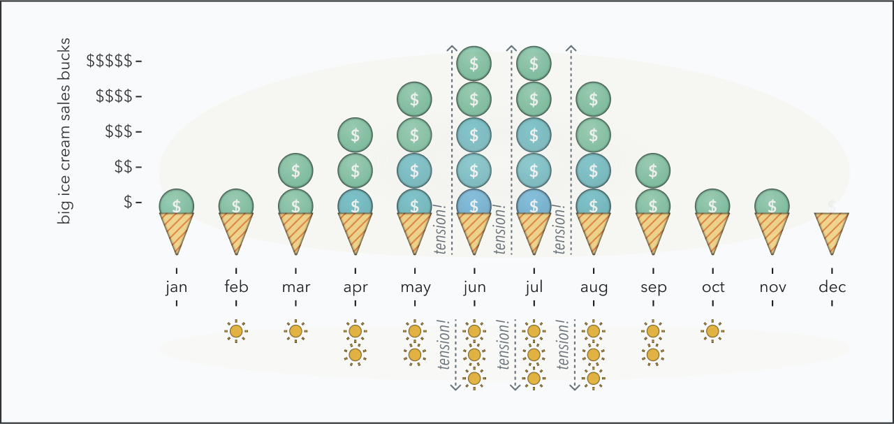
A stacked ice cream icon array, comparing ice cream sales (scoops) to warm weather (suns), to put sales in the context of fair expectations. Quantiative feedback loops can be risky because they can create unhealthy fixations and expectations. Humanistic metric design can help frame outcomes against fair expectations.
Results
Nightingale Magazine
Digital and print copies of Nightingale Magazine are available from the Data Visualization Society here.